Visualizing time-series
This is in a very familiar data structure: 365 rows for each day in 2011 and five columns to store the four metrics for the dates stored in the first variable. Let's transform that to a time-series object and plot it right away:
> plot(ts(daily))
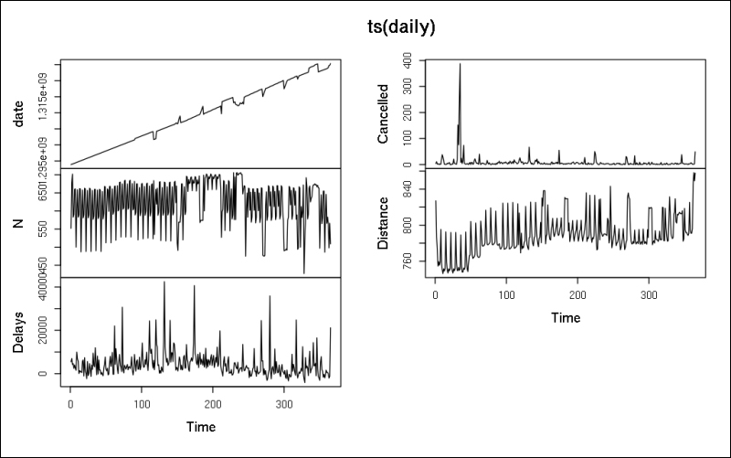
It was easy, right? We have just plotted several independent time-series on a line chart. But what's shown on the first plot? The x axis is indexed from 1 to 365 because ts did not automatically identify that the first column stores our dates. On the other hand, we find the date transformed to timestamps on the y axis. Shouldn't the points form a linear line?
This is one of the beauties ...
Get Mastering Data Analysis with R now with the O’Reilly learning platform.
O’Reilly members experience books, live events, courses curated by job role, and more from O’Reilly and nearly 200 top publishers.

