Visualizing network data
To compare these two metrics, let's draw a simple scatter plot showing each R package by degree and betweenness:
> plot(degree(g), betweenness(g), type = 'n',
+   main = 'Centrality of R package dependencies')
> text(degree(g), betweenness(g), labels = V(g)$name)
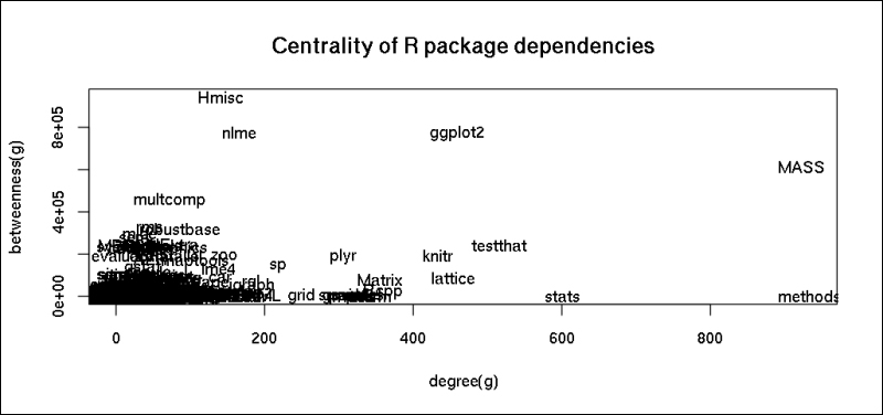
Relax; we will be soon able to generate much more spectacular and instructive plots in a few minutes! But the preceding plot shows that there are some packages with a rather low number of direct dependents that still have a great impact on the global R ecosystem.
Before we proceed, let's filter our dataset and graph to include far fewer vertices by building the dependency ...
Get Mastering Data Analysis with R now with the O’Reilly learning platform.
O’Reilly members experience books, live events, courses curated by job role, and more from O’Reilly and nearly 200 top publishers.

