We chose 1,023 as the break point because that is just one pixel under the width of an iPad held in landscape orientation.
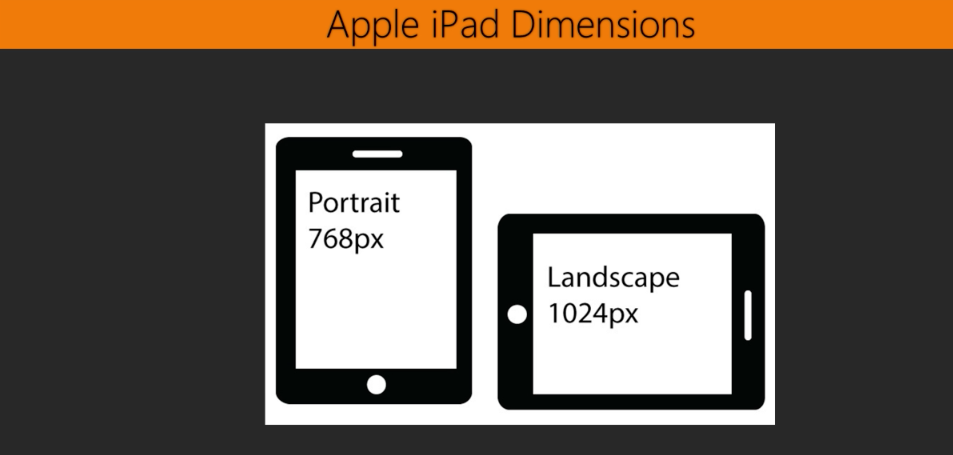
This way, our media query will apply to all the widths and devices lesser than 1,024p. As of 2017, I would guess that the iPad is - if not the most popular tablet - one of the most popular. I can say with more certainty that the iPad is definitely not the only popular tablet. In fact, it is amazing just how many different tablet devices and widths there are out there, so you may not want to necessarily use 1,024 and 768, respectively, as the basis for your media queries. Figure ...

