Typically, this is the best practice. We want to be thinking about smaller displays at the same time or before the desktop experience, as the name suggests. This way, the content and design take into account mobile devices and all their constraints at the very beginning, so they can be fully realized in the design and build process. Mobile first relates to much more than how we code our CSS. But here's the general idea behind the code part of mobile first: Put all of your CSS targeting the smallest devices outside of any media query. Then use media queries to target larger and larger devices.
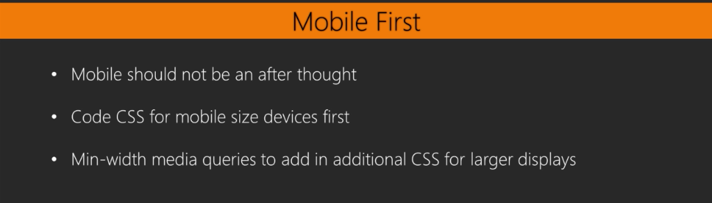
This means using min-width ...

