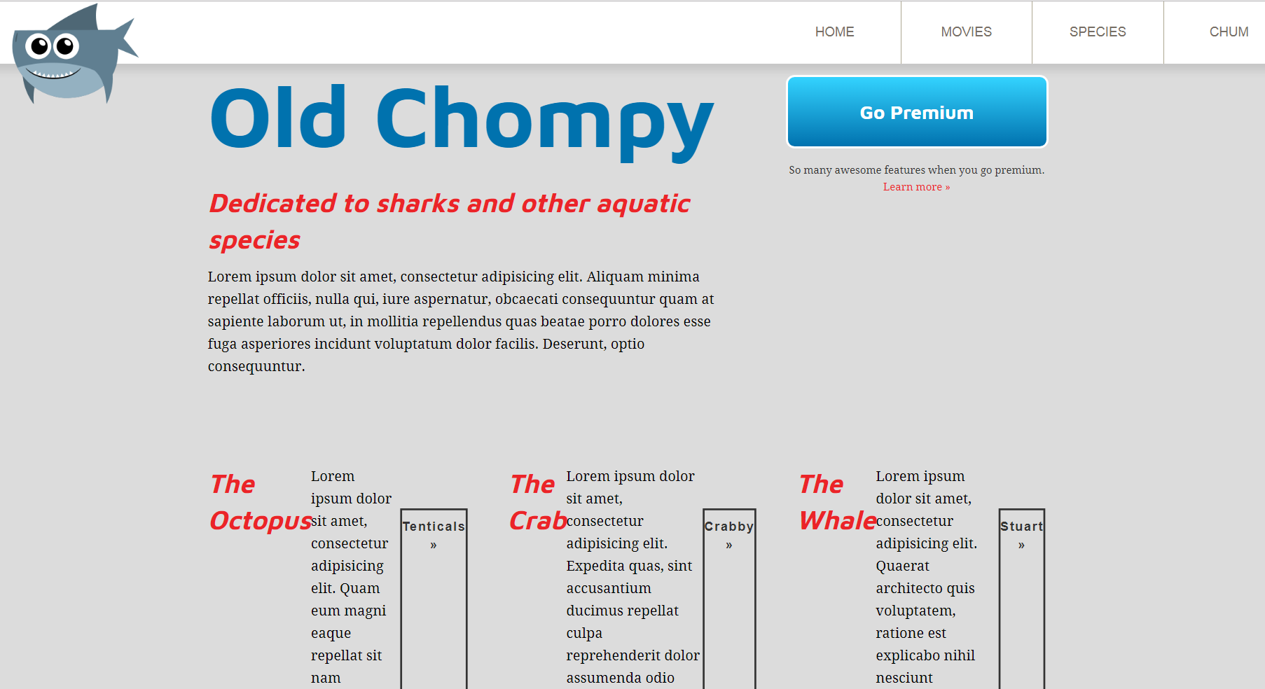
Let's convert the column into a nested flex container:
.columns { display: flex; justify-content: space-between;}.column { flex-basis: 30%; display: flex;}.column figure { max-width: 50%;}
Of course, the flex items of a container are set as flex-direction:row by default, so they all sit next to each other horizontally, which totally destroyed things:

That's not what we want it to look like, obviously, but we can easily remedy this. Let's change flex-direction to column, as shown in the following code snippet:
.column { flex-basis: 30%; display: flex; flex-direction: column;}
Nice, we're back in business. Looks identical ...

