17. Responsive Web Design
17
Responsive Web Design
In this chapter
What RWD is and why it’s important
Fluid layouts
Media queries
Design strategies and patterns
Testing options
I first introduced you to the concept of Responsive Web Design way back in Chapter 3, Some Big Concepts You Need to Know, and we’ve been addressing ways to keep all screen sizes in mind throughout this book. In this chapter, we get to do a deeper dive into responsive strategies and techniques.
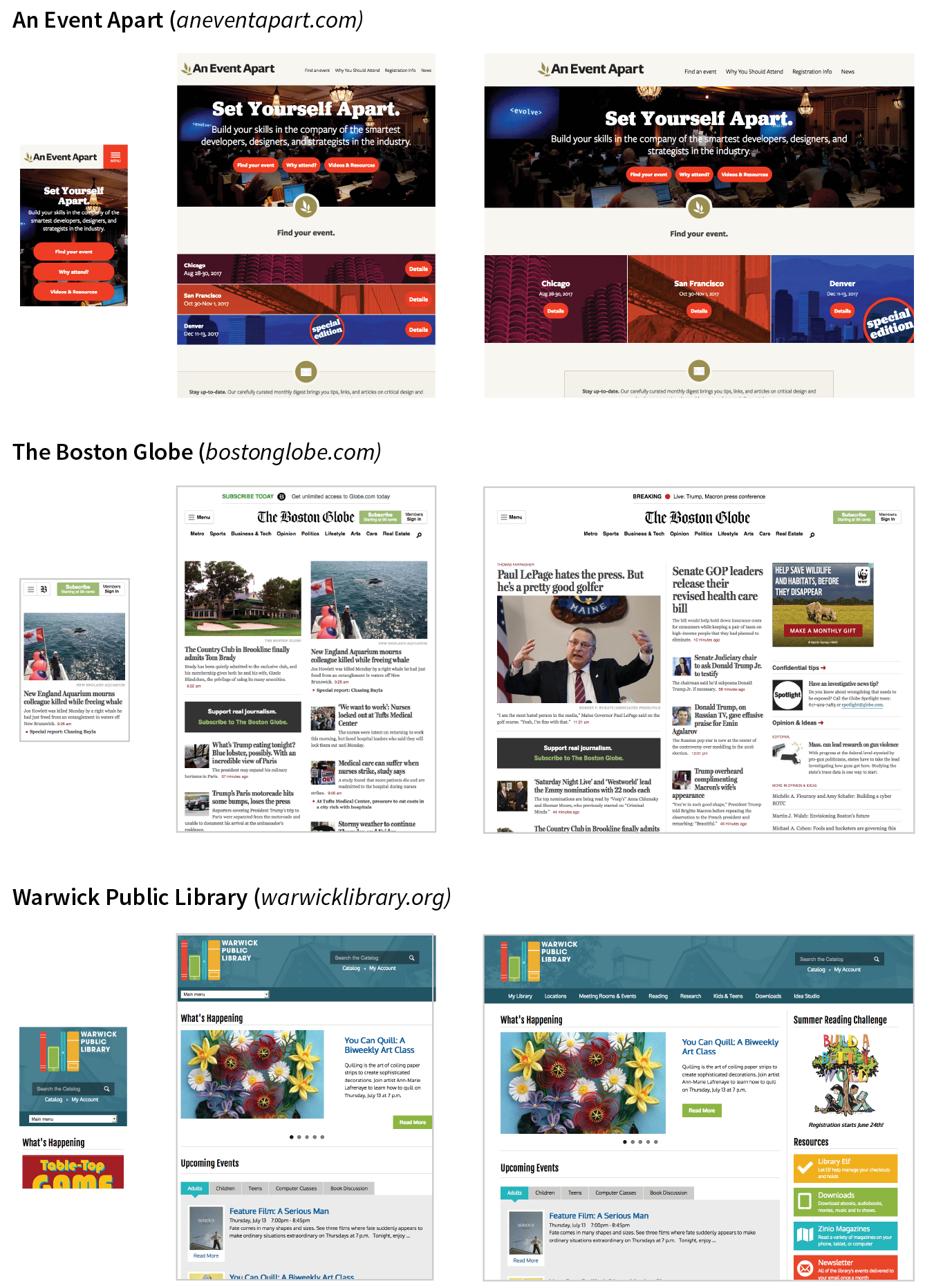
Just to recap, Responsive Web Design (or RWD) is a design and production approach that allows a website to be comfortably viewed and used on all manner of devices. The core principle is that all devices get the same HTML source, located at the same URL, but different styles are applied based on the viewport size to rearrange components and optimize usability. Figure 17-1 shows examples of responsive sites as they might appear on a smartphone, tablet, and desktop, but it is important to keep in mind that these sites are designed to work well on the continuum of every screen width in between.
Note
Each site in Figure 17-1has one morphing design, not three distinct layouts. Some sites do have a limited number of layouts aimed at specific devices, which is an approach known as
Get Learning Web Design, 5th Edition now with the O’Reilly learning platform.
O’Reilly members experience books, live events, courses curated by job role, and more from O’Reilly and nearly 200 top publishers.

