Adding our first chart component (pie chart)
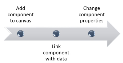
Now, we are ready to build the model phase, as we have already imported the data and prepared our canvas. We will start by adding a pie chart to show the sales revenue per product line. We will learn how to add the pie chart component to our dashboard. Then, we will learn how to link it with the data in Excel model and how to change the pie chart properties. Finally, we will learn how to handle the missing data in our data ranges while displaying our chart. We can see the steps in the following screenshot:
Pie charts can be used to show a relation between one dimension and one measure. The chart will show ...
Get Learning SAP BusinessObjects Dashboards now with the O’Reilly learning platform.
O’Reilly members experience books, live events, courses curated by job role, and more from O’Reilly and nearly 200 top publishers.

