Working with @media in Less
In the age of using mobile devices and responsive design, a key element in building sites is to allow their use on mobile devices, such as iPads or smartphones.
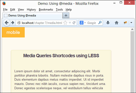
The key to responsive design is the @media rule—we can use this to define the style at particular breakpoints or sizes of screen estate for different devices. To illustrate how this works when using Less, we'll use a simplified example created by Eric Rasch as a basis for an example web page:
Note
Eric's original example is available at http://codepen.io/ericrasch/HzoEx.
For this demonstration, we'll break the convention and use the copies of the media.html and
Get Learning Less.js now with the O’Reilly learning platform.
O’Reilly members experience books, live events, courses curated by job role, and more from O’Reilly and nearly 200 top publishers.

