Converting a spline chart to a polar/radar chart
Polar (or radar) charts are generally used to spot data trends. They have a few differences from line and column type charts. Even though they may look like pie charts, they have nothing in common with them. In fact, a polar chart is a round representation of the conventional two-dimensional charts. To visualize it another way, it is a folded line or a column chart placed in a circular way with both ends of the x axis meeting.
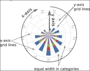
Again, we need to include highcharts-more.js in order to plot a polar chart. The following screenshot illustrates the structure of a polar chart:
There are very few differences ...
Get Learning Highcharts 4 now with the O’Reilly learning platform.
O’Reilly members experience books, live events, courses curated by job role, and more from O’Reilly and nearly 200 top publishers.

