Plotting the solid gauge chart
Highcharts provides another type of gauge chart, solid gauge, which has a different presentation. Instead of having a dial, the chart background is filled with another color to indicate the level. The following is an example derived from the Highcharts online demo:
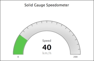
The principle of making a solid gauge chart is the same as a gauge chart, including the pane, y axis and series data, but without the dial setup. The following is our first attempt:
chart: { renderTo: 'container', type: 'solidgauge' }, title: ...., pane: { size: '90%', background: { innerRadius: "70%", outerRadius: "100%" } }, // the value axis yAxis: { min: ...Get Learning Highcharts 4 now with the O’Reilly learning platform.
O’Reilly members experience books, live events, courses curated by job role, and more from O’Reilly and nearly 200 top publishers.

