Here is a window using button faces:
Here is its code:
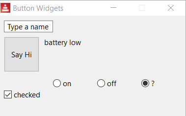
; see Chapter09/button-faces.red:view [ title "Button Widgets" below name: field 100 "Type a name" across button 70x70 "Say Hi" center [t1/text: append "Hi " name/text] t1: text "" return ch1: check 90x70 "Check me" [ either ch1/data [ch1/text: "checked"] [ch1/text: "unchecked"] ] r1: radio "on" [t1/text: "too loud!"] r2: radio "off" [t1/text: "that's better"] r3: radio "?" [t1/text: "battery low"]]
Buttons are specifically used for the actions they produce when they are clicked. Here we change text content to the input of the name field. The default event is ...

