Representing Data Graphically with Icon Sets
Another helpful way of representing data graphically is by using icon sets to indicate the relationship of a set of values to each other. For example, you can apply a set of directional arrows to make Excel show green up arrows on high values, yellow right-pointing arrows on midpoint values, and red down arrows on low values. Figure 8–10 shows this kind of icon set used to track the month-by-month and full-quarter performance of the five salespeople you met earlier in this chapter.
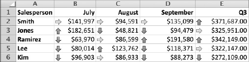
Figure 8–10. Apply an icon set to a range of cells to provide a quick visual reference to their relationship. This ...
Get Learn Excel 2011 for Mac now with the O’Reilly learning platform.
O’Reilly members experience books, live events, courses curated by job role, and more from O’Reilly and nearly 200 top publishers.

