Chapter 4. Brand Symbols
The principal role of a logo is to identify, and simplicity is its means... Its effectiveness depends on distinctiveness, visibility, adaptability, memorability, universality, and timelessness.
—Paul Rand[30]
Books are judged by their cover. This isn’t fair to the writer. It isn’t optimal for understanding. It isn’t even practical for the reader. But, as with most other human pet peeves we don’t like, it is how it is. Human beings form a first impression of something online within 50 milliseconds.[31] We are quick to judge, creating rules of thumb about everything that surrounds us based on incomplete evidence. We overlook things, prioritizing what we see visually and mentally according to the needs and aspirations that are active at the moment.
Fortunately, colors, words, images, and their infinite combinations can be used strategically to influence consumer perception. As you remember that brands are not only about graphics, let me warn you that this chapter is entirely about visual power. Hang on tight and open up your mind, number fans.
This chapter will walk you through the creation of some of your brand’s visual symbols: a logo, color palette, typography scheme, imagery, stationery, and collateral.
After having built a strong brand story in Chapter 3, you might be skeptical about the need to spend time on your visual identity. I’ve heard dozens of entrepreneurs dismiss any attention to graphics to “focus on the product.” Here’s my message to them: be smarter than that. Consider this for a few minutes: you’re standing in front of investors pitching your new product/company and the first slide pops up. You’re thinking nothing is happening unless you’re speaking. No mistakes made yet. Blank slate. Wrong.
Everything is happening at that point. By the time you open your mouth, these human beings in front of you will have formed die-hard first impressions based on whatever their eyes processed before their ears. This is not the sort of situation where you actually think, “Now, eyes and brain, please put on your judgmental hat and come up with 10 ideas of who this person is and what they offer. You have 50 milliseconds. Go!” This very human impression formation happens in the background, in the back of your mind—more specifically, in two regions called the amygdala and posterior cingulate cortex.[32] You don’t just query them into action. First impressions are formed so quickly that there’s no possible way for you to command your brain to make them. If this is something you’re interested in, please check Dr. Lindgaard’s studies on first impressions in the upcoming “Dig Deeper” sidebar.
Now think about your buyers—also known as “the people we’re going after,” remember? The ones with the wallets who bring a happy ending to your brand story. These people are forming first impressions about you and your product all the time. And unless you literally cage them in a lab and force them to try your product in complete isolation (and not even then!), you might be able to make their first impression be about your core product. In all other (nontorturing and legal) market situations, let me warn you:
Consumers are probably making first impressions based on symbols surrounding your core product.
Given how important visual communication cues can be for impression formation, we will tackle both in this and the following chapter. First, we will discuss brand symbols and how to approach them with a lean mindset, and then we will explore brand strategy to empower the spread of your story and symbols avoiding wasting money and time.
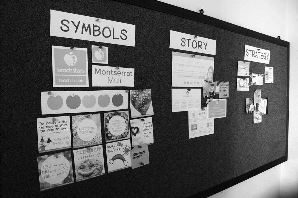
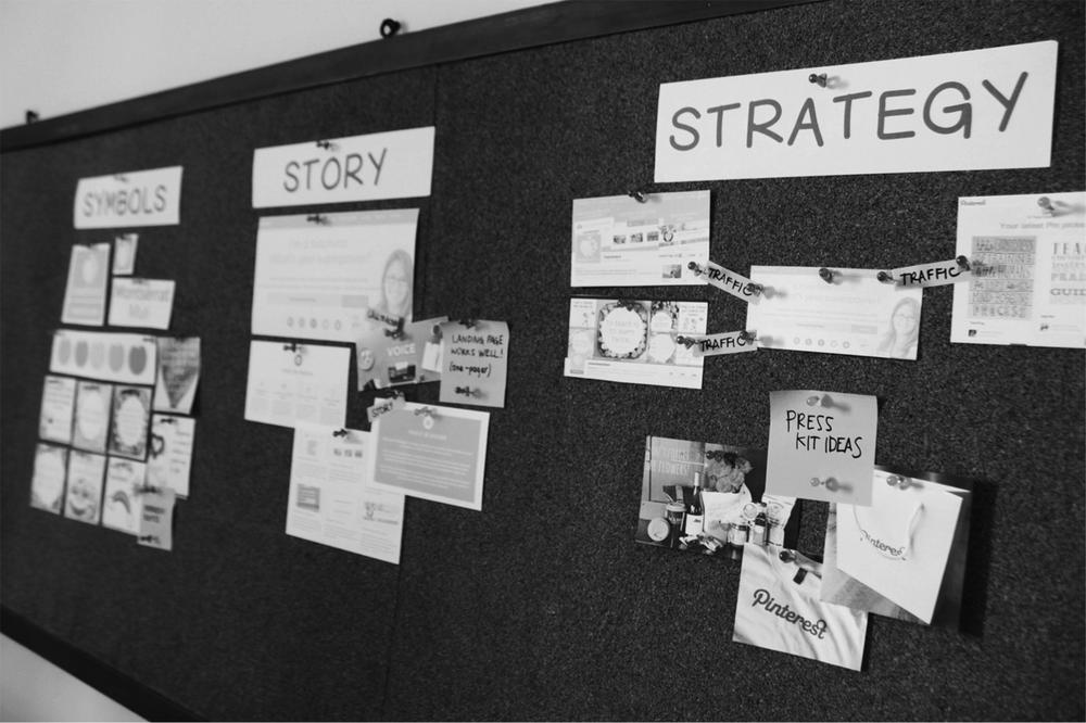
First Things First: Set Up Your Brand Wall
If you’ve ever been involved in the creative industry, chances are you know what a working wall is. In case you don’t, you will not be surprised: a working wall is—you guessed it—a wall where you lay out your work. In our case, this new space in our home or office will become the source of our brand inspiration. Pick an available wall and use a corkboard or whiteboard to pin data and visuals that can inform your brand development process.
I know this sounds a lot like Pinterest. However, the importance of physically pinning inspiring clips on a wall is that you will look at them every day in times when you are not necessarily working. The gifted multitaskers we think we are, human beings still need time and space for creative thought—and if you’ve ever felt a strong sense of epiphany (an “aha!” moment) you know that this can happen when you least expect it.
The point of collecting graphics that relate to your product’s context, competitors, and customers is to conduct what we call a visual audit. We are basically trying to deduct, through examples, what our market’s visual language is. What customers are used to seeing (and therefore expect), what competing brands use to persuade, and what visual cues are found in the context of the purchase situation.
Assemble your wall and start pinning. Find similarities and differences. Change the order of things. Every time an idea strikes you, paste it on the wall. Start over if you need to.[34]
Some ideas for your brand wall:
Pin everything you came up with in Chapter 3: your brand story.
Pin your competitors’ sales material, logos, color palettes, and imagery.
Print out screenshots of your competitors’ social media profiles.
Clip a magazine ad that would work for your brand.
Write taglines and implicit/explicit messages that you find interesting in sticky notes.
Use masking tape to paste an inspiring piece of packaging that would work for your brand.
Definitely pin any doodles on napkins involved in this process.
Back to Our Recipe: Lean Brand Ingredients
Let’s recall our list of lean brand symbol ingredients to learn how to create them, one by one. Remember, these are the minimal elements you will need to create a brand experience in the marketplace:
Aside from sight, other senses like hearing and smell have the potential to generate memorable brand symbols. Though this chapter focuses on visual symbols, if you would like to learn more about how scents and sounds can become symbols that help convey your brand story, read the “Dig Deeper” sidebar at the end of the chapter.
Logo
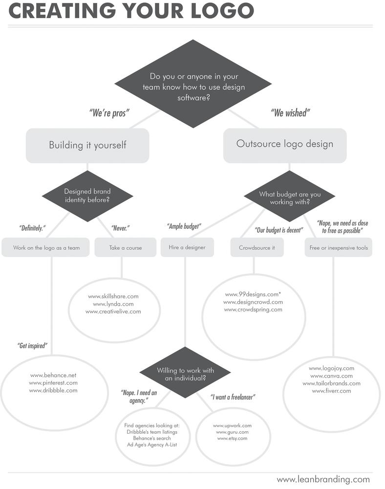
If the fear of coming up with a name is a phobia, creating a logo is probably stage II of the disease. Whether you are creating it in-house (i.e., someone inside your company is producing it) or you’ve outsourced it to someone else, it seems like creative and business minds speak two entirely different languages, and the end result is often something with a huge “OK, but...” painted all over it.
Actually, aligning business and design is one of the core challenges you will have to face this century anyway, so you might as well get started now. Rather than an aesthetic pursuit, design has become a strategic business tool to create, add, and communicate value. Companies like Apple and Airbnb have championed a new movement where design escapes from the island where we’ve traditionally secluded it to become part of strategic business planning.
Jonathan Ive, Senior VP of Design at Apple, explained Apple’s integration of design and business in the following terms:
We have always thought of design as being so much more than just the way something looks. It’s the whole thing. The way something actually works on so many different levels. Ultimately, of course, design defines so much of our experience.[35]
Similarly, Airbnb cofounder Joe Gebbia explained to Mediabistro how integrating design into its existing business model changed the future of the company:
In the early days of Airbnb, we had a bunch of great listings in New York, but they weren’t being booked. We decided to try out taking professional photos of various listings, and putting an “Airbnb Verified” watermark on it... This one small design decision shifted the way our users interact with our product.[36]
Design decisions reflect underlying business strategies. This is precisely why Chapter 3, came before Chapter 4. Without clear positioning, product, personality, personas, promise, and pricing, we’d be wasting time with visual symbols. Guessing. Speaking some random dialect nobody else understands. Wasting designers’ very valuable time. Research and its insights put everyone on the same page and are the key to your being understood by designers (and pretty much everyone else).
Logo design workshop
Ever found it difficult to start brainstorming logo ideas? The following steps will help you get a head start:
Think about your brand. Write your brand’s positioning statement on a blank sheet of paper.
Think about the logo’s emotional impact. Create a list of adjectives (descriptive words) answering the question: “How do we want this logo to make customers feel?” Go beyond basic descriptors like happy, sad, or interested. Explore words that truly represent the impact you wish to achieve with this brand: empowered, inspired, curious, challenged, intrigued, excited, professional, proactive, and so on.
Think about the logo’s message and its cognitive impact. Create a list of short phrases or words answering the question: “What do we want this logo to make customers think or think about?” Again, go beyond obvious ideas like the product or its name. Is there a particular feature that should stand out? Should customers think about overarching topics like creativity, innovation, health, relationships, or happiness?
Think graphically. This step involves mind mapping. Use a blank sheet of paper and draw four circles, using each of the following prompts as titles. Then, go ahead and think of graphic symbols that we would normally associate with each of them. Draw these graphic symbols around each of the circles, and try to generate as many related symbols as you can. To make the process simpler, draw all your symbols in black and white at this point. The more symbols you generate, and the deeper this mind map becomes, you’ll start seeing some nonapparent relationships and paving the field for a more robust design:
Your brand name: Consider literal and abstract symbols that are related to the specific words used in your brand name.
The situation in which your brand would be used: Think about the environment, time, and place where your product or service comes into play. Are there any specific objects, instruments, tools, ingredients, weather conditions, elements of nature, or locations that could help identify your offer in the marketplace?
The problem/need/aspiration that your brand is trying to solve: Think about the main issues and pain points related to your brand. Is something too expensive, troublesome, or difficult for consumers, and you are here to facilitate it? If so, how could these issues be represented graphically?
The action through which your brand solves this problem: Write down your core activity as a verb (action word). Do you store, improve, save, empower, inform, design, or entertain? Think both about the means used to add value for the customer, as well as the brand personality involved in doing so. Do you inform with humor, or entertain with satire? Do you store with friendliness, or design with calmness? Could your brand be portrayed using a character—animal or human—that reflects its personality as it fulfills this activity?
The emotional impact that you are trying to convey: Rely on your list of adjectives from step 3 to generate visual symbols that reflect the emotions that your brand is trying to produce.
The cognitive impact that you are trying to convey: Rely on your list of phrases from step 4 to generate visual symbols that reflect the main ideas that your brand is trying to express.
Think typographically. Now that you’ve considered graphic symbols, study the possibility of conveying the same ideas using typefaces only. Is there a font that can express the emotional impact just described? How can words and letters be arranged to transmit these emotions?
Think about competitors. Collect examples of other logos in your industry. Are there any visible patterns or trends? Do you see something you like or dislike?
Think about aesthetics. Look out for a few examples of logo designs that resemble what you would like to achieve with yours. Find specific shapes, color combinations, and typeface treatments that appeal to you.
Think about applications. Where will this logo be used? Consider the different scenarios where this symbol will be visible: icons, price tags, t-shirts, or even airplane wings. It is essential to keep in mind the possible uses for this graphic symbol to be able to design it accordingly.
After this ideation process is complete, you will have a clearer idea of what kind of logo you would like to see and a thoughtful process to discover symbols that are truly relevant to your brand. Following ideation, there are several steps related to execution. The logo still needs to be refined, colorized, and digitized, among other stages that designers are well acquainted with. Should you decide to hire a designer, it will now be much easier for her to understand your intentions. On the other hand, if you decide to execute the logo design in-house, this process will allow you to involve nondesigners in idea generation and create an environment where everyone’s input is valid.
If you will be outsourcing your logo design, please take a look at the upcoming section Why nobody designs something that you actually like. It gives you a few tips to inform designers about what you really want or need for your brand symbols.
Once your logo has been completed, these are some filter questions that you might want to ask yourself:
Is this logo flexible? Would we be able to adapt it to different backgrounds and future brand extensions? Does it lend itself to both a square treatment (as in many profile pictures) and a rectangular treatment (as in some headers)?
Is it simple? Can it be understood by the average Joe? Is it too intricate to be recognized at a moderate distance? Does it work in black and white?
Is it “me”? Does it convey the brand personality that you created in Chapter 3? Is it a solemn logo for a hilarious brand, or a playful logo for a serious brand?
Is it web-friendly? Can it be adapted horizontally and vertically? Is there a miniature (stripped down) version that can be used for icons and smaller formats?
Is it scalable? Will it work equally well on a business card and a giant poster?
Is it differentiable? At a glance, will this logo stand out among a sea of options? Consider the places where you need this differentiation to work, such as an app store or store shelf.
Chapter 8 shows some of the ways in which you can test this newly designed logo’s effectiveness. Your intention to convey the emotions and ideas that we just discussed is only one part of the story. The other part is validating whether consumers feel the same way.
Colors
On that same train of thought, either your in-house or external designer (or maybe even you, if this is something you can tackle), must create a set of colors that distinguish your brand in the marketplace. I’ll stress this: a color palette isn’t ornamental. It activates deep psychological associations that may trigger or hinder purchase, and will come in handy every single day of your product’s existence.
Something you will want to take into account as you build your brand’s palette is the cultural meaning of color. Different countries attach diverse meanings to color, and they can be related to age, values, ethnicity, religion, and infinitely many other aspects of life. Crucial aspects of life. Stuff you don’t want to miss. Consider blue: it stands for “corporate and masculine” in the US and “evil” in Malaysia.[37] Again, differences you don’t want to miss.
As a low-cost alternative, you can also consider crowdsourcing marketplaces. Take a look at the guide in the following sidebar to learn more.
Typography
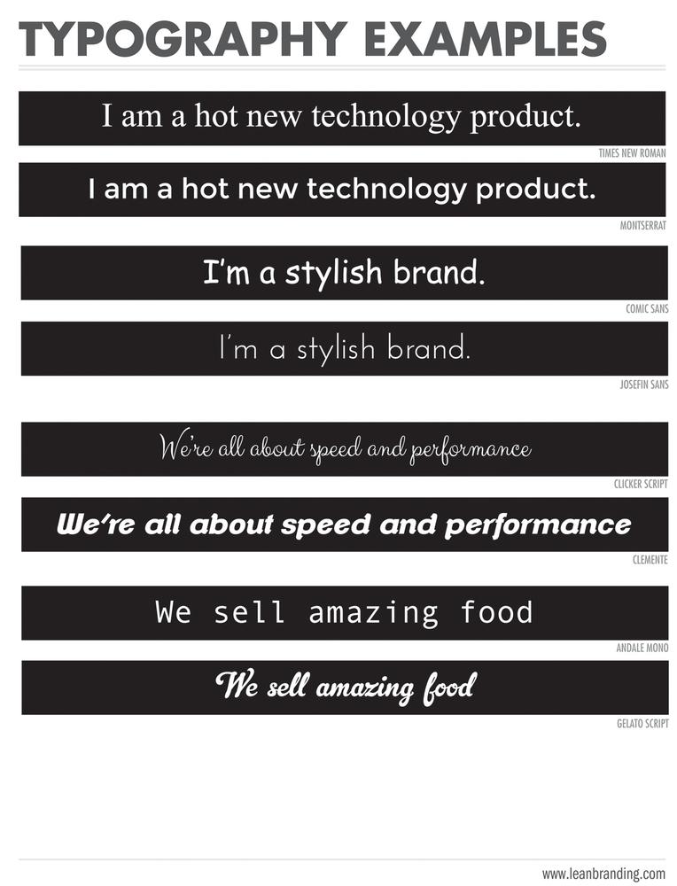
Look at these two statements and think about your reactions to each:
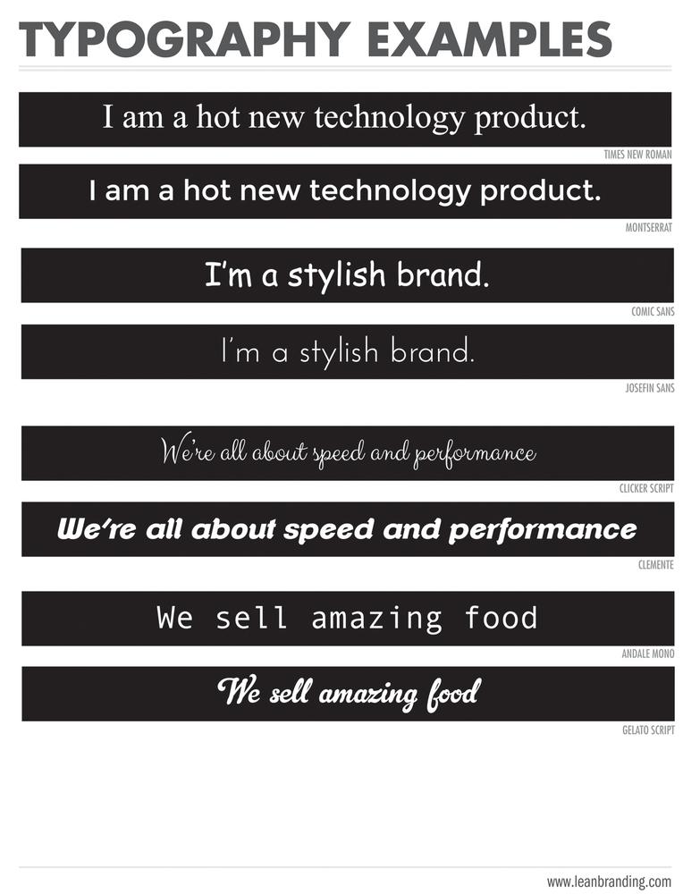
Does the first statement make you think this is a high-tech brand? Do you think the second statement would work if we wanted to sell antiques? If your conclusion was that the first statement looks dated and the second would suit a technology brand best, you’ve fallen in the typography trap. As long as typography plays with perception in these powerful ways, some of us will remain obsessed with putting it to work for us.
Here are some other examples of how brand personality can come through (or sink) with typefaces:
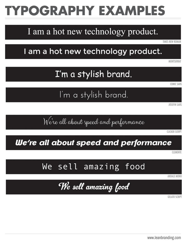
In your opinion, which of those two phrases was more successful at evoking “stylish”? If you went for Josefin Sans, the second typeface, you have instinctively identified some design details that spell out “stylish”: the prolonged ascenders and descenders; its thinner, more delicate weight; and its geometric, more sophisticated shape.
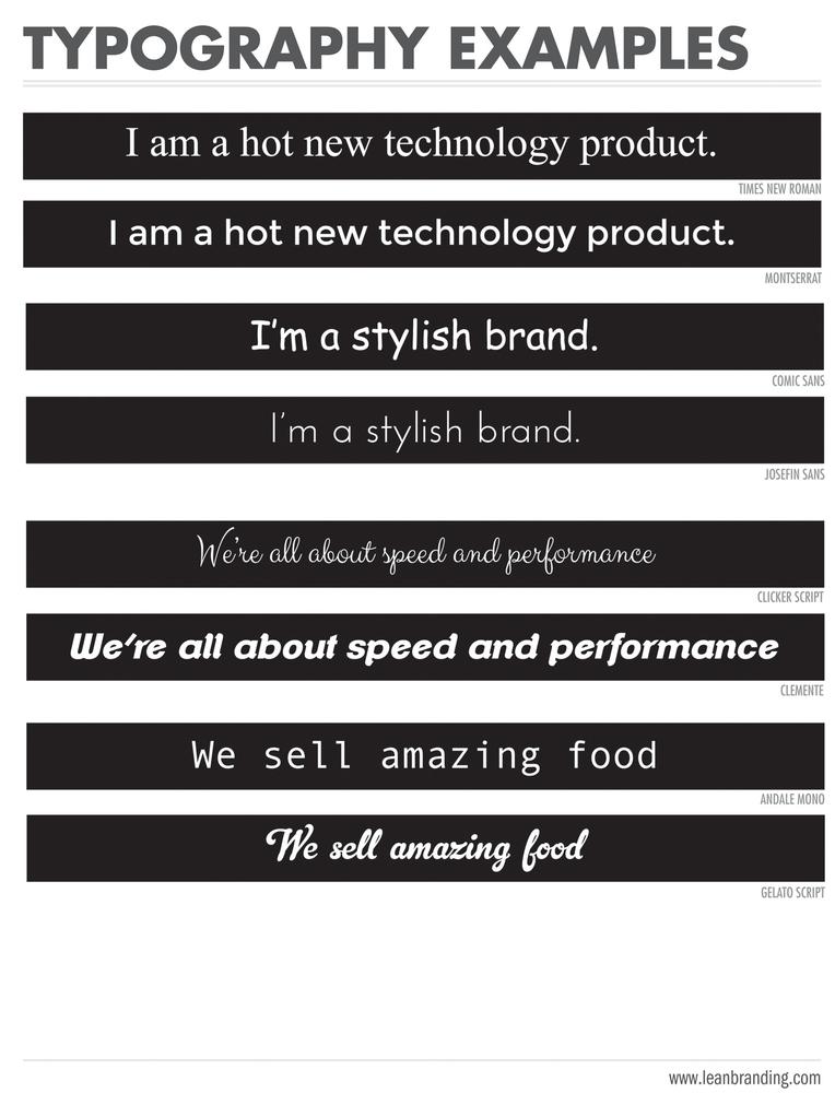
Consider the following example:
When you defined your brand personality in the previous chapter, you actually built a resource that makes selecting logos, color, and typography 100 times easier. You just saw why.
Why nobody designs something that you actually like
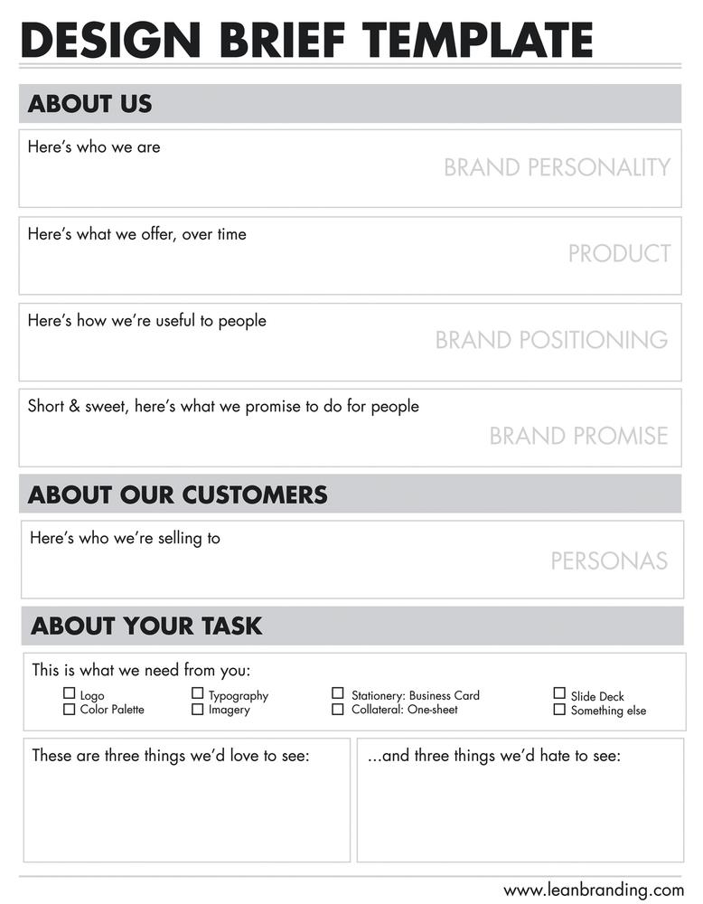
If you’ve asked someone to create a logo, color palette, and/or typography before and hated what he did, chances are you failed, too. Did you give him the information about your brand that would inform every design choice?
We like to call this “information” a brief. For the purposes of Lean Branding, here’s what our brief will look like:
Attach the positioning, product, personality, personas, promise, and pricing you did in Chapter 3.
Make a list of the items that you need delivered: logo, typography, color palette, and so on. Look at the brand symbol ingredient list in this chapter to get ideas.
Show him three examples of designs you hate and three that you love.
(The End.)
See? Brief. Hand this information to your in-house or external designer and you’ve basically given him no-fail instructions as to what really works for your brand.
Imagery and Mockups
Now you have the tools with which to create your logo, color palette, and typography. Human beings, though, need to see your brand in context to understand what it can do for them. (Remember? Taking them from point A to B where B is whom they aspire to be.) So now we must find ways to illustrate this point B: scenery that shows them this “aspirational place” they’re looking for.
Basically our task here is to put our product in context, illustrating the brand experience. Are you building an app? Where will people use it, to do what, and surrounded by whom? Is your product actually a combination of product and service? Who’s delivering the service, in what type of environment, and how do people react when they get it?
I’ll use a personal example here. I own (and often simultaneously use) a laptop, a tablet, and a smartphone. An ereader didn’t really seem like a necessary purchase, since all of my devices could already access ebooks and every day a new app comes out to make it even easier. But then this suddenly hit me: a series of Kindle videos with young women that looked just like me reading books on hammocks, planes...and the beach. Those were my places. And yet there they were, reading comfortably and in complete absorption because, guess what, there were no obnoxious app notifications popping up. No sunlight glare on the screen, no need to carry chargers around, no other purpose but reading. Reading beautifully. Amazon made its sale then and there. The right imagery sold me Kindle.
Here are some basic brand images that you will want to have:
Product images/mockups
Images of consumers using your product
Images of consumers sharing your product with others
An image for your email signature
A tiny icon to be displayed next to your URL (favicon)
Social media assets in different sizes:
Square thumbnails for profile pictures
Wide rectangles for cover pictures
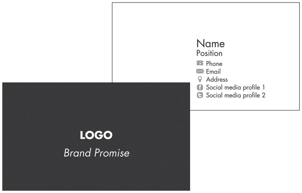
Stationery: The Business Card
Although brand stationery can include dozens of different pieces (think letterhead, envelopes, folders, and the like), we will be looking at its most essential piece: the business card.
I can’t overemphasize the importance of a well-thought-out business card. Remember when we discussed first impressions at the beginning of this chapter? Business cards can consolidate first impressions with prospective buyers, investors, press partners, and employees.
People store dozens, sometimes hundreds, of business cards in obscure drawers. Best scenario: they store them in some sort of binder. In either case, I think you can see the importance of having yours stand out. I’ve seen people close deals with no offices, home offices, mature products, minimum viable products, thousands of customers, zero customers, huge teams, no team...but they all had business cards.
Though creativity is encouraged, here are some components that all business cards must have:
Brand logo (with visible name)
Brand promise (tagline)
Name
Title/position
Address
Phone number and/or fax
Email address
Website URL
Optional: Skype, Linkedin, Facebook, Twitter, and other social media profiles.
Collateral: One-Sheets and Slide Decks
Collateral is the material that we use to present our brand to the world. However, unlike with advertising, we use collateral to appeal to specific people we’re interested in. Think about the press, investors, employees, and particular buyers that grant you private spaces to meet. First step: you hand them your brand new business card. Second step: we’re going to need to leave a lasting impression with something else.
Don’t get me wrong: this “something else” obviously involves a great product. It is no secret that the press, investors, and buyers will want to try your product as a part of their decision to feature, finance, or buy it. People will weigh the importance of each product feature differently. They will ask different questions based on their unique previous knowledge. Their varied aspirations will impact the way they understand what your product can do. But one thing is for sure: every single one of them is heavily influenced by visual power.
So, I’ll just stress this differently now:
A great product deserves equally great collateral that does it justice.
We will tackle two of the most time- and cost-effective collateral pieces: one-sheets and slide decks. These two will get you through most of the meetings where your new product will face initial scrutiny.
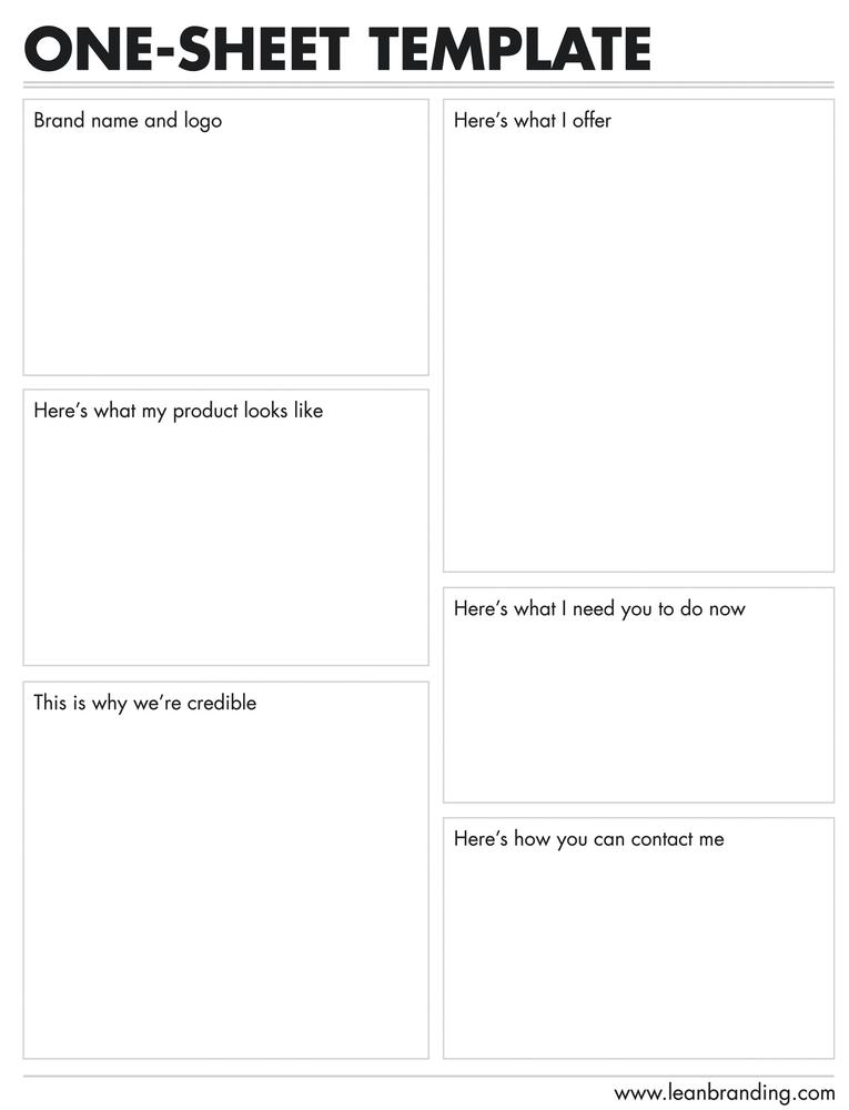
One-sheets
Let’s face it: full, undivided attention is just something we don’t get from anyone anymore. This is precisely why bullet points, short videos, gifs, and infographics are all the rage today.
Don’t expect your investors, the press, or buyers to behave differently. Though they might be genuinely interested in what you have to offer, your sales material wouldn’t be smart if it assumed that they have plenty of time for it.
So, being realistic, a one-sheet is your best bet to capture your listeners’ attention and convey your brand story—before they sigh and look away.
I’m not saying you shouldn’t eventually prepare a longer brochure, portfolio, catalog, or whatever else you need to sell your brand. What is clear, though, is that upon initial approximation, people don’t want or need to dive into bible-long sales material.
One-sheets should inform your listeners about your brand story without overwhelming them. Something along the lines of “Hello, my product’s name is X. Here’s what it looks like. Here’s why it is essential. Here’s what I need you to do now. This is why I’m credible. Let’s stay in touch.” Let’s go over each component:
- “Hello, my product’s name is” section
Include the name of your product and brand promise. We created both of these back in Chapter 3.
- “Here’s what it looks like” section
Include one or two images of the product in use. Here’s where our imagery work in Chapter 4 starts to pay off. Select one or two images that show your core product feature (i.e., the one thing you are best at) in context.
- “Here’s what I offer and why this product is essential” section
Explain what the product does and offers. Use the positioning statement template you created back in Chapter 3. Change the wording and move words around if needed. Then, make sure you outline a short list of features that differentiate your product from that of competitors.
- “Here’s what I need you to do now” section
This is also known as a call to action. (“Why am I reading this again?”) Begin with your goal in mind. What is the recipient supposed to do now? Email you to ask for a quote? Download your app immediately? Visit some website where she can subscribe to your updates? I recommend avoiding fancy jargon in general, but your call to action is the one place where you’ll be particularly thankful you scrapped it. All of it. Just to make sure, please ask an elementary student if he knows exactly what to do next. Be careful not to have several calls to action that compete against one another for importance.
- “This is why I’m credible” section
Use testimonials, institutional partnerships, press coverage, awards, and any other credentials you consider important to validate your claim that this product is absolutely essential and must be purchased now. New brands, like the one we’re building, need to display all the credibility they can find (legally and ethically) to get a head start in such a crowded marketplace.
- “Let’s stay in touch” section
Share your contact information. Include your phone number, email, and any other channel that the reader can use to communicate with you. Depending on whom you’re handing this one-sheet to, you will want these channels to be as direct as possible. Meaning: give people like investors your personal email and mobile phone number. Cut out machines and email redirects as much as you can—unless you can afford to put financing or media coverage on hold. (Can someone actually do that?)

Use the following template to speed up your one-sheet creation process.
Slide decks
Along the same lines, brand presentations often require some sort of visual aid that captures the audience’s (extremely divided!) attention. This is where a well-thought-out slide deck can make the difference. Fortunately, the brand story and brand symbols you’ve created so far are everything you will need to create a meaningful, engaging slide deck to introduce your brand.
These are some of the occasions in which your slide deck will come in handy:
Investor meetings
Big client meetings
Press conferences or meetings
Team meetings
To download a slide deck template that you can modify, visit www.leanbranding.com/resources.

Delivering a pitch can be a defining moment in an entrepreneur’s journey. Luckily, most scenarios let you use visual aids to tell your story. This is where the power of visual symbols comes into play. In this image, a young entrepreneur in the Apps.co program presents her online education solution at a Demo Day.
Recap
This chapter introduced different ways to build your brand’s visual symbols. Six essential brand ingredients were discussed: logo, color palette, typography, imagery, stationery, and collateral.
Colors, words, images, and their infinite combinations can be used strategically to influence consumer perception. A brand’s color palette isn’t ornamental. It activates deep psychological associations that may trigger or hinder purchase, and will come in handy every single day of your product’s existence. Consumers often (if not always) make first impressions based on visual symbols surrounding your core product. Imagery is a strategic business resource because human beings need to see your brand in context to understand what it can do for them.
Visual pieces like business cards and sales collateral are key in generating first impressions about your brand. Business cards can give you a head start with prospective buyers, investors, press partners, and employees. Similarly, well-designed sales collateral like one-sheets and slide decks can make the difference in the midst of a negotiation. A great product deserves equally great collateral that does it justice.
[30] Paul Rand (1993), Design, Form, and Chaos. New Haven: Yale University Press.
[31] Gitte Lindgaard et al., “Attention Web Designers: You have 50 Milliseconds to Make a Good First impression,” Behaviour and Information Technology 25, no. 2 (2006): 115–126.
[32] Daniela Schiller et al. (2009) “A Neural Mechanism of First Impressions,” Nature Neuroscience, 12, 4, 508–514.
[33] Gitte Lindgaard et al., “Attention Web Designers: You Have 50 Milliseconds to Make a Good First Impression,” Behaviour and Information Technology 25, no. 2 (2006): 115–126.
[34] For templates and tips to go about doing this, take a look at my article for Smashing Magazine: “Up On The Wall: How Working Walls Unlock Creative Insight,” http://bit.ly/1lCJG6n.
[35] Apple Worldwide Developers Conference, 2013.
[36] Stephanie Murg, “Seven Questions for Airbnb Co-Founder Joe Gebbia,” Mediabistro, August 30, 2012, http://bit.ly/1kI4WHw.
[37] Mubeen M. Aslam, “Are You Selling the Right Colour? A Cross-Cultural Review of Colour as a Marketing Cue,” Journal of Marketing Communications 12, no. 1 (2006): 15–30.
[38] Martin Lindstrom, Brand Sense: Sensory Secrets Behind the Stuff We Buy (New York: Free Press, 2010).
[39] Ibid.
Get Lean Branding now with the O’Reilly learning platform.
O’Reilly members experience books, live events, courses curated by job role, and more from O’Reilly and nearly 200 top publishers.

