THREE COLUMN
21. Make It Look Simple
The most successful design looks simple but is subtly versatile. A design that seems open and spare can support a lot of material, especially in a book or catalog.
If the project contains both text and images, look at the proportion between the two and determine how much space is needed for each. When captions are long and contain a lot of additional information, such as credits and supplemental descriptions, distinguish the captions from the text by using different typefaces, by setting the type smaller, or by varying the amount of space between elements.
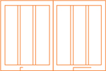
One structural solution is a three-column grid that ...
Get Layout Essentials now with the O’Reilly learning platform.
O’Reilly members experience books, live events, courses curated by job role, and more from O’Reilly and nearly 200 top publishers.

