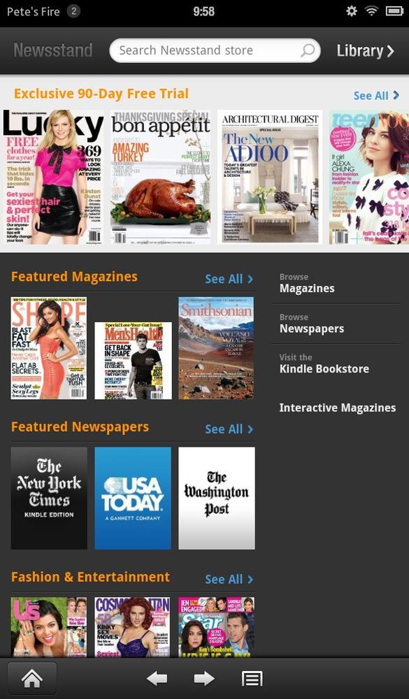
Chapter 3. The Newsstand

AS YOU SAW IN the previous chapter, ebooks look great on the Fire. Later on, you’ll learn how movies shrink gracefully from silver- to touchscreen. But magazines and newspapers are a mixed bag. On the one hand, thanks to Amazon’s growing clout as an e-power, the company has signed deals with all the biggies: Condé Nast (publisher of Vanity Fair, The New Yorker, many others), the New York Times, National Geographic—the list is huge. The heart of the problem: trying to cram a full-sized print page onto a display better suited for books and Angry Birds. The worst offenders are the magazines, most of which don’t even try to rejigger their layouts; what you get is a whole lot of panning and zooming.
Most newspapers, to their credit, don’t even try this “let’s hold our breath and maybe readers won’t mind” maneuver. Instead, they ditch all their fancy formatting and deliver plain text plus a few pictures. On an early-generation Kindle—the kind with the black-and-white screen—this formula made sense. It even helped de-gunk ad clutter so readers could focus on articles. But the Fire has illuminated all that’s out there on the technicolor Web. It’s like being stuck with a radio when all your neighbors have color TVs.
Consider the Newsstand, then, an area where the Fire flickers a bit dimly. To be fair, it’s not entirely Amazon’s fault. Until periodical publishers redesign ...
Get Kindle Fire: The Missing Manual now with the O’Reilly learning platform.
O’Reilly members experience books, live events, courses curated by job role, and more from O’Reilly and nearly 200 top publishers.

