Showing the result in a graph
When you have done the second step, you should have a new figure for capacity and time to market. The following diagram shows the result plotted in a graph:
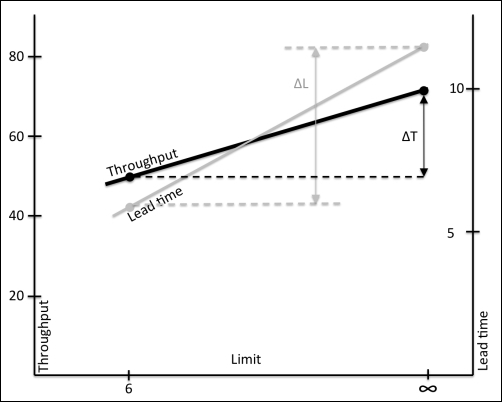
The game's result put in a graph. As you can see, the lead time shrinks more than the throughput when introducing limits.
Theoretically, there should be a big difference in time to market (ΔL) and a small difference in throughput (ΔT). Practically, this is not always the result due to the big variation in personal capacity, 1-6. If you have four teams or more doing this exercise, your average result will most likely get close to the theoretical outcome.
The time to ...
Get Kanban In 30 days now with the O’Reilly learning platform.
O’Reilly members experience books, live events, courses curated by job role, and more from O’Reilly and nearly 200 top publishers.

