Using Gadfly on data
Let's apply
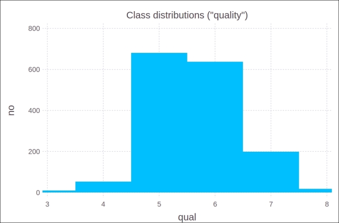
Gadfly to visualize the histogram we made in the Using DataFrames section of Chapter 8, I/O, Networking, and Parallel Computing, when examining the quality of wine samples:
# see code in Chapter 8\DataFrames.jl:
using Gadfly
p = plot(df_quality, x="qual", y="no",
         Geom.bar(),Guide.title("Class distributions (\"quality\")"))
draw(PNG(14cm,10cm),p)
This produces the following output:
Here is an example to explore medical data: medical.csv is a file that contains the following columns: IX, Sex, Age, sBP, dBP, Drink, and BMI (IX is a number for each data line, sBP and dBP are systolic and diastolic blood pressure, Drink ...
Get Julia: High Performance Programming now with the O’Reilly learning platform.
O’Reilly members experience books, live events, courses curated by job role, and more from O’Reilly and nearly 200 top publishers.

