People do not browse the Web only from their desktop. Now we have very different devices with different screen sizes, input mechanisms, and even new features from old friends such as HTML, JavaScript, and CSS.
Mobile devices are here. There is no doubtâthere are more than five billion devices worldwide and counting. Tablets are also coming in a big way, with millions in the market.
Right now, we can divide mobile devices into the following categories:
Mobile phones
Low-end mobile devices
Mid- and high-end mobile devices, also known as social devices
Smartphones
Tablets
Okay, we still have mobile phones in some markets. These are phones with call and SMS support. They donât have web browsers or connectivity, and they donât have any installation possibilities. These phones donât really interest us; we canât do anything for them right now.
In a couple of years, because of device recycling and evolving services provided by carriers and manufactures, such phones will probably not be on the market anymore.
Low-end mobile devices have a great advantage: they have web support. They typically have a very basic browser, but this is the gross market. Perhaps they arenât the most heavy Internet users today, but this may change quickly with the advent of social networks and Web 2.0 services. If your friends can post pictures from their mobile devices, youâll probably want to do the same, so you may upgrade your phone whenever you can.
Nokia, Motorola, Kyocera, LG, Samsung, and Sony Ericsson have devices for this market. They typically do not have touch support, have limited memory, and include only a very basic camera and a basic music player.
This is the mass-market option for a decent mobile web experience. Mid-end devices maintain the balance between a good user experience and moderate cost. In recent years, this category was also known as social devices, meaning that the users access social sites, such as Facebook or Twitter via the mobile web.
In this category, devices typically offer a medium-sized screen, basic HTML-browser support, sometimes 3G, a decent camera, a music player, games, sometimes touch, and application support. The big difference between these and smartphones is that high-end devices generally are not sold with flat Internet rates. The user can get a flat-rate plan, but heâll have to go out and find it himself. Starting in 2011, many of these devices include WLAN (WiFi), as we can see in Figure 1-3.
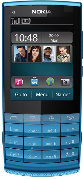
There are dozens of smartphone devices on the market, including iPhone, Android-based devices, webOS, Symbian, BlackBerry, and Windows Phone (Figure 1-4). This is the most difficult category to define. Why arenât some mid-end and high-end devices considered âsmartâ enough to be in this category? The definition of smart evolves every year. Even the simplest mobile device on the market today would have been considered very smart 10 years ago.
Typically when you buy a smartphone, you sign up for a one- or two-year contract with a flat-rate data plan. A smartphone, as defined today, has a multitasking identifiable operating system, a modern HTML5 browser, wireless LAN (WLAN, also known as WiFi) and 3G connections, a music player, and several of the following features:

Tip
Some multimedia devices qualify as smartphones for us web creators, but they donât have a phone feature. On this list are the Apple iPod Touch and the Sony PlayStation Portable (PSP). The only difference from tablets is their screen size, less than three inches.
This book is not intended to delve deeply into the mobile ecosystem. There is a detailed list of operating systems, platforms, and browsers in Programming the Mobile Web (OâReilly). However, if we are going to create mobile web experiences, we need to at least know what we are talking about.
In the mobile world, we can divide the operating systems in two main groups: identifiable operating systems and proprietary ones. In the latter group, we will find mainly phones, low- and mid-end devices.
With the identifiable operating systems, we will be more interested in which OS a device has than its brand and model. I mean, we are not going to develop a webapp for the Samsung Galaxy; we are going to develop a webapp for Android devices. The iPhone may be an exception to this rule, because it is a platform of its own, having as of this writing only one device: the iPhone. (Different versions of the device are just that; for web developers there are no huge differences between an iPhone 4 and an iPhone 3GS.)
Table 1-1 lists the operating systems we can find on todayâs market in smartphones and tablets.
Table 1-1. Operating systems and browsers available in smartphones, social devices, and tablets
| Operating system | Creator | Browser included | Other browsers |
|---|---|---|---|
iOS | Apple | Safari | Opera Mini and pseudo-browsers |
Android | Android Browser | Firefox, Opera Mini, Amazon Silk, Opera Mobile | |
Symbian | Nokia | Symbian Browser | Opera Mini, Opera Mobile |
webOS / Open webOS | HP (formerly Palm) | webOS Browser | |
Windows Phone | Microsoft | Internet Explorer | |
Windows Mobile | Microsoft | Internet Explorer | Opera Mobile |
MeeGo | Nokia | Micro Browser/Nokia Browser | Firefox |
BlackBerry OS | RIM | BlackBerry Browser | Opera Mini |
Tablet OS | RIM | Tablet OS Browser | |
S40 | Nokia | Nokia Browser | |
Bada | Samsung | Samsung Browser |
Every operating system has different versions, and some allow the user to update to a newer one. Every OS comes with an installed browser, but the user can install and use an alternative browser. Sometimes the manufacturer or the operator from whom the user bought the device installs or replaces the default browser with an alternative, such as Opera Mobile.
If we expand our browser research to low- and mid-end devices, we will find more than 20 other new browsers, including Ovi Browser, NetFront Browser, and Phantom Browser from LG. But that is not the target of jQuery Mobile right now.
In Programming the Mobile Web, you will find 20 pages with detailed information about browser types and features of each one.
jQuery Mobile is a framework intended for touch devices, including smartphones, tablets, and multimedia devices. The compatible list will change with time and as the framework continues to evolve, so it is difficult to publish a complete list here.
The jQuery Mobile 1.0 version is compatible with the following by-default browsers:
- iOS
Safari for iPhone, iPod Touch, and iPad from iOS 3.2
- Android OS
Android Browser phones and tablets
- BlackBerry OS
BlackBerry Browser for smartphones from 5.0 and for tablets
- Symbian
Nokia Browser for touch devices
- webOS
webOS Browser from webOS 1.4
- Bada
Bada Browser
- MeeGo
Micro Browser and Nokia Browser (included in Nokia N9)
- Windows Phone
Internet Explorer from Windows Phone/Mobile 6.5 and Windows Phone 7.0
- Kindle
Browser from Kindle 3
jQuery Mobile is also compatible with the following third-party browsers:
Opera Mini, fully supported from 5.0 on most devices
Opera Mobile, fully supported from 10.0 on most devices
Firefox Mobile
This compatibility list just gives you some information to start with. The compatibility is far more complex than this list because we can cross multiple operating system versions with multiple browser versions with different results. Even newer devices not listed here will be compatible with the library if they support the minimum features that the framework needs.
To simplify: jQuery Mobile will work on every browser with the capabilities to offer the experience that the framework provides. Any modern browser should be included in this list.
Tip
Many modern mobile browsers use a WebKit-based engine, like Safari or Chrome for desktop. Any modern WebKit-based mobile browser should be fully compatible with jQuery Mobile. Also Chrome, Firefox, Safari, Opera, and Internet Explorer for desktop are compatible with jQuery Mobile.
jQuery Mobile uses a table chart to define the compatibility of every device with this library (Figure 1-5). I would not try to enter in this categorization war if I were you. But you can check it if you want more information at http://jquerymobile.com/gbs/.
Tip
Many modern desktop browsers, such as Firefox, Google Chrome, Safari, or Internet Explorer, are compatible with jQuery Mobile too. Even if it is not intended for desktop applications, this ability will be useful for testing purposes. However, we will see later that installing an emulation environment will be useful.
I believe the compatibility is far more complex than this table, and for a typical web designer and developer it should be absolutely hidden. There are better ways to know if a feature is available in a mobile browser than trying to categorize each one of them. One solution is right in your hands: use jQuery Mobile.
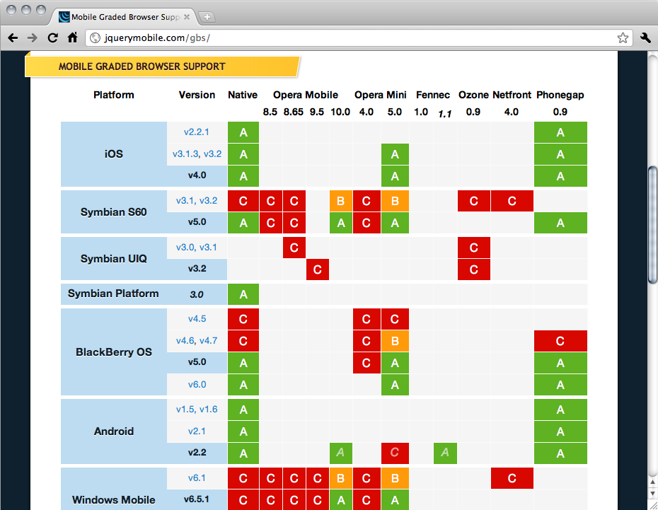
GBS (Graded Browser Support) divides mobile browsers into three categories: A-grade, B-grade, and C-grade. In the jQuery Mobile world, hereâs what these grades mean:
- A-grade
A browser with CSS3 media queries capability. These browsers will be fully tested by the jQuery team. However, some features will be automatically disabled if the device does not support them. The framework provides a full experience with AJAX-based animations.
- B-grade
Browser has an enhanced experience but without AJAX navigation features.
- C-grade
A browser incompatible with jQuery Mobile. This browser will not receive any CSS or JavaScript code from the framework, so the user will see a plain HTML file with the content. We will see later in this book how to handle this situation.
PhoneGap and native development
If you look into the Mobile Graded Browser Support Table of jQuery Mobile, you will find PhoneGap as a browser. PhoneGap is not a browser; itâs a framework with which to create hybrids. That is: native applications with a webapp inside. PhoneGap is officially supported by jQuery in many platforms, such as iOS, Symbian, BlackBerry, Android, and webOS.
The great news is that you can use whatever hybrid framework you like; jQuery Mobile will work if it works for PhoneGap. That is because PhoneGap is not a browser by itself; it is just a framework using the native browser engine.
To make it simple: jQuery Mobile is compatible with the creation of native apps with HTML.
Get jQuery Mobile: Up and Running now with the O’Reilly learning platform.
O’Reilly members experience books, live events, courses curated by job role, and more from O’Reilly and nearly 200 top publishers.

