The grid system
The only change made in the Bootstrap 4 grid system is that a new extra-large breakpoint has been added. The class prefix for this breakpoint is .col-xl-. Here are the Bootstrap 4 grid breakpoints after this new addition:
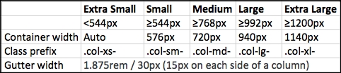
The .col-xl- breakpoint targets screen sizes of 1200px or larger, which was targeted by .col-lg- in Bootstrap 3. Therefore, this makes other breakpoints compress to target smaller screen sizes than they used to in Bootstrap 3. Here, you can see that .col-xs- now targets a screen width of less than 544px instead of the 768px it did in Bootstrap 3, making it easier to target mobile devices and have different layouts ...
Get JavaScript: Moving to ES2015 now with the O’Reilly learning platform.
O’Reilly members experience books, live events, courses curated by job role, and more from O’Reilly and nearly 200 top publishers.

