Chapter 13. Working with Web Page Spaces
13.0. Introduction
The web page space is all of the area contained within the browserâs chrome: the outer edge of the browser, status, and menu bars. If the contents of the page are larger than the window area, vertical and horizontal scrollbars are added so you can scroll to see all of the page contents.
The web page size is determined by the page elements, in combination with the default and explicit styling for each. If there are no elements, or the elements donât participate in the page flow (if theyâre absolutely positioned, or in some other way removed from the flow), the area of the web page space is the size of the window minus the chrome.
Element sizes vary, based on their contents, but they can be resized
or even clipped. If they are resized, setting the elementâs overflow alters what
happens to their content if it is
larger than the elementâs size. If the overflow is set to scroll, vertical and horizontal scrollbars are
added to the element.
How the elements impact page flow is based on a number of factors.
For instance, if the element is a block-level element, such as a div, header (h1), or paragraph (p), thereâs a new line before and after the
element. An inline element, though, such as a span, is not surrounded by line breaks. The
display for both types of elements can be changed by setting the CSS
display or float property.
An elementâs positioning can also impact page flow. By default,
elements have static positioning, where properties such as top and left have no impact.
An elementâs position can be changed
through the CSS position property, and
through the use of positional properties such as left and topâeither changing the elementâs position in
the page, or removing it entirely out of the page flow.
All of the element properties just mentioned can be set in a stylesheet:
<style>
div#test
{
   position: absolute;
   left: 10px;
   top: 10px;
}
In this chapter, weâre more interested in the many ways of using JavaScript to dynamically manage the web pageâs space.
13.1. Determining the Area of the Web Page
Solution
Youâll need to use a cross-browser technique that ensures consistent results regardless of the browser used. The following is an example of a function that returns an object with the web page viewportâs width and height:
function size()
{
  var wdth = 0;
  var hth = 0;

  if(!window.innerWidth)
  {
     wdth = (document.documentElement.clientWidth ?
document.documentElement.clientWidth :
document.body.clientWidth);
     hth = (document.documentElement.clientHeight ?
document.documentElement.clientWidth :
document.body.clientHeight);
  }
  else
  {
    wdth = window.innerWidth;
    hth = window.innerHeight;
  }
  return {width:wdth, height:hth};
}
Discussion
There is currently no standard approach to accessing the window viewport information, which is why we have to use a series of case statements.
Most major browsers, including Opera, Firefox, Chrome, and Safari,
support window object properties called innerWidth and innerHeight, which return the windowâs
viewport area, minus any scrollbar dimensions. However, Internet
Explorer doesnât support innerWidth
and innerHeight, which accounts for
the first test case in the solution.
If the innerWidth property is
supported, the width and height are accessed from innerWidth and innerHeight, respectively. If it isnât
supported, the ternary operator is used to test for a document property,
documentView, and its
property, clientWidth. If there is no
documentView object, the clientWidth property is accessed on the
document body property:
wdth = (document.documentElement.clientWidth ?
              document.documentElement.clientWidth :
              document.body.clientWidth);
IE provides viewport information through the documentView property
except in IE6, when the application is run in
quirks mode. Though support for IE6 is rapidly diminishingâmajor
websites such as Google, YouTube, and Amazon no longer support it, and
it isnât one of the supported browsers in this bookâIâve included the
test to be comprehensive.
Note
Quirks mode is a way for browsers to provide backward version
support. Itâs typically triggered with a special DOCTYPE, such as: <!DOCTYPE HTML PUBLIC "-//W3C//DTD HTML 4.01
Transitional//EN">.
After the tests, both the width and height values are assigned to appropriately named properties in a returned object, using JSON notation:
return {width:wdth, height: hth}Once the viewport size object is returned, you can access the width and height using the following code:
var viewPort = size();
var w = viewPort.width;
var h = viewPort.height;
See Also
There is a draft for a CSS3 standards effort to define a CSSOM View module, in order to provide a standard set of CSS specifications for window viewports and other dimensional and view information. The current draft is at http://www.w3.org/TR/cssom-view/. However, the priority for this specification is low, and the cross-browser approach just demonstrated is widely adopted, so a standard approach is off in the distant future.
See Recipe 19.4 for more on the JSON notation.
13.2. Measuring Elements
Solution
Call getBoundingClientRect
for the element. If the returned TextRectangle/ClientRect object has a height property,
use that. Otherwise, subtract the rectangleâs bottom value from its top
to derive the height:
var height = 0;
var rect = document.getElementById("it").getBoundingClientRect();
if (rect.height) {
    height = rect.height;
} else {
    height = rect.bottom - rect.height; // derive height
}
alert(rect.height);
Discussion
The getBoundingClientRect
method is based on a method that Microsoft implemented for IE5, and is
now being standardized in the W3C CSSOM View module. The W3C CSSOM View
module specification provides a standardized way of getting information
about the web page viewport, and the elementâs spatial arrangement
within the viewport.
The element.getBoundingClientRect method returns a
ClientRect object
(TextRectangle in implementations)
that contains information about the bounding rectangle for the element.
Most implementations support four properties on the object: top, bottom, right, and left. Firefox also includes width and height, though both can be derived from the
other values.
When I mention the bounding rectangle for the element, the
dimensions returned include any padding and border values. If
an element has the following stylesheet setting:
#elem
{
   height: 400px;
 }
and you access the bounding rectangleâs height, it is 400 pixels. However, if the element has the following stylesheet:
#elem
{
  height: 400px;
  padding: 10px;
  border: 5px solid red;
  margin: 20px;
}
the bounding rectangleâs height would be 430 pixels: 400 for the height setting, plus 10 pixels each side for the padding, and 5 pixels each side for the border. The margin doesnât figure into the calculation.
If you donât provide any stylesheet setting, the height depends on the viewport size; changing the viewport will also change the elementâs dimensions, including its height.
The values for each of the ClientRect/TextRectangle dimensions are floating-point
numbers.
13.3. Locating Elements in the Page
Solution
Use getBoundingClientRect
to get the dimensions and position of the bounding
rectangle for the element, and then access its top and left values to
find position:
function positionObject(obj) {
   var rect = obj.getBoundingClientRect();
   return [rect.left,rect.top];
}
Discussion
Element positioning is based on the position, or offset, of the elementâs top-left corner relative to its viewport and ancestor elements. The position of the element is relative to other elements, and is dependent on whether its position is static (by default), relative, fixed, or absolute. The margin also affects the elementâs position.
The element.getBoundingClientRect method returns
the rectangle for the element, including the top, left,
right, and bottom positions, regardless of stylesheet
setting.
To demonstrate how the method can be used to find element
positions, Example 13-1
contains a web page with three nested div elements and a separate div element acting as cursor. Each nested
div element is labeled and outlined,
and the separate element is a solid color. When the page loads, the user
is prompted for a box label, and if the label matches one of the
div elements, the solid cursor
div element is positioned over the
specified div element. The
prompt/move continues until canceled.
<!DOCTYPE html>
<head>
<title>Locating Elements</title>
<style type="text/css">
div#a
{
width: 500px;
}
div
{
border: 1px solid #000;
padding: 10px;
}
#cursor
{
position: absolute;
background-color: #ffff00;
width: 20px;
height: 20px;
left: 50px;
top: 300px;
}
</style>
<script type="text/javascript">
function positionObject(obj) {
var rect = obj.getBoundingClientRect();
return [rect.left,rect.top];
}
window.onload=function() {
var tst = document.documentElement.getBoundingClientRect();
alert(tst.top);
var cont = "A";
var cursor = document.getElementById("cursor");
while (cont) {
cont = prompt("Where do you want to move the cursor block?",
"A");
if (cont) {
cont=cont.toLowerCase();
if (cont == "a" || cont == "b" || cont == "c") {
var elem = document.getElementById(cont);
var pos = positionObject(elem);
cursor.setAttribute("style","top: " + pos[1] +
"px; left : " + pos[0] + "px");
}
}
}
}
</script>
</head>
<body>
<div id="a">
<p>A</p>
<div id="b">
<p>B</p>
<div id="c">
<p>C</p>
</div>
</div>
</div>
<div id="cursor"></div>
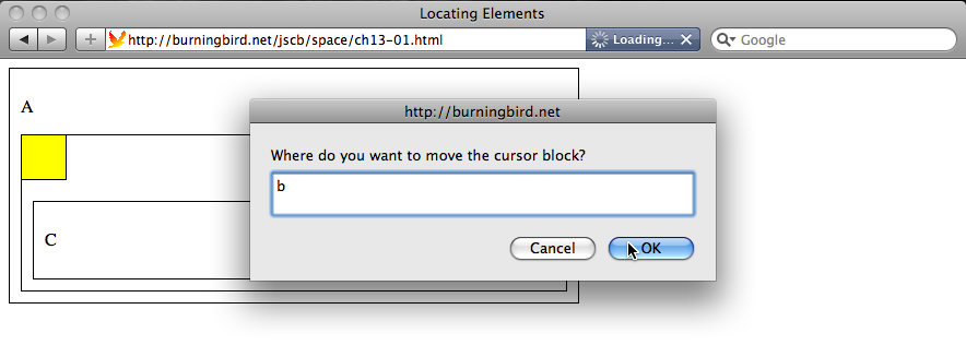
</body>Figure 13-1 shows the
page after I selected the âBâ div
element. The application works with all of this bookâs target
browsers.
An interesting little quirk with getBoundingClientRect and positioning is that
Microsoft originally added a two-pixel margin around the document
element, which affected the getBoundingClientRect values. If you test the
method with the document element:
var tst = document.documentElement.getBoundingClientRect();
alert(tst.top);
You get a value of 0 for Firefox, Safari, Chrome, and Opera, but
you get a value of 2 for IE7, and â2 for IE8. If you run the application
in IE7 compatibility mode and re-position the cursor element using code
thatâs compatible for IE7 (IE7 doesnât like the setAttribute technique when used with the
style attribute):
var pos = positionObject(elem);
cursor.style.top = pos[1] + "px";
cursor.style.left = pos[0] + "px";
The cursor is exactly 2 pixels offâboth from the top and the left.
With IE8, Microsoft âregularizedâ the margin for the document element,
offsetting it â2 pixels. Now, when you use getBoundingClientRect with any element in the
page, IE8 returns the same results as the other browsers.
If you need to support IE7, youâll need to adjust the getBoundingClientRect values accordingly, and
also use the older approach of setting style values. The downloadable
example code contains a workaround for this older browser.
See Also
See Recipe 12.15
for more on using setAttribute to
change style settings.
13.4. Hiding Page Sections
Solution
You can set the CSS visibility property to hide and show the message:
msg.style.hidden="visible"; // to display
msg.style.hidden="hidden"; // to hide
or you can use the CSS display property:
msg.style.display="block"; // to display
msg.style.display="none"; // to remove from display
Discussion
Both the CSS visibility and
display properties can be used to
hide and show elements. There is one major difference between the two
that impacts on which youâll use.
The visibility property
controls the elementâs visual rendering, but its physical presence still
affects other elements. When an element is hidden, it still takes up
page space. The display property, on
the other hand, removes the element completely from the page layout. The
property can take several values, but there are four of interest to
us:
noneWhen display is set to
none, the element is removed completely from display.blockWhen display is set to
block, the element is treated like ablockelement, with a line break before and after.inline-blockWhen display is set to
inline-block, the contents are formatted like ablockelement, which is then flowed like inline content.inheritThis is the default display, and specifies that the
displayproperty is inherited from the elementâs parent.
There are other values, but these are the ones weâre most likely to use within JavaScript applications.
Unless youâre using absolute positioning with the hidden element,
youâll want to use the CSS display
property. Otherwise, the element will affect the page layout, pushing
any elements that follow down and to the right, depending on the type of
hidden element.
There is another approach to removing an element out of page view, and that is to move it totally offscreen using a negative left value. This could work, especially if youâre creating a slider element that will slide in from the left. Itâs also an approach that the accessibility community has suggested using when you have content that you want rendered by Assistive Technology (AT) devices, but not visually rendered.
To just hide an element, I generally use the hidden attribute, and
to remove the element from the page display, I use the display attribute.
See Also
See Recipe 14.1 on
accessible approaches to hiding and displaying page elements. See Recipe 13.4 for a demonstration of the display attribute.
13.5. Creating Collapsible Form Sections
Problem
You have a large form that takes up a lot of space. You only want to display sections of the form as they are needed.
Solution
Split the form into display blocks using div elements, and then change the blockâs
styling to control the display of the form section. When the page is
loaded, hide all of the form blocks by changing the display value to
none using JavaScript:
theformblock.setAttribute("style","display: none");or:
theformblock.style.display="none";
To expand the section, change the display setting to block using setAttribute:
theformblock.setAttribute("style","block");or set the value directly:
theformblock.style.display="block";
Discussion
There are multiple ways you can prevent form elements from taking up page space. For
one, you can clip the element by setting the clipping area. Another
approach is to resize the element to zero height. The best approach,
though, and the one most applications use, is to employ a
collapsible section.
A collapsible section is a form of widgetâa set of elements, CSS, and JavaScript packaged together and generally considered one object. The typical implementation consists of one element that acts as a label that is always displayed, another element that holds the content, and all contained within a third, parent element.
The collapsible section may or may not be used with other collapsible sections to form a higher level widget, the accordion. The accordion widget is a grouping of collapsible sections with an additional behavior: depending on preference, any number of collapsible sections can be expanded, or only one section can be expanded at a time.
To demonstrate how collapsible sections can be used with forms,
Example 13-2 shows a form thatâs split into
two sections. Notice that each form
block has an associated label that expands the collapsed form section when clicked. When the label is
clicked again, the form section is collapsed again.
<!DOCTYPE html>
<head>
<title>Collapsed Form Elements</title>
<style>
.label
{
  width: 400px;
  margin: 10px 0 0 0;
  padding: 10px;
  background-color: #ccccff;
  text-align: center;
  border: 1px solid #ccccff;
}
.elements
{
  border: 1px solid #ccccff;
  padding: 10px;
  border: 1px solid #ccccff;
  width: 400px;
}
button
{
   margin: 20px;
}
</style>
</head>
<body>
<form>
  <div>
    <div id="section1" class="label">
      <p>Checkboxes</p>
    </div>
    <div id="section1b" class="elements">
      <input type="checkbox" name="box1" /> - box one<br />
      <input type="checkbox" name="box1" /> - box one<br />
      <input type="checkbox" name="box1" /> - box one<br />
      <input type="checkbox" name="box1" /> - box one<br />
      <input type="checkbox" name="box1" /> - box one<br />
     </div>
    </div>
  <div>

  <div id="section2" class="label">
    <p>Buttons</p>
  </div>
  <div class="elements">
    <input type="radio" name="button1" /> - button one<br />
    <input type="radio" name="button1" /> - button one<br />
    <input type="radio" name="button1" /> - button one<br />
    <input type="radio" name="button1" /> - button one<br />
    <input type="radio" name="button1" /> - button one<br />
    <button>Submit</button>
  </div>
</div>
</form>
<script type="text/javascript">

var elements = document.getElementsByTagName("div");

// collapse all sections
for (var i = 0; i < elements.length; i++) {
  if (elements[i].className == "elements") {
    elements[i].style.display="none";
  } else if (elements[i].className == "label") {
    elements[i].onclick=switchDisplay;
  }
}

//collapse or expand depending on state
function switchDisplay() {

  var parent = this.parentNode;
  var target = parent.getElementsByTagName("div")[1];

  if (target.style.display == "none") {
    target.style.display="block";
  } else {
    target.style.display="none";
  }
  return false;
}
</script>
</body>
There are numerous ways you can map the click activity in one
element by changing the display in another. In Example 13-2, I wrapped both the label and the content elements in a parent element. When you
click on a label, the parent to the label element is accessed in JavaScript and
its children returned as an HTML collection. The second elementâs
display togglesâif the elementâs display is none, itâs changed to block; if block, changed to none. Figure 13-2 shows the page,
with one form section expanded.
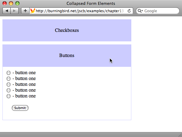
In the example, notice that the form elements are displayed when the page
loads, and only collapsed after the elements are loaded. The reason for
this is if JavaScript is turned off, the form elements are displayed by default.
See Also
See Recipe 14.5 for how to make a collapsible section/accordion widget accessible with ARIA attributes.
13.6. Adding a Page Overlay
Problem
You want to overlay the web page in order to display a message, or provide an expanded photo.
Solution
Provide a stylesheet setting for a div element that is sized and positioned to
cover the entire web page:
.overlay
{
   background-color: #000;
   opacity: .7;
   filter: alpha(opacity=70);
   position: absolute; top: 0; left: 0;
   width: 100%; height: 100%;
   z-index: 10;
}
Create the div element on demand, adding whatever other content is to be displayed
to the div element:
function expandPhoto() {

   var overlay = document.createElement("div");
   overlay.setAttribute("id","overlay");
   overlay.setAttribute("class", "overlay");
   document.body.appendChild(overlay);
}
When the overlay is no longer needed, remove it from the page:
function restore() {
   document.body.removeChild(document.getElementById("overlay"));
}
Discussion
Creating an overlay in a web page consists of creating a div element set to a z-index higher than anything else in the page,
absolutely positioned at the upper left of the page, and sized
100%.
In the solution, this is achieved more easily by created a CSS
style setting for the overlay class that manages the appearance
of the element, and then using document.createElement and appendChild to add it to the page. To restore
the page, the overlay element is
removed.
Page overlays are popular for displaying ads, logins, or providing important site messages. They are also useful with photos. Example 13-3 contains a web page with four photo thumbnails. Clicking any of the thumbnails opens an overlay, and displays a larger size photo.
<!DOCTYPE html>
<head>
<title>Overlay</title>
<style>
img
{
  padding: 5px;
}

#outer
{
  width: 100%; height: 100%;
}
.overlay
{
   background-color: #000;
   opacity: .7;
   filter: alpha(opacity=70);
   position: fixed; top: 0; left: 0;
   width: 100%; height: 100%;
   z-index: 10;
}
.overlayimg
{
  position: absolute;
  z-index: 11;
  left: 50px;
  top: 50px;
}
</style>
<script>

function expandPhoto() {

   // create overlay and append to page
   var overlay = document.createElement("div");
   overlay.setAttribute("id","overlay");
   overlay.setAttribute("class", "overlay");
   document.body.appendChild(overlay);

   // create image and append to page
   var img = document.createElement("img");
   img.setAttribute("id","img");
   img.src = this.getAttribute("data-larger");
   img.setAttribute("class","overlayimg");

   // click to restore page
   img.onclick=restore;

   document.body.appendChild(img);

}
// restore page to normal
function restore() {

 document.body.removeChild(document.getElementById("overlay"));
 document.body.removeChild(document.getElementById("img"));
}


window.onload=function() {
   var imgs = document.getElementsByTagName("img");
   imgs[0].focus();
   for (var i = 0; i < imgs.length; i++) {
     imgs[i].onclick=expandPhoto;
     imgs[i].onkeydown=expandPhoto;
   }
}

</script>

</head>
<body>
<div id="outer">
  <p>Mouse click on image to expand the photo. To close expanded
photo, mouse click on image.</p>
  <img src="dragonfly2.thumbnail.jpg" data-larger="dragonfly2.jpg"
alt="image of common dragonfly on bright green and pink flowers" />
  <img src="dragonfly4.thumbnail.jpg" data-larger="dragonfly4.jpg"
alt="Dark orange dragonfly on water lily" />
  <img src="dragonfly6.thumbnail.jpg" data-larger="dragonfly6.jpg"
alt="Dark orange dragonfly on purple water lily" />
  <img src="dragonfly8.thumbnail.jpg" data-larger="dragonfly8.jpg"
alt="Dragonfly on bright pink water lily" />
</div>
</body>
Example 13-3
creates an overlay that fits the size of the page as itâs currently
opened. Note the CSS setting for the overlay, in particular the fixed positioning. This ensures that the
overlay fits the window even if the contents require you to scroll to
the right, or down, to see all of the contents.
Figure 13-3 shows the page with the overlay and one of the photos displayed.
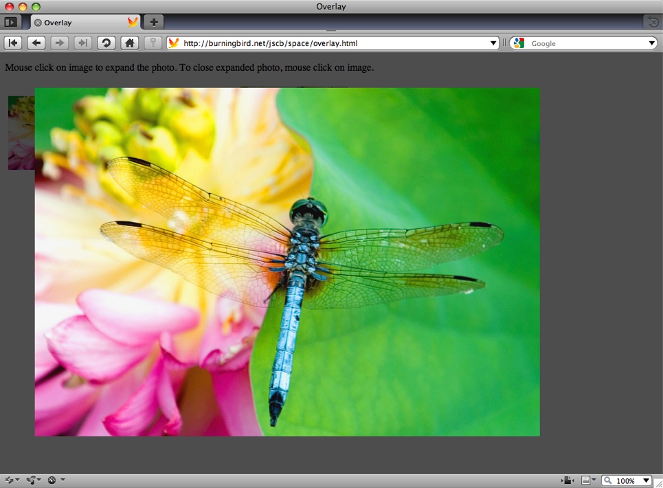
The application works with Firefox, Opera, Chrome, Safari, and
IE8. IE7 doesnât like the use of setAttribute with the class attribute. If you need to support IE7,
set the className attribute
directly:
overlay.className = "overlay";
See Also
See Recipe 12.15
for more on using setAttribute with
CSS styles.
13.7. Creating Tab Pages
Problem
You have divided content that you want to hide or display based on the web page readerâs actions.
Solution
Create a tabbed page effect and hide or display tab pages based on clicking the tab label:
// click on tab
function displayPage() {
  var current = this.parentNode.getAttribute("data-current");
  document.getElementById("tabnav_" + current).setAttribute("style",
                          "background-color: #fff");
  document.getElementById("tabpage_" + current).style.display="none";

  var ident = this.id.split("_")[1];
  this.setAttribute("style","background-color: #f00");
  document.getElementById("tabpage_" + ident).style.display="block";
  this.parentNode.setAttribute("data-current",ident);
}
Discussion
Tabbed pages have been popular for some time, and rightfully so. Theyâre a great way to make use of limited web page space in a manner thatâs intuitiveâweâre all familiar with tabs from other applications, including browsers.
The tabbed page concept is simple: display a list of tabs to click on the top, and pages underneath. All tabs are shown, but only one page is shown at a time. Clicking any of the tabs resets the page:
The highlighted tab is changed to the one just clicked.
The currently displayed page is hidden or set to nondisplay.
The clicked tabâs style is changed (so itâs highlighted).
The associated content page is displayed.
In the solution, part of a tabbed page application is shown: the part that demonstrates what happens when you click the tab. In this case, the tab is associated by an identifier number attached to the end of the tab identifier for the associated tab page, so there doesnât have to be any form of container relation between the two. You want to avoid a container relationship between tab and page as much as possible, because it makes it difficult to ensure the page displays well when JavaScript is turned off.
The current tab picked is stored in the parent nodeâs custom data
attribute, data-current. Using a custom data-* attribute, as
these values are called, means we can avoid global variables. The next
time a tab is clicked, itâs easy to find the current selection in order
to reset the page.
Note
The custom data-* attributes
were introduced with HTML5. You can use any name that begins with
data-, and the page is still
considered conforming to HTML5.
There are probably dozens of different approaches you can use to
create tabbed pages, including making your own library, or using another
that can be dropped into a page to automatically build the pages based
on class settings.
The approach in Example 13-4 incorporates the
approach outlined in the solution. It also makes use of the fact that
elements form their own document trees, and that we can query an element
tree the same as we can query the document tree. Using this approach, we
can add as many tabbed page containers to the page as we wish. For each
container, the application displays the navigation bar, turns off the
display for all of the pages except the first, and highlights the first
tab, and then adds the onclick event
handler to each tab.
<!DOCTYPE html>
<head>
<title>Tabbed Pages</title>
<style>
.tabcontainer
{
padding: 5px; width: 500px;
margin: 20px;
}
.tabnavigation ul
{
padding: 0; margin: 0; display: none;
}
.tabnavigation ul li
{
padding: 3px; display: inline;
border: 1px solid #000; background-color: #fff;
}
.tabnavigation ul li:hover
{
cursor: pointer;
}
.tabpages
{
position: relative; z-index: 2;
border: 1px solid #000; background-color: #fff;
}
.tabpage
{
margin: 0 10px;
}
</style>
<script>
// set up display
// for each container display navigation
// hide all but first page, highlight first tab
window.onload=function() {
// for each container
var containers = document.querySelectorAll(".tabcontainer");
for (var j = 0; j < containers.length; j++) {
// display and hide elements
var nav = containers[j].querySelector(".tabnavigation ul");
nav.style.display="block";
// set current tab
var navitem = containers[j].querySelector(".tabnavigation ul li");
var ident = navitem.id.split("_")[1];
navitem.parentNode.setAttribute("data-current",ident);
navitem.setAttribute("style","background-color: #f00");
var pages = containers[j].querySelectorAll(".tabpage");
for (var i = 1; i < pages.length; i++) {
pages[i].style.display="none";
}
var tabs = containers[j].querySelectorAll(".tabnavigation ul li");
for (var i = 0; i < tabs.length; i++) {
tabs[i].onclick=displayPage;
}
}
}
// click on tab
function displayPage() {
var current = this.parentNode.getAttribute("data-current");
document.getElementById("tabnav_" + current).setAttribute("style",
"background-color: #fff");
document.getElementById("tabpage_" + current).style.display="none";
var ident = this.id.split("_")[1];
this.setAttribute("style","background-color: #f00");
document.getElementById("tabpage_" + ident).style.display="block";
this.parentNode.setAttribute("data-current",ident);
}
</script>
</head>
<body>
<div class="tabcontainer">
<div class="tabnavigation">
<ul>
<li id="tabnav_1">Page One</li>
<li id="tabnav_2">Page Two</li>
<li id="tabnav_3">Page Three</li>
</ul>
</div>
<div class="tabpages">
<div class="tabpage" id="tabpage_1">
<p>page 1</p>
</div>
<div class="tabpage" id="tabpage_2">
<p>page 2</p>
</div>
<div class="tabpage" id="tabpage_3">
<p>page 3</p>
</div>
</div>
</div>
<div class="tabcontainer">
<div class="tabnavigation">
<ul>
<li id="tabnav_4">Page Two One</li>
<li id="tabnav_5">Page Two Two</li>
</ul>
<div>
<div class="tabpages">
<div class="tabpage" id="tabpage_4">
<p>Page 4</p>
</div>
<div class="tabpage" id="tabpage_5">
<p>Page 5</p>
</div>
</div>
</div>
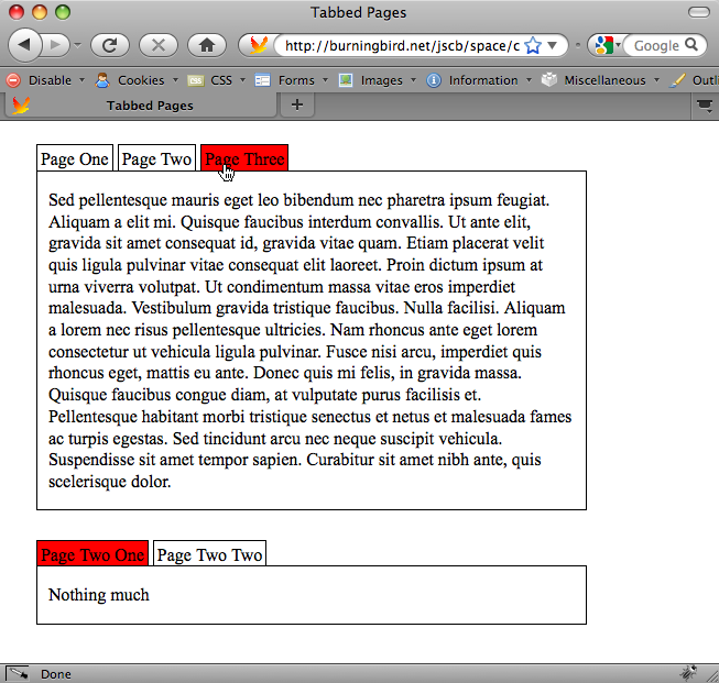
</body>Figure 13-4 shows
the application with two containers, different tabbed pages open in
each. The application works with Chrome, Firefox, Opera, Safari, and
IE8. It doesnât work with IE7 because of the use of querySelectorAll.
See Also
See Recipe 14.8 for how to make tabbed pages accessible using ARIA roles and attributes.
13.8. Creating Hover-Based Pop-up Info Windows
Problem
You like the Netflix web siteâs pop-up window that displays when the mouse cursor is over a movie thumbnail, and you want to incorporate this functionality into your own application.
Solution
The Netflix-style of pop-up info window is based on four different functionalities.
First, you need to capture the mouseover and mouseout events for each image thumbnail, in
order to display or remove the pop-up window, respectively. Using a
function that manages cross-browser event handling for every object that
has an info bubble, assign a function to both the onmouseover and
onmouseout event handlers. In the
following code, the event handlers are attached to all images in the
page:
function manageEvent(eventObj, event, eventHandler) {
   if (eventObj.addEventListener) {
      eventObj.addEventListener(event, eventHandler,false);
   } else if (eventObj.attachEvent) {
      event = "on" + event;
      eventObj.attachEvent(event, eventHandler);
   }
}

window.onload=function() {
  var imgs = document.getElementsByTagName("img");
  for (var i = 0; i < imgs.length; i++) {
     manageEvent(imgs[i],"mouseover",getInfo);
     manageEvent(imgs[i],"mouseout",removeWindow);
  }
}
Second, you need to access something about the item youâre hovering over in order to know what to use to populate the pop-up bubble. The information can be in the page, or you can use Ajax to get the information:
function getInfo() {

  // prepare request
  if (!xmlhttp) {
    xmlhttp = new XMLHttpRequest();
  }
  var value = this.getAttribute("id");
  var url = "photos.php?photo=" + value;
  xmlhttp.open('GET', url, true);
  xmlhttp.onreadystatechange = showWindow;
  xmlhttp.send(null);

  return false;
}
Third, you need to either show the pop-up window, if it already
exists and is not displayed, or create the window. In the following
code, the pop-up window is created just below the object, and just to
the right when the Ajax call returns with the information about the
item. The element.getBoundingClientRect method is used
to determine the location where the pop up should be placed, and the DOM
methods document.createElement and
document.createTextNode are used to
create the pop up:
// compute position for pop up
function compPos(obj) {
    var rect = obj.getBoundingClientRect();
    var height;
    if (rect.height) {
      height = rect.height;
    } else {
      height = rect.bottom - rect.top;
    }
    var top = rect.top + height + 10;
    return [rect.left, top];
}

// process return
function showWindow() {
   if(xmlhttp.readyState == 4 && xmlhttp.status == 200) {
     var response = xmlhttp.responseText.split("#");
     var img = document.getElementById(response[0]);

     if (!img) return;

     // derive location for pop up
     var loc = compPos(img);
     var left = loc[0] + "px";
     var top = loc[1] + "px";

     // create pop up
     var div = document.createElement("popup");
     div.id = "popup";
     var txt = document.createTextNode(response[1]);
     div.appendChild(txt);

     // style pop up
     div.setAttribute("class","popup");
     div.setAttribute("style","left: " + left + "; top: " + top);
     document.body.appendChild(div);
   }
}
Lastly, when the mouseover
event fires, you need to either hide the pop-up window or remove
itâwhichever makes sense in your setup. Since I created a new pop-up
window in the mouseover event, Iâll
remove it in the mouseout event
handler:
function removeWindow() {
   var popup = document.getElementById("popup");
   if (popup)
     popup.parentNode.removeChild(popup);

   return false;
}
Discussion
Creating a pop-up information or help window doesnât have to be
complicated, if you keep the action simple and follow the four steps
outlined in the solution. If the pop up is help for form elements, then you might want to cache
the information within the page, and just show and hide pop-up elements
as needed. However, if you have pages like the ones at Netflix, which
can have hundreds of items, youâll have better performance if you get
the pop-up window information on demand using Ajax. The solution
demonstrates that using Ajax doesnât add significant additional
complexity to the application.
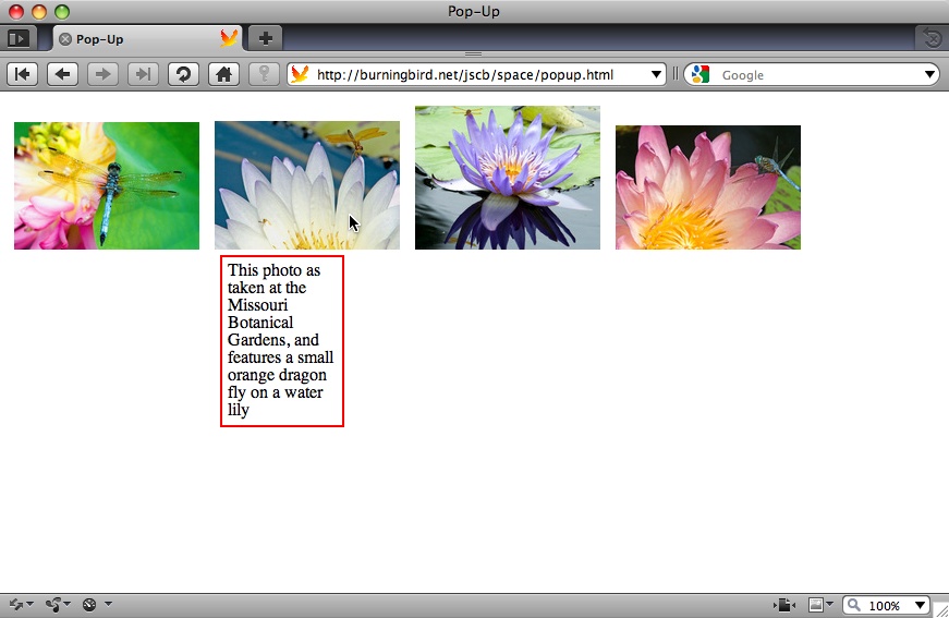
When I positioned the pop up in the example, I didnât place it directly over the object, as shown in Figure 13-5. The reason is that Iâm not capturing the mouse position to have the pop up follow the cursor around, ensuring that I donât move the cursor directly over the pop up. But if I statically position the pop up partially over the object, the web page readers could move their mouse over the pop up, which triggers the event to hide the pop up...which then triggers the event to show the pop up, and so on. This creates a flicker effect, not to mention a lot of network activity.
If, instead, I allowed the mouse events to continue by returning
true from either event handler
function, when the web page readers move their mouse over the pop up,
the pop up wonât go away. However, if they move the mouse from the image
to the pop up, and then to the rest of the page, the event to trigger
the pop-up event removal wonât fire, and the pop up is left on the
page.
The best approach is to place the pop up directly under (or to the side, or a specific location in the page) rather than directly over the object. This is the approach Netflix uses on its site.
IE7 doesnât like the use of setAttribute with the class or style attributes. To modify the code so it
also works with IE7, replace the setAttribute with:
// IE7
div.className="popup";
div.style.left=left;
div.style.top = top;
See Also
See Recipes 13.2 and 13.3 for more information about using
element.getBoundingClientRect. Chapter 12 provides coverage
of creating new page elements, and
Chapter 18 of using Ajax. Recipe 12.15 covers using
setAttribute with CSS style settings.
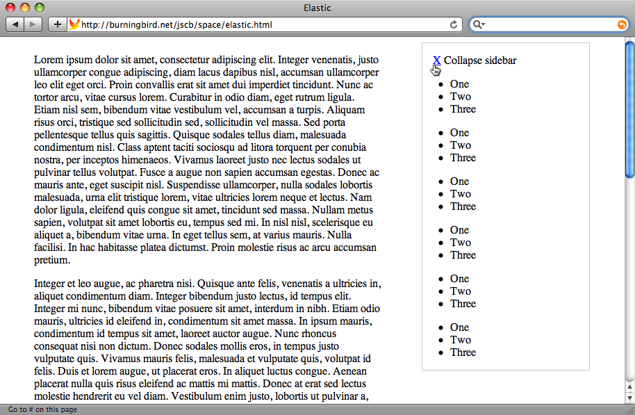
13.9. Collapsing or Resizing the Sidebar
Problem
You have a website that has a main column and one or more side columns, as shown in Figure 13-6. You want to provide a way for your web page readers to control the width of the main column, without having to resize the browser.
Solution
Use a collapsible sidebar.
Add an X in a span element at the top of the sidebar.
Include a custom data-expand
attribute set to "true", to track
whether the column is expanded or not. Also include tabindex="0", so that the element can receive
keypress events:
 <div>
   <p id="x" data-expand="true" tabindex="0">
<span style="text-decoration: underline">X</span>
 Collapse sidebar</p>
 </div>
Add a method handler to the elementâs click and keypress events that checks the data-expand attribute to see if the column is
currently expanded or not. If it is expanded, the column is collapsed,
and the main column expanded; if not, the sidebar and main column are
returned to their regular dimensions:
window.onload=function() {

 var x = document.getElementById("x");
 x.setAttribute("style","display: block");
 x.onclick=expandOrShrink;
 x.onkeypress=expandOrShrink;
}

function expandOrShrink() {
   if (this.getAttribute("data-expand") == "true") {
      document.getElementById("sidebar").setAttribute("style",
             "width: 50px");
      document.getElementById("main").setAttribute("style",
             "width: 700px");
      this.setAttribute("data-expand", "false");
   } else {
      document.getElementById("sidebar").setAttribute("style",
              "width: 240px");
      document.getElementById("main").setAttribute("style",
              "width: 500px");
      this.setAttribute("data-expand", "true");
   }
}
Discussion
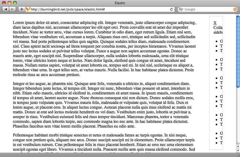
Working with page space doesnât mean that the JavaScript has to be complex or involved. The collapsible sidebar is very simple. The key to making it work is to ensure that the sidebar contents are clipped when the sidebar is shrunk (as shown in Figure 13-7), rather than overflowing the sidebar dimensions.
To ensure the page works if JavaScript is disabled, the default
CSS for the X element is set to
display none. When the page loads,
JavaScript changes the X to
display.
Since IE7 doesnât like the use of setAttribute with the style attribute, you can modify the
application to support this older browser by using direct attribute
assignment:
function expandOrShrink() {
   if (this.getAttribute("data-expand") == "true") {
      document.getElementById("sidebar").setAttribute("style",
                "width: 50px");
      document.getElementById("main").setAttribute("style",
                "width: 700px");

      // IE7
      // document.getElementById("sidebar").style.width="50px";
      // document.getElementById("main").style.width="700px";

      this.setAttribute("data-expand", "false");
   } else {
      document.getElementById("sidebar").setAttribute("style",
                 "width: 240px");
      document.getElementById("main").setAttribute("style",
                 "width: 500px");

      // IE7
      // document.getElementById("sidebar").style.width="240px";
      // document.getElementById("main").style.width="500px";

      this.setAttribute("data-expand", "true");
   }
}
IE7 does support the use of getAttribute and setAttribute with custom data-* attributes.
Get JavaScript Cookbook now with the O’Reilly learning platform.
O’Reilly members experience books, live events, courses curated by job role, and more from O’Reilly and nearly 200 top publishers.

