The JCheckBox Class
The JCheckBox [5] class is shown in various L&Fs in Figure
5-7. JCheckBox is a subclass
of JToggleButton and is typically
used to allow the user to turn a given feature on or off or to make
multiple selections from a set of choices. A JCheckBox is usually rendered by showing a
small box into which a “check” is placed when selected (as shown in
Figure 5-7). If you specify
an icon for the checkbox, this icon replaces the default box.
Therefore, if you specify an icon, you should always also supply a
selected icon—otherwise, there is no way to tell if a checkbox is
selected.
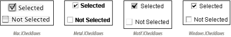
Figure 5-7. JCheckBoxes in four L&Fs
Properties
The JCheckBox class inherits
most of its properties from its superclasses. The exceptions are shown
in Table 5-12. By
default, no border is painted on JCheckBoxes, and their horizontalAlignment is to the leading edge
(which means to the left in the default locale, in which text reads
left to right).[6] Setting the borderPaintedFlat property to true is
a hint to the L&F that the checkbox should be drawn more plainly
than usual. (This is used primarily by cell renderers for tables and
trees.)
Table 5-12. JCheckBox properties
Property | Data type | get | is | set | Default value |
|---|---|---|---|---|---|
accessibleContexto | AccessibleContext | · | AccessibleJCheckBox | ||
borderPaintedo | boolean | · | · | false | |
borderPaintedFlat1.3, b | boolean | · | · | false | |
horizontalAlignmento | int | · | · | LEADING1.4 | |
UIClassIDo | String | · | “CheckBoxUI” ... |
Get Java Swing, 2nd Edition now with the O’Reilly learning platform.
O’Reilly members experience books, live events, courses curated by job role, and more from O’Reilly and nearly 200 top publishers.

