Beware of Chartjunk
With all the tools, labels, decorations, and effects that you can add to iWork charts, it’s easy to get carried away. Marbled textures! Shadows! Gridlines! Tick marks! Three-dimensional exploding pie graphs! Whoa there, eager chart-maker, you’re burying your information under a pile of distracting effects.
Statisticians call this stuff chartjunk, unnecessary visual elements that make your graph tough to read or, worse, distort its shapes or perspective in ways that make your audience misinterpret the info. Chartjunk is usually added with the best intentions—to make the chart pretty, to make it appear more “scientific,” or just because the graphic tools are so much fun to play with. But don’t lose sight of the reason you’re making the chart in the first place: to convey complex information efficiently and in a way that draws underlying trends to the surface. If a chart element doesn’t contribute directly to that goal, if it’s merely ornamental, it’s chartjunk. Let it go. Show off the data, not the chart.
Here are some common examples of chartjunk:
Shadows and 3D effects. However you might draw your graphs, the data behind iWork charts is two dimensional, drawn from a table of values. Faking a third dimension by adding shadows or perspective only distorts your graph’s shapes without contributing meaning, as shown in Figure 22-22.
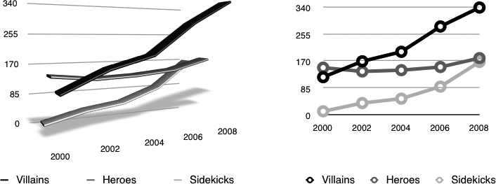
Figure 22-22. Adding 3D perspective to ...
Get iWork '09: The Missing Manual now with the O’Reilly learning platform.
O’Reilly members experience books, live events, courses curated by job role, and more from O’Reilly and nearly 200 top publishers.

