Chapter 19
Popovers and Modal Views
This lesson presents two ways of temporarily displaying data for user feedback:
- Popovers
- Modal views
Though the overall purpose is the same between popovers and modal views, they behave differently when implemented. For example, to dismiss a popover, you simply tap outside the bounds of the popover itself. To dismiss a modal view, you must touch a user-defined button that will dismiss it. Because of this permanence, modal views are presented to the user for immediate required feedback in order to continue the application.
Popovers
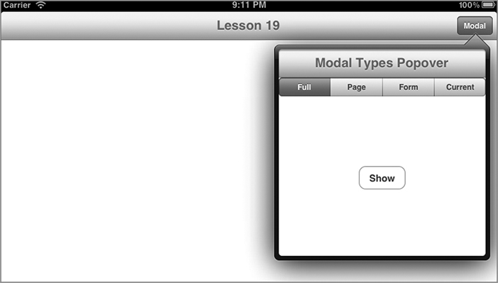
Popovers by definition are views that are revealed when a control is tapped. They also have the visual effect of being attached to that control as shown in Figure 19-1.
Usage Guidelines
The popover is an iPad-only view, and suggested uses are as follows:
- To provide a list of additional information related to the selected control.
- In a split view in portrait mode, to display the list that would appear in the left pane in landscape mode.
- To display a list of options displayed in an action sheet.
Presenting the Popover ...
Get iPhone and iPad App 24-Hour Trainer now with the O’Reilly learning platform.
O’Reilly members experience books, live events, courses curated by job role, and more from O’Reilly and nearly 200 top publishers.

