Chapter 1. The Basics
1.0. Introduction
In order to write apps for iOS, you need to know some of the basics of the Swift programming language that we will use throughout this book. Swift is Apple’s new programming language introduced in Xcode 6 and iOS 8 SDK. Objects and classes are fundamental in object-oriented programming (OOP) languages such as Swift, Objective-C, Java, C++, and many others.
All iOS applications essentially use the model-view-controller (MVC) architecture. Model, view, and controller are the three main components of an iOS application from an architectural perspective.
The model is the brain of the application. It does the calculations and creates a virtual world for itself that can live without the views and controllers. In other words, think of a model as a virtual copy of your application, without a face!
A view is the window through which your users interact with your application. It displays what’s inside the model most of the time, but in addition to that, it accepts users’ interactions. Any interaction between the user and your application is sent to a view, which then can be captured by a view controller and sent to the model.
The controller in iOS programming usually refers to the view controllers I just mentioned. Think of a view controller as a bridge between the model and your views. This controller interprets what is happening on one side and uses that information to alter the other side as needed. For instance, if the user changes a field in a view, the controller makes sure the model changes in response. And if the model gets new data, the controller tells the view to reflect it.
In this chapter, you will learn how to create the structure of an iOS application and how to use views and view controllers to create intuitive applications.
I also want to teach you a few basics of the Swift programming language—but before we begin, I want to make it absolutely obvious that the goal of this book is not to teach you how to program in Swift. Apple has already released a full book more than 500 pages long that teaches you how to use Swift. But in case you’re using this book in parallel with some other resource to learn Swift, I will go over a few basics.
Defining Constants and Variables in Swift
We define constants with the let
keyword like so:
letintegerValue=10letstringValue="Swift"letdoubleValue=10.0
The value that we assign to a constant (or later to a variable) defines its type. In the examples I gave, we did not have to define the data type of the constants at all because the Swift compiler can figure out the proper type from the values we assigned. However, if you want to define the data type manually, you can do so using the following syntax:
letintegerFromDouble=10.7asInt/* The value of this variable is 10because the compiler truncated the value to an integer*/
When a constant is defined and a value is assigned to it, it
cannot be changed later. If you need to change a value, use a variable
instead, with the var
keyword:
varmyString="Swi"myString+="ft"/* myString is now "Swift" */
Variables can be mutable or immutable. An immutable variable cannot be changed or appended to. Mutable variables can be changed.
Creating and Using Arrays in Swift
The [DataType] syntax
can create an array. This is an example of creating an
immutable array:
letallStrings=["Swift","Objective-C"]
If you want to create a mutable array, initialize an empty mutable
array and then append values to it like so. Use var so your allStrings array is a variable, not a
constant:
varallStrings=[String]()allStrings.append("Swift")allStrings.append("Objective-C")/* Our array is now ["Swift", "Objective-C" */
If you want to access values inside an array, use subscripting
with the [] syntax:
varallStrings=[String]()allStrings.append("Swift")allStrings.append("Objective-C")println(allStrings[0])/* Prints out "Swift" */allStrings.insert("C++",atIndex:0)println(allStrings[0])/* Prints out "C++" */
Defining and Accessing Dictionaries in Swift
A dictionary is a hash table. Each entry in a dictionary specifies one object as a key
and another object as its value. Dictionaries in Swift are dynamically
typed, based on what we feed them, and are created with the [key: value]
syntax, as shown here:
letallFullNames=["Vandad":"Nahavandipoor","Andy":"Oram","Molly":"Lindstedt"]
To access the value of a key, use subscripting like so:
println(allFullNames["Vandad"])/* Prints out "Nahavandipoor" */
The dictionary that we created was immutable because of the
let keyword. To create a mutable
version of the same dictionary, use the var keyword like so:
varallFullNames=["Vandad":"Nahavandipoor","Andy":"Oram","Molly":"Lindstedt"]allFullNames["Rachel"]="Roumeliotis"
This dictionary is of type [String:
String] because of the values that we provided to it. You can
add any type of value or key to the dictionary to see how the data type
changes:
letpersonInformation=["numberOfChildren":2,"age":32,"name":"Random person","job":"Something cool",]as[String:AnyObject]
The AnyObject type, as its name
implies, represents an instance of any class type. In this case, we are
saying that the keys to our dictionary are strings but the values are a
mix of various class types. Dictionaries and arrays in Swift can be
freely bridged to their Cocoa Touch counterparts of NSDictionary and NSArray.
Grouping Functionality with Classes and Structures in Swift
Structures are value types. That means that when they are passed around from one function to another, for instance, a new instance of them is created and then passed to the function. Classes are reference types, so that they can be passed around without having to be copied.
Imagine having the following structure:
structPerson{varfirstName,lastName:StringmutatingfuncsetFirstNameTo(firstName:String){self.firstName=firstName}}
This structure has a method that can cause the structure to
mutate, so it is prefixed with the keyword mutating. Now we can create a function that
can change the value of any Person
instance to any given string:
@UIApplicationMainclassAppDelegate:UIResponder,UIApplicationDelegate{varwindow:UIWindow?funcchangeFirstNameOf(varperson:Person,to:String){person.setFirstNameTo(to)/* person.firstName is VANDAD now and only in this function */}funcapplication(application:UIApplication,didFinishLaunchingWithOptionslaunchOptions:[NSObject:AnyObject]?)->Bool{varvandad=Person(firstName:"Vandad",lastName:"Nahavandipoor")changeFirstNameOf(vandad,to:"VANDAD")/* vandad.firstName is still Vandad */returntrue}}
Note that the value of the firstName property of the person instance is
changed only in the context of the function, not outside it. That means
when the instance of the Person
structure was passed to the function to change the first name to a given
string, the structure as a whole was copied into the stack and passed to
the function. Therefore, even though we called the mutating function on
it, the first name of the vandad
variable did not change.
Now off to classes. Classes are reference types and when passed to functions, are passed just as references to a single copy held in memory. Have a look at the following example:
classPerson{var(firstName,lastName)=("","")init(firstName:String,lastName:String){self.firstName=firstNameself.lastName=lastName}}@UIApplicationMainclassAppDelegate:UIResponder,UIApplicationDelegate{varwindow:UIWindow?funcchangeFirstNameOf(person:Person,to:String){person.firstName=to}funcapplication(application:UIApplication,didFinishLaunchingWithOptionslaunchOptions:[NSObject:AnyObject]?)->Bool{varvandad=Person(firstName:"Vandad",lastName:"Nahavandipoor")changeFirstNameOf(vandad,to:"VANDAD")/* vandad.firstName is now VANDAD */returntrue}}
You can see that the first name of the vandad variable is indeed changed in its
original context after it was passed to a function that changed the
first name. Classes can also have inheritance, but structures cannot
have inheritance.
Diving into Operators in Swift
There are many valid operators in Swift. Here are a few examples:
typealiasbyte=UInt8@UIApplicationMainclassAppDelegate:UIResponder,UIApplicationDelegate{varwindow:UIWindow?funcapplication(application:UIApplication,didFinishLaunchingWithOptionslaunchOptions:[NSObject:AnyObject]?)->Bool{/* Bitwise OR operator */letbyte3=0b01010101|0b10101010/* = 0b11111111 *//* plus operator */letplus=10+20/* = 30 *//* minus operator */letminus=20-10/* = 10 *//* multiplication operator */letmultiplied=10*20/* = 200 *//* division operator */letdivision=10.0/3.0/* = 3.33333333333333 */returntrue}}
You can also override operators. As we saw before, we had a class called Person. The two-character == operator checks whether two things are equal in the sense of having
the same value, whereas the three-character === operator checks for instance equality. That means the first
operator checks whether the two instances are equal (in whatever way
that makes sense in the context of your app). The === operator is very strict: it makes sure
that the two things you pass are occupying the same position in
memory.
Let’s explore the first type of equality. With our Person class, it makes sense to declare two
instances of this class equal if they have the same first and last name.
Therefore, using the operator overloader for the == operator, we can define this
functionality:
func==(left:Person,right:Person)->Bool{ifleft.firstName==right.firstName&&left.lastName==right.lastName{returntrue}returnfalse}
And now, if we define two people with the same first name and last name and check whether they are the same, even though the instances are different, they will come out the same:
letandy=Person(firstName:"Andy",lastName:"Oram")letsomeoneElse=Person(firstName:"Andy",lastName:"Oram")ifandy==someoneElse{/* This will be printed */println("They are the same")}else{/* We won't get here in this case */println("They are not the same")}
The three-character ===
operator would say they’re different, because they are separate
variables and you can change one without changing the other.
Now let’s say that we want to add a postfix ++ operator to our Person class. To create some numerical data it
can operate on, we’ll add a age
property of type Int to the
class:
classPerson{varage:IntvarfullName:Stringinit(fullName:String,age:Int){self.fullName=fullNameself.age=age}}
Our goal is to allow the programmer to perform the prefix and the
postfix operators of ++ on our
person instances just like we would perform the prefix and postfix
operator of ++ on integer values in
C:
postfixfunc++(inoutperson:Person)->Person{letnewPerson=Person(fullName:person.fullName,age:person.age)person.age++returnnewPerson}prefixfunc++(inoutperson:Person)->Person{person.age++letnewPerson=Person(fullName:person.fullName,age:person.age)returnnewPerson}
And now we can use them like so:
varvandad=Person(fullName:"Vandad Nahavandipoor",age:29)varsameAgeVandad=vandad++/*vandad.age = 30sameAgeVandad.age = 29*/letolderVandad=++sameAgeVandad/*vandad.age = 30sameAgeVandad.age = 30olderVandad.age = 30*/
In the same way, you can define prefix and postfix operators for any class or structure you like. Just ensure that your operator overloaders are public functions and not defined inside any specific class or structure.
Declaring and Using Enumerations in Swift
Enumerations are very sophisticated in Swift indeed. They can be of any given type. For instance, they can be strings:
enumCarClassification:String{caseEstate="Estate"caseHatchback="Hatchback"caseSaloon="Saloon"}structCar{letclassification:CarClassification}
And then you can use them without having to point to the enumeration type. Just use the values:
letvolvoV50=Car(classification:.Estate)
You can then use the switch statement to
find each case of an enumeration:
letvolvoV50=Car(classification:.Estate)switchvolvoV50.classification{case.Estate:println("This is a good family car")case.Hatchback:println("Nice car, but not big enough for a family")default:println("I don't understand this classification")}
You can also get the raw value of an enumeration item using
the rawValue
property:
letvolvoV50=Car(classification:.Estate)println(volvoV50.classification.rawValue)/* Prints out "Estate" */
Alternatively, you can construct a value of type of a specific structure using the initializer:
ifletclassification=CarClassification(rawValue:"Estate"){letvolvoV50=Car(classification:classification)}
You can use the where clause
inside a switch statement to add logic to case statements.
For instance, if we have our Car type
defined like so:
enumCarClassification:String{caseEstate="Estate"caseHatchback="Hatchback"caseSaloon="Saloon"}structCar{letclassification:CarClassificationletyear:Int}
We can have a function that classifies our cars and, for each classification, decides how old the car should be and still be considered in good condition:
funcclassifyCar(car:Car){switchcar.classification{case.Estatewherecar.year>=2013:println("This is a good and usable estate car")case.Hatchbackwherecar.year>=2010:println("This is an okay hatchback car")default:println("Unhandled case")}}
And we can use the function like so:
letoldEstate=Car(classification:.Estate,year:1980)letestate=Car(classification:.Estate,year:2010)letnewEstate=Car(classification:.Estate,year:2015)lethatchback=Car(classification:.Hatchback,year:2013)letnewSaloon=Car(classification:.Saloon,year:2015)classifyCar(oldEstate)/* Will go to the default case */classifyCar(estate)/* Will go to the default case */classifyCar(newEstate)/* Will be picked up in the function */classifyCar(hatchback)/* Will be picked up in the function */classifyCar(newSaloon)/* Will go to the default case */
1.1. Adding Blur Effects to Your Views
Solution
Use the following two classes:
UIBlurEffectThis is a class that represents a blur effect. You can initialize an instance of this class with its designated constructor and pass a value of type
UIBlurEffectStyleto it. This value will then decide what type of blur effect you want to create.UIVisualEffectViewThis is a simple
UIViewsubclass that can accept and apply a visual effect of typeUIVisualEffect. Because theUIBlurEffectclass is a subclass of theUIVisualEffect, you can simply create a blur effect and pass it to your visual effect view. Once you have the visual effect view, you can add it to any other existing view that you have on or off screen.
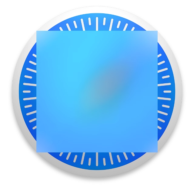
Figure 1-1 shows Safari’s icon rendered with a visual effect view that includes a blur effect, blurring the center of that image.
Discussion
For the purpose of this discussion, I have already added an image view on my view controller. The image is Safari.app’s icon. I have explained the process of extracting this icon in Recipe 19.2, so if you are curious and don’t have any other icon to use on your view controller, you can have a look at the aforementioned section of the book to learn how to extract Safari’s icon (or any other app’s icon for that matter). My view controller looks like Figure 1-2 at the moment.
What I want to do now is add a blurred view on top of this image view. As we learned in the Solution section of this recipe, we are going to create our blur effect and then create a visual effect view on top of our current view, like so:
importUIKitclassViewController:UIViewController{overridefuncviewDidLoad(){super.viewDidLoad()letblurEffect=UIBlurEffect(style:.Light)letblurView=UIVisualEffectView(effect:blurEffect)blurView.frame.size=CGSize(width:200,height:200)blurView.center=view.centerview.addSubview(blurView)}}
The UIBlurEffect class can be
initialized with any of the blur styles that are specified in the
UIBlurEffectStyle enumeration
like so:
enumUIBlurEffectStyle:Int{caseExtraLightcaseLightcaseDark}
In our example code, we used a light blur effect, but you can use
any of the ones just listed. Once you have your blur effect, you can add
it to the UIVisualEffectView class.
This class itself can accept any visual effect of type UIVisualEffect.
Another class of the aforementioned type is the UIVibrancyEffect. This class is very similar
to the UIBlurEffect class, and in
fact under the hood uses a blur effect as well. UIVibrancyEffect brings out the colors on the layers that are behind it. For
instance, if you have a popup window that is about to appear on top of
another view that contains many colorful photos on it, it is best to add
a UIVibrancyEffect to a visual effect
view and construct your popup using this visual effect view. That way,
the colors underneath the popup (colors that come from the photos) will
be more appealing to the user and the user will be able to get a better
understanding of the content under your popup.
1.2. Presenting Temporary Information on the Screen with Popovers
Problem
You want to display a temporary view to the user on the screen and allow them to interact with it. When they are done, this view will need to get dismissed. On an iPad, you would like this information to take up only a bit of the screen real estate, not the whole.
Solution
Use a popup controller of type UIPopoverController and display it on your
view controllers using the presentPopoverFromBarButtonItem:permittedArrowDirections:animated:
method of the popup controller. A popup controller has to originate from
a specific rectangular space on the screen. This is usually a button or
a control on the screen where the user taps and expects to see the
popover. This item could be of type UIBarButtonItem,
in which case you can display the popover using its presentPopoverFromBarButtonItem:permittedArrowDirections:animated:
method. Otherwise, you can display and originate a popover from any
rectangular spot on the screen using the presentPopoverFromRect:permittedArrowDirections:animated:
method.
Discussion
Popovers are used to display temporary information on the screen. They can be used both on regular and on compact size devices such as iPads and iPhones. In this recipe, we want to build an application with a main view controller embedded inside a navigation bar. On the navigation bar we show a plus (+) button which, upon pressing, will display a table view that is populated with 100 items. This table view will be embedded inside its own navigation bar with a Cancel button on it. When the user selects an item in the table view, the popover will be dismissed and the selected item will be passed to the root view controller for processing (see Figure 1-3).

The table view controller has its own class and works with a completion handler. When an item is selected, this controller takes the selected item and passes it to its completion handler. Therefore, processing is very decoupled and it is best to start our implementation of this controller first. Before we begin, we need to define a few handy extensions:
extensionArray{subscript(path:NSIndexPath)->T{returnself[path.row]}}extensionNSIndexPath{classfuncfirstIndexPath()->NSIndexPath{returnNSIndexPath(forRow:0,inSection:0)}}
The first extension retrieves an item from an array using an index path, which is really cool, and the other extension constructs an index path at the first row of the first section to relieve us from doing it manually every time. We will be using these quite soon, so don’t worry if you don’t fully understand their use yet.
Next we are going to define the most useful variables for our table view controller. The most useful one out of all these variables is the array of items that we are going to display to the user in the table view, so they can select one. This is an array of strings and we populate it lazily:
classPopoverTableViewController:UITableViewController{structTableViewValues{staticletidentifier="Cell"}/* This variable is defined as lazy so that its memory is allocatedonly when it is accessed for the first time. If we don't use this variable,no computation is done and no memory is allocated for this variable */lazyvaritems:[String]={varreturnValue=[String]()forcounterin1...100{returnValue.append("Item \(counter)")}returnreturnValue}()varcancelBarButtonItem:UIBarButtonItem!varselectionHandler:((selectedItem:String)->Void!)?<#restofthecode#>}
When the table view is displayed to the user, we will also construct our bar button items and show them on the navigation bar without an animation:
requiredinit(coderaDecoder:NSCoder){super.init(coder:aDecoder)}overrideinit(nibNamenibNameOrNil:String!,bundlenibBundleOrNil:NSBundle!){super.init(nibName:nibNameOrNil,bundle:nibBundleOrNil)tableView.registerClass(UITableViewCell.classForCoder(),forCellReuseIdentifier:TableViewValues.identifier)}overrideinit(style:UITableViewStyle){super.init(style:style)}overridefuncviewDidLoad(){super.viewDidLoad()cancelBarButtonItem=UIBarButtonItem(title:"Cancel",style:.Plain,target:self,action:"performCancel")navigationItem.leftBarButtonItem=cancelBarButtonItem}
When the Cancel button is pressed, we should simply dismiss our controller:
funcperformCancel(){dismissViewControllerAnimated(true,completion:nil)}
And when an item is selected, we will pass the item to our selection handler, which is an optional closure:
overridefunctableView(tableView:UITableView,didSelectRowAtIndexPathindexPath:NSIndexPath){letselectedItem=items[indexPath]selectionHandler?(selectedItem:selectedItem)dismissViewControllerAnimated(true,completion:nil)}
This way the root view controller can become the selection handler and get notified whenever the user has selected an item. As soon as our table view appears on the screen, we will set the preferred size of the popover controller:
overridefuncviewWillAppear(animated:Bool){super.viewWillAppear(animated)preferredContentSize=CGSize(width:300,height:200)}
Last but not least, we will display the items that we have prepared, inside the table view:
overridefunctableView(tableView:UITableView,numberOfRowsInSectionsection:Int)->Int{returnitems.count}overridefunctableView(tableView:UITableView,cellForRowAtIndexPathindexPath:NSIndexPath)->UITableViewCell{letcell=tableView.dequeueReusableCellWithIdentifier(TableViewValues.identifier,forIndexPath:indexPath)asUITableViewCellcell.textLabel.text=items[indexPath]returncell}
Now let’s go to our root view controller and construct an instance of our popover controller. We place it inside a navigation bar so that the popover controller has a place to put the bar button items:
importUIKitclassViewController:UIViewController{varselectedItem:String?lazyvarpopoverContentController:UINavigationController={letcontroller=PopoverTableViewController(style:.Plain)controller.selectionHandler=self.selectionHandlerletnavigationController=UINavigationController(rootViewController:controller)returnnavigationController}()lazyvarpopoverController:UIPopoverController={returnUIPopoverController(contentViewController:self.popoverContentController)}()<#restofthecode#>}
As you saw, the selectionHandler closure of our root view
controller has become the selection handler of the popover controller,
so we can implement this closure like this:
funcselectionHandler(selectedItem:String){self.selectedItem=selectedItem/* Do something with the selected item */}
I’ve left the implementation quite open, as you may want to do
something special with the value that the table view passed to you. For
instance, you may want to display an alert view to the user using what
you have learned in Recipe 1.6. The plus (+) button on
the navigation bar of the root view controller is hooked to a method
named displayPopover: that simply
displays the popover:
@IBActionfuncdisplayPopover(sender:UIBarButtonItem){popoverController.presentPopoverFromBarButtonItem(sender,permittedArrowDirections:.Any,animated:true)}
Please note the permittedArrowDirections parameter of the
presentPopoverFromBarButtonItem:permittedArrowDirections:animated
method of the popover controller. This parameter dictates the direction
of the arrow that originates from the source of the popover. Have
another look at Figure 1-3.
Can you see the arrow that is originating from the plus (+) button? That
is the source of the popover. In this case, the arrow is pointing
upwards towards the button, but you can change this behavior by changing
the value of the permittedArrowDirections parameter of the
aforementioned method to any of the values inside the UIPopoverArrowDirection structure.
See Also
1.3. Displaying Images with UIImageView
Solution
Use the UIImageView
class.
Discussion
The UIImageView is one of the
least-complicated classes in the iOS SDK. As you know, an image view is
responsible for displaying images. There are no tips or tricks involved.
All you have to do is instantiate an object of type UIImageView and add it to your views. Now, I
have a photo of Safari’s icon and I would like to display it in an image
view. Let’s start with our view controller’s implementation file:
importUIKitclassViewController:UIViewController{letimage=UIImage(named:"Safari")varimageView:UIImageViewrequiredinit(coderaDecoder:NSCoder){imageView=UIImageView(image:image)super.init(coder:aDecoder)}}
Go ahead and add the image view to your view controller’s view:
overridefuncviewDidLoad(){super.viewDidLoad()imageView.center=view.centerview.addSubview(imageView)}
Now if we run the app, we will see something similar to Figure 1-4.
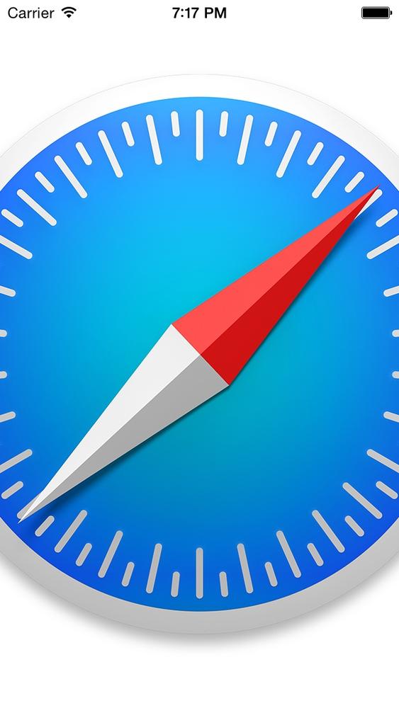
I should mention that the Safari image that I’m loading into this
image view is 512×512 pixels, and as you can see, it certainly doesn’t
fit into the screen. So how do we solve this problem? First, we need to
make sure that we are initializing our image view using the initWithFrame: method, instead of the initWithImage: method, as the latter will set
the width and height of the image view to the exact width and height of
the image. So let’s remedy that first:
importUIKitclassViewController:UIViewController{letimage=UIImage(named:"Safari")varimageView:UIImageView!overridefuncviewDidLoad(){super.viewDidLoad()imageView=UIImageView(frame:view.bounds)imageView.image=imageimageView.center=view.centerview.addSubview(imageView)}}
So how does the app look now? See Figure 1-5.
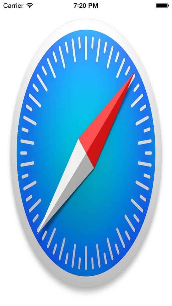
This isn’t really what we wanted to do, is it? Of course, we got
the frame of the image view right, but the way the image is rendered in
the image view isn’t quite right. So what can we do? We can rectify this
by setting the contentMode property
of the image view. This property is of type UIContentMode.
Here is an explanation of some of the most useful values
in the UIViewContentMode enumeration:
UIViewContentModeScaleToFillThis will scale the image inside the image view to fill the entire boundaries of the image view.
UIViewContentModeScaleAspectFitThis will make sure the image inside the image view will have the right aspect ratio and fit inside the image view’s boundaries.
UIViewContentModeScaleAspectFillThis will make sure the image inside the image view will have the right aspect ratio and fill the entire boundaries of the image view. For this value to work properly, make sure that you have set the
clipsToBoundsproperty of the image view totrue.
Note
The clipsToBounds property of
UIView denotes whether the subviews
of that view should be clipped if they go outside the boundaries of
the view. You use this property if you want to be absolutely certain
that the subviews of a specific view will not get rendered outside the
boundaries of that view (or that they do get rendered outside the
boundaries, depending on your requirements).
So to make sure the image fits into the image view’s boundaries
and that the aspect ratio of the image is right, we need to use the
UIViewContentModeScaleAspectFit
content mode:
importUIKitclassViewController:UIViewController{letimage=UIImage(named:"Safari")varimageView:UIImageView!overridefuncviewDidLoad(){super.viewDidLoad()imageView=UIImageView(frame:view.bounds)imageView.contentMode=.ScaleAspectFitimageView.image=imageimageView.center=view.centerview.addSubview(imageView)}}
1.4. Displaying Static Text with UILabel
Problem
You want to display text to your users. You would also like to control the text’s font and color.
Note
Static text is text that is not directly changeable by the user at runtime.
Solution
Use the UILabel class.
Discussion
Labels are everywhere in iOS. You can see them in practically every application, except for games, where the content is usually rendered with OpenGL ES instead of the core drawing frameworks in iOS.
To create a label, instantiate an object of type UILabel. Setting or getting the text of a
label can be done through its text
property. So let’s first define a label in our view controller:
importUIKitclassViewController:UIViewController{varlabel:UILabel!}
Now in the viewDidLoad method,
instantiate the label and tell the runtime where the label has to be
positioned (through its frame property) on the view to which it will be
added (in this case, our view controller’s view):
importUIKitclassViewController:UIViewController{varlabel:UILabel!overridefuncviewDidLoad(){super.viewDidLoad()label=UILabel(frame:CGRect(x:20,y:100,width:100,height:23))label.text="iOS Programming Cookbook"label.font=UIFont.boldSystemFontOfSize(14)view.addSubview(label)}}
Now let’s run our app and see what happens (see Figure 1-6).
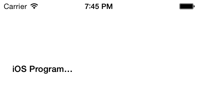
You can see that the contents of the label are truncated, with a
trailing ellipsis, because the width of the label isn’t long enough to
contain the whole contents. One solution would be to make the width
longer, but how about the height? What if we wanted the text to wrap to
the next line? OK, go ahead and change the height from 23.0f to 50.0f:
label=UILabel(frame:CGRect(x:20,y:100,width:100,height:50))
If you run your app now, you will get exactly
the same results that you got in Figure 1-6.
You might ask, “I increased the height, so why didn’t the content wrap
to the next line?” It turns out that the UILabel class has a property called numberOfLines that needs to be adjusted to the
number of lines the label has to wrap the text to, in case it runs out
of horizontal space. If you set this value to 3, it tells the label that
you want the text to wrap to a maximum of three lines if it cannot fit
the text into one line:
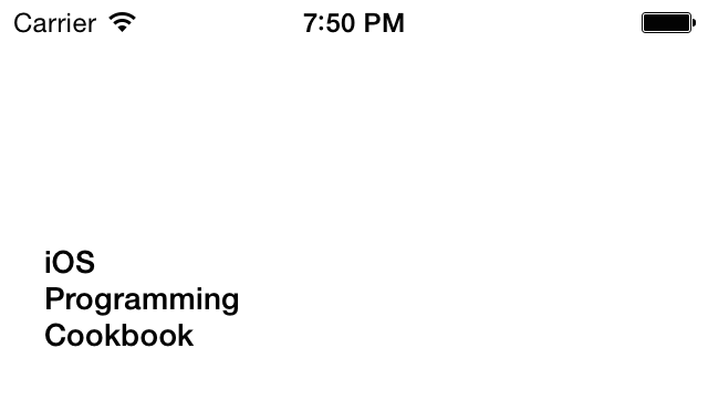
importUIKitclassViewController:UIViewController{varlabel:UILabel!overridefuncviewDidLoad(){super.viewDidLoad()label=UILabel(frame:CGRect(x:20,y:100,width:100,height:70))label.numberOfLines=3label.lineBreakMode=.ByWordWrappinglabel.text="iOS Programming Cookbook"label.font=UIFont.boldSystemFontOfSize(14)view.addSubview(label)}}
If you run the app now, you will get the desired results (see Figure 1-7).
Note
In some situations, you might not know how many lines are
required to display a certain text in a label. In those instances, you
need to set the numberOfLines
property of your label to 0.
If you want your label’s frame to stay static and you want the
font inside your label to adjust itself to fit into the boundaries of
the label, you need to set the adjustsFontSizeToFitWidth property of your
label to true. For instance, if the
height of our label was 23.0f, as we
see in Figure 1-6,
we could adjust the font of the label to fit into the boundaries. Here
is how it works:
importUIKitclassViewController:UIViewController{varlabel:UILabel!overridefuncviewDidLoad(){super.viewDidLoad()label=UILabel(frame:CGRect(x:20,y:100,width:100,height:23))label.adjustsFontSizeToFitWidth=truelabel.text="iOS Programming Cookbook"label.font=UIFont.boldSystemFontOfSize(14)view.addSubview(label)}}
Rich text is a thing of legend! A lot of us programmers have had the requirement to display mixed-style strings in one line of text on our UI. For instance, in one line of text you might have to display straight and italic text together, where one word is italic and the rest of the words are regular text. Or you might have had to underline a word inside a sentence. For this, some of us had to use Web Views, but that is not the optimal solution because Web Views are quite slow in rendering their content, and that will definitely impact the performance of your app.
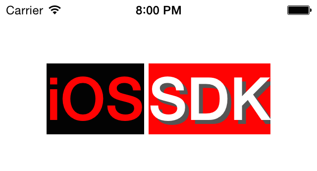
Before we begin, I want to clearly show you what I mean by attributed strings, using Figure 1-8. Then we will set out on the journey to write the program to achieve exactly this.
Note
Just to be explicit, this text is rendered inside a
single instance of the UILabel class.
So what do we see in this example? I’ll list the pieces:
- The text “iOS” with the following attributes:
Bold font with size of 60 points
Background color of black
Font color of red
- The text “SDK” with the following attributes:
Bold font with size of 60 points
White text color
Light-gray shadow
Red background color
The best way to construct attributed strings is to use the
initWithString: method of the mutable
variant of the NSMutableAttributedString class and pass an
instance of the NSString to this
method. This will create our attributed string without any attributes.
Then, to assign attributes to different parts of the string, we will use
the setAttributes:range: method of
the NSMutableAttributedString class.
This method takes in two parameters:
setAttributesA dictionary whose keys are character attributes and the value of each key depends on the key itself. Here are the most important keys that you can set in this dictionary:
NSFontAttributeNameThe value of this key is an instance of
UIFontand defines the font for the specific range of your string.NSForegroundColorAttributeNameThe value for this key is of type
UIColorand defines the color for your text for the specific range of your string.NSBackgroundColorAttributeNameThe value of this key is of type
UIColorand defines the background color on which the specific range of your string has to be drawn.NSShadowAttributeNameThe value of this key must be an instance of the
NSShadowand defines the shadow that you want to use under the specific range of your string.
rangeA value of type
NSRangethat defines the starting point and the length of characters to which you want to apply the attributes.
Note
To see all the different keys that you can pass to this method,
simply browse the Apple documentation online for the NSMutableAttributedString class. I will not
put the direct URL to this documentation here because Apple may change
the URL at some point, but a simple search online will do the
trick.
We’ll break our example down into two dictionaries of attributes. The dictionary of attributes for the word “iOS” can be constructed in this way in code:
letattributesForFirstWord=[NSFontAttributeName:UIFont.boldSystemFontOfSize(60),NSForegroundColorAttributeName:UIColor.redColor(),NSBackgroundColorAttributeName:UIColor.blackColor()]
And the word “SDK” can be constructed using the following attributes:
letshadow=NSShadow()shadow.shadowColor=UIColor.darkGrayColor()shadow.shadowOffset=CGSize(width:4,height:4)letattributesForSecondWord=[NSFontAttributeName:UIFont.boldSystemFontOfSize(60),NSForegroundColorAttributeName:UIColor.whiteColor(),NSBackgroundColorAttributeName:UIColor.redColor(),NSShadowAttributeName:shadow,]
Putting it together, we get the following code that not only creates our label, but also sets its attributed text:
importUIKitclassViewController:UIViewController{varlabel:UILabel!funcattributedText()->NSAttributedString{letstring="iOS SDK"asNSStringletresult=NSMutableAttributedString(string:string)letattributesForFirstWord=[NSFontAttributeName:UIFont.boldSystemFontOfSize(60),NSForegroundColorAttributeName:UIColor.redColor(),NSBackgroundColorAttributeName:UIColor.blackColor()]letshadow=NSShadow()shadow.shadowColor=UIColor.darkGrayColor()shadow.shadowOffset=CGSize(width:4,height:4)letattributesForSecondWord=[NSFontAttributeName:UIFont.boldSystemFontOfSize(60),NSForegroundColorAttributeName:UIColor.whiteColor(),NSBackgroundColorAttributeName:UIColor.redColor(),NSShadowAttributeName:shadow,]/* Find the string "iOS" in the whole string and set its attribute */result.setAttributes(attributesForFirstWord,range:string.rangeOfString("iOS"))/* Do the same thing for the string "SDK" */result.setAttributes(attributesForSecondWord,range:string.rangeOfString("SDK"))returnNSAttributedString(attributedString:result)}overridefuncviewDidLoad(){super.viewDidLoad()label=UILabel()label.backgroundColor=UIColor.clearColor()label.attributedText=attributedText()label.sizeToFit()label.center=CGPoint(x:view.center.x,y:100)view.addSubview(label)}}
1.5. Adding Buttons to the User Interface with UIButton
Solution
Use the UIButton class.
Discussion
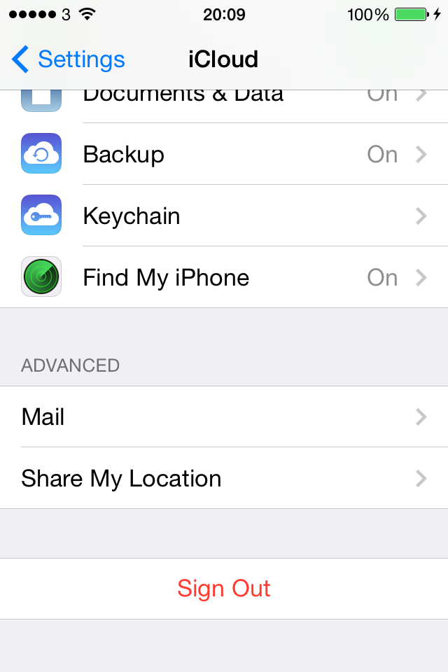
Buttons allow users to initiate an action in your app. For instance, the iCloud Settings bundle in the Settings app presents a Sign Out button, as you can see in Figure 1-9. If you press this button, the iCloud app will take action. The action depends on the app. Not all apps act the same when a Sign Out button is pressed by the user. Buttons can have images in them as well as text, as we will soon see.
A button can assign actions to different triggers. For instance, a button can fire one action when the user puts her finger on the button and another action when she lifts her finger off the button. These become actions, and the objects implementing the actions become targets. Let’s go ahead and define a button in our view controller:
importUIKitclassViewController:UIViewController{varbutton:UIButton!}
Next, we move on to the implementation of the button (Figure 1-10):
importUIKitclassViewController:UIViewController{varbutton:UIButton!funcbuttonIsPressed(sender:UIButton){println("Button is pressed.")}funcbuttonIsTapped(sender:UIButton){println("Button is tapped.")}overridefuncviewDidLoad(){super.viewDidLoad()button=UIButton.buttonWithType(.System)as?UIButtonbutton.frame=CGRect(x:110,y:70,width:100,height:44)button.setTitle("Press Me",forState:.Normal)button.setTitle("I'm Pressed",forState:.Highlighted)button.addTarget(self,action:"buttonIsPressed:",forControlEvents:.TouchDown)button.addTarget(self,action:"buttonIsTapped:",forControlEvents:.TouchUpInside)view.addSubview(button)}}
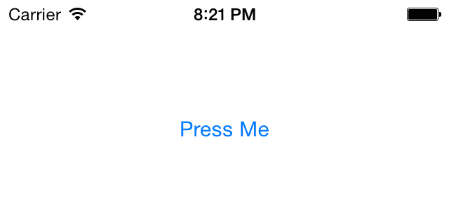
In this example code, we are using the setTitle:forState: method of our button to set
two different titles for the button. The title is the text that gets
displayed on the button. A button can be in different states at
different times—such as normal and highlighted (pressed down)—and can
display a different title in each state. So in this case, when the user
sees the button for the first time, he will read “Press Me.” After he
presses the button, the title of the button will change to “I’m
Pressed.”
We did a similar thing with the actions that the button
fires. We used the addTarget:action:forControlEvents: method to
specify two actions for our button:
An action to be fired when the user presses the button down.
Another action to be fired when the user has pressed the button and has lifted his finger off the button. This completes a touch-up-inside action.
The other thing that you need to know about UIButton is that it must always be assigned a
type, which you do by initializing it with a call to the class method
buttonWithType, as shown in the
example code. As the parameter to this method, pass a value of type
UIButtonType.
A button can also render an image. An image will replace the
default look and feel of the button. When you have an image or a series
of images that you want to assign to different states of a button, make
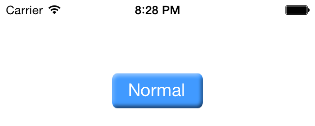
sure your button is of type UIButtonTypeCustom. I have prepared two images
here: one for the normal state of the button and the other for the
highlighted (pressed) state. I will now create my custom button and
assign the two images to it.
importUIKitclassViewController:UIViewController{varbutton:UIButton!overridefuncviewDidLoad(){super.viewDidLoad()letnormalImage=UIImage(named:"NormalBlueButton")lethighlightedImage=UIImage(named:"HighlightedBlueButton")button=UIButton.buttonWithType(.Custom)as?UIButtonbutton.frame=CGRect(x:110,y:70,width:100,height:44)button.setTitle("Normal",forState:.Normal)button.setTitle("Pressed",forState:.Highlighted)button.setBackgroundImage(normalImage,forState:.Normal)button.setBackgroundImage(highlightedImage,forState:.Highlighted)view.addSubview(button)}}
Figure 1-11 shows what the
app looks like when we run it in iOS Simulator. We are using the
setBackgroundImage:forState: method
of the button to set a background image. With a background image, we can
still use the setTitle:forState:
methods to render text on top of the background image. If your images
contain text and you don’t need the title for a button, you can instead
use the setImage:forState: method or
simply remove the titles from the button.
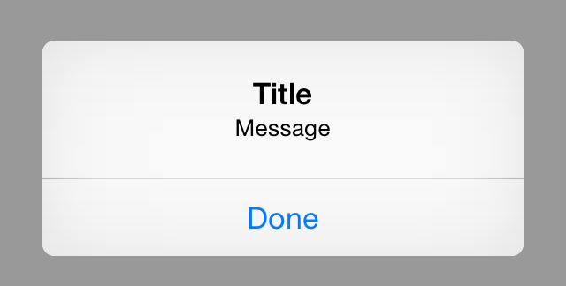
1.6. Displaying Alerts and Action Sheets
Solution
Use the UIAlertController class
to create alert views and action sheets. To get an
understanding of what an alert view looks like, take a look at Figure 1-12.
You can also see an example of an action sheet in Figure 1-13. Both action sheets and alert views can
easily be created using the UIAlertController class. This class provides
you with an instance of UIViewController that you can present on your
own view controllers using the presentViewController:animated:completion:
method of UIViewController.
A few steps are involved in creating a simple alert view or action sheet:
Create an instance of the
UIAlertControllerclass and specify whether you want an alert view or an action sheet.For every action that you want to add to your alert view or action sheet (actions are usually represented by a button), create an instance of the
UIAlertActionclass.Add your
UIAlertActionactions to your alert controller using theaddAction:method of your alert controller.Now that you are all set up, when you are ready to display your alert controller, do so using the
presentViewController:animated:completion:method of your host view controller. The host view controller is the view controller that is a part of your application. Every instance ofUIViewControllerinherits the aforementioned method, so you can use that method to display your alert controller. Bear in mind that as we mentioned before, an alert controller is an instance ofUIViewControlleritself, so you can display it like you would a normal view controller.
Discussion
Let’s have a look at constructing a simple alert view using the alert controller that we talked about. The first thing that we have to do, obviously, is define the variable that will hold our alert controller.
importUIKitclassViewController:UIViewController{varcontroller:UIAlertController?}
Next we are going to start constructing a simple alert view controller using the alert view style:
controller=UIAlertController(title:"Title",message:"Message",preferredStyle:.Alert)
Now that the alert controller is created, we are going to create an action that will simply print out a text to the console when pressed.
letaction=UIAlertAction(title:"Done",style:UIAlertActionStyle.Default,handler:{(paramAction:UIAlertAction!)inprintln("The Done button was tapped")})
The only thing that is left now in order to construct the alert controller is to add the action that we created to the alert controller like so:
controller!.addAction(action)
When our view appears on the screen, we will attempt to present the alert controller, that holds an alert view, to the user:
overridefuncviewDidAppear(animated:Bool){super.viewDidAppear(animated)self.presentViewController(controller!,animated:true,completion:nil)}
So by now, the code for our view controller will look like this:
importUIKitclassViewController:UIViewController{varcontroller:UIAlertController?overridefuncviewDidLoad(){super.viewDidLoad()controller=UIAlertController(title:"Title",message:"Message",preferredStyle:.Alert)letaction=UIAlertAction(title:"Done",style:UIAlertActionStyle.Default,handler:{(paramAction:UIAlertAction!)inprintln("The Done button was tapped")})controller!.addAction(action)}overridefuncviewDidAppear(animated:Bool){super.viewDidAppear(animated)self.presentViewController(controller!,animated:true,completion:nil)}}
Let’s talk a bit about how we constructed our alert controller.
The constructor for UIAlertController
is alertControllerWithTitle:message:preferredStyle.
The title is a simple string that will usually be displayed on top of
the alert or the action view. The message is an optional message that
you would like to display to the user. This message usually appears
under the title. Last but not least is the style of the alert
controller, which you can set to either an alert (.Alert) or an action sheet (.ActionSheet). This style must be of
type UIAlertControllerStyle.
We have now seen how we can construct a simple alert view. There
is one more thing that I would like to show you before we conclude
speaking about alert views, and that is adding text fields to alert
views. Sometimes you want to capture some text in your app from the
user—for instance, their username or some sort of an ID—using a popup
dialog. You can do this easily using the alert controller. All you have
to do is use the addTextFieldWithConfigurationHandler: method
of your alert controller to add a text field to your alert view. Figure 1-14 shows you an example of how an
alert view looks with a text field configured in it.
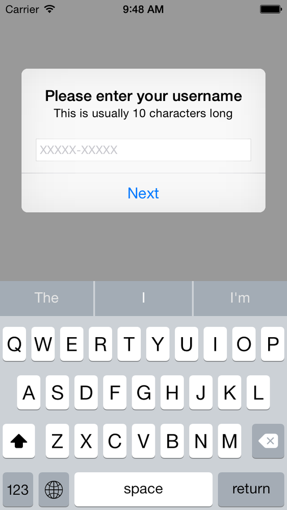
This is how we added the text field to our alert controller:
controller!.addTextFieldWithConfigurationHandler({(textField:UITextField!)intextField.placeholder="XXXXXXXXXX"})
And then, in our action closure that we constructed before, we can
access the text fields in our alert controller using its textFields property. This is an array of text
fields, and we want the text field in the zeroeth place because we have
only one. So the code for the action to our alert view becomes
so:
letaction=UIAlertAction(title:"Next",style:UIAlertActionStyle.Default,handler:{[weakself](paramAction:UIAlertAction!)iniflettextFields=self!.controller?.textFields{lettheTextFields=textFieldsas[UITextField]letuserName=theTextFields[0].textprintln("Your username is \(userName)")}})
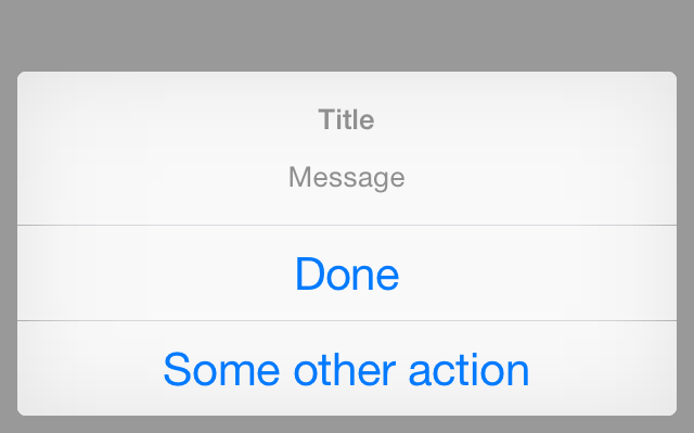
Now let’s have a look at constructing action sheets. Action sheets are also very similar to alert views, but the way in which they appear on the screen is different and they cannot contain text fields in them. They also have a concept of a destructive button that is visually very distinct. A destructive button is a button that usually terminates the alert view or the action sheet by doing something that is irreversible. For instance, if a delete or remove button causes an irreversible action such as losing information previously entered by the user, the button is said to be destructive. Alert views also have destructive buttons, but the way a destructive button is presented in an alert view is not as prominent as in an action sheet.
Now we want to display an action sheet similar to that shown in Figure 1-15.
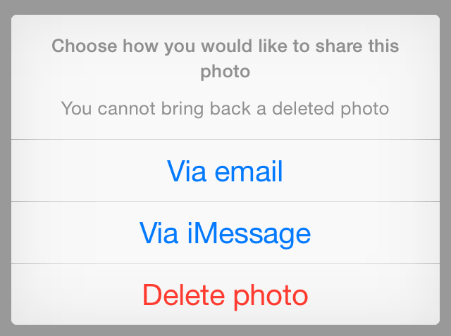
First we will start by creating our alert controller:
controller=UIAlertController(title:"Choose how you would like to share this photo",message:"You cannot bring back a deleted photo",preferredStyle:.ActionSheet)
And then we will create our actions:
letactionEmail=UIAlertAction(title:"Via email",style:UIAlertActionStyle.Default,handler:{(paramAction:UIAlertAction!)in/* Send the photo via email */})letactionImessage=UIAlertAction(title:"Via iMessage",style:UIAlertActionStyle.Default,handler:{(paramAction:UIAlertAction!)in/* Send the photo via iMessage */})letactionDelete=UIAlertAction(title:"Delete photo",style:UIAlertActionStyle.Destructive,handler:{(paramAction:UIAlertAction!)in/* Delete the photo here */})
Once the actions are created, we add them to our alert controller like so:
controller!.addAction(actionEmail)controller!.addAction(actionImessage)controller!.addAction(actionDelete)
Everything is now set up for us to show our alert controller to the user, which we do when our view controller is displayed on the screen:
overridefuncviewDidAppear(animated:Bool){super.viewDidAppear(animated)self.presentViewController(controller!,animated:true,completion:nil)}
See Also
1.7. Creating, Using, and Customizing Switches with UISwitch
Solution
Use the UISwitch class.
Discussion
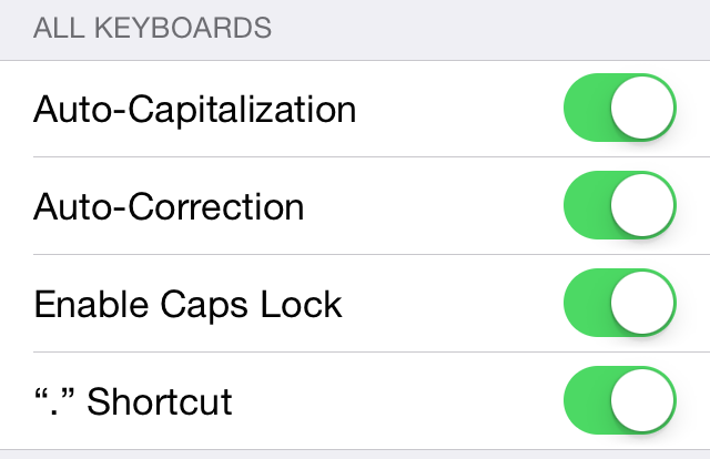
The UISwitch class provides an
On/Off control like the one shown in Figure 1-16 for Auto-Capitalization,
Auto-Correction, and so on.
In order to create a switch, you can either use Interface Builder
or simply create your instance in code. Let’s do it through code. Let’s
create a property of type UISwitch:
importUIKitclassViewController:UIViewController{varmainSwitch:UISwitch!}
We can go ahead now and create our switch:
importUIKitclassViewController:UIViewController{varmainSwitch:UISwitch!overridefuncviewDidLoad(){super.viewDidLoad()mainSwitch=UISwitch(frame:CGRect(x:100,y:100,width:0,height:0))view.addSubview(mainSwitch)}}
So we are allocating an object of type UISwitch and using the initWithFrame: constructor to initialize our
switch. Note that the parameter that we have to pass to this method is
of type CGRect. A CGRect denotes the boundaries of a rectangle using the
(x,y) position of the top-left corner of the
rectangle and its width and height. After we’ve created the switch, we
simply add it to our view controller’s view.
Now let’s run our app on iOS Simulator. Figure 1-17 shows what happens.
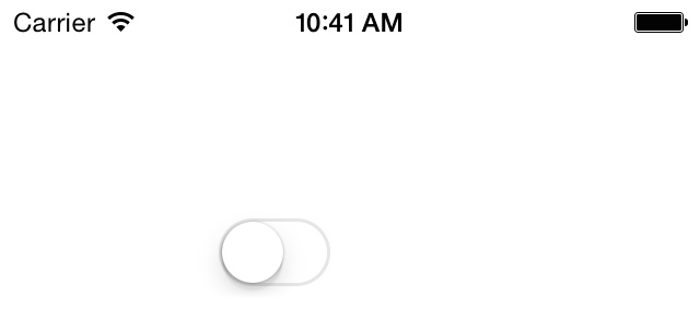
As you can see, the switch’s default state is off. We can change
this by changing the value of the on
property of the switch. Alternatively, you can call the setOn: method on the switch, as shown
here:
mainSwitch.setOn(true,animated:true)
You can prettify the user interaction by using the setOn:animated: method of the switch. The
animated parameter accepts a Boolean
value. If this Boolean value is set to true, the change in the switch’s state (from
on to off or off to on) will be animated, just as if the user were
interacting with it.
Obviously, you can read from the on property of the switch to find out whether
the switch is on or off at the moment. Alternatively, you can use the
isOn method of the switch, as shown
here:
ifmainSwitch.on{/* Switch is on */}else{/* Switch is off */}
If you want to get notified when the switch
gets turned on or off, you will need to add your class as the
target for the switch, using the addTarget:action:forControlEvents: method of UISwitch, as shown here:
mainSwitch.addTarget(self,action:"switchIsChanged:",forControlEvents:.ValueChanged)
Then implement the switchIsChanged: method. When the runtime
calls this method for the UIControlEventValueChanged event of the
switch, it will pass the switch as the parameter to this
method so you can find out which switch fired this event:
funcswitchIsChanged(sender:UISwitch){println("Sender is = \(sender)")ifsender.on{println("The switch is turned on")}else{println("The switch is turned off")}}
There are two main ways of customizing a switch:
- Tint Colors
Tint colors are colors that you can apply to a UI component such as a
UISwitch. The tint color will be applied on top of the current color of the component. For instance, in a normalUISwitch, you will be able to see different colors. When you apply the tint color on top, the normal color of the control will be mixed with the tint color, giving a flavor of the tint color on the UI control.- Images
A switch has two images:
- On Image
The image that represents the on state of the switch. The width of this image is 77 points, and its height is 22.
- Off Image
The image that represents the switch in its off state. This image, like the on state of the switch, is 77 points in width and 22 points in height.
Let’s get started by learning how we can change the tint color of
the switch UI component. This can be achieved by using three important
properties of the UISwitch class.
Each of these properties is of type UIColor.
tintColorThis is the tint color that will be applied to the off state of the switch. Unfortunately, Apple has not taken the time to name this property
offTintColorinstead oftintColorto make it more explicit.thumbTintColorThis is the tint color that will be applied to the little knob on the switch.
onTintColorThis tint color will be applied to the switch in its on state.
Here is a simple code snippet that will change the on-mode tint color of the switch to red, the off-mode tint color to brown, and the knob’s tint color to green. It is not the best combination of colors but will demonstrate what this recipe is trying to explain:
overridefuncviewDidLoad(){super.viewDidLoad()mainSwitch=UISwitch(frame:CGRect(x:100,y:100,width:0,height:0))/* Adjust the off-mode tint color */mainSwitch.tintColor=UIColor.redColor()/* Adjust the on-mode tint color */mainSwitch.onTintColor=UIColor.brownColor()/* Also change the knob's tint color */mainSwitch.thumbTintColor=UIColor.greenColor()view.addSubview(mainSwitch)}
1.8. Picking Values with the UIPickerView
Solution
Use the UIPickerView
class.
Discussion
A picker view is a graphical element that allows you to display a series of values to your users and allow them to pick one. The Timer section of the Clock app on the iPhone is a great example of this (Figure 1-18).
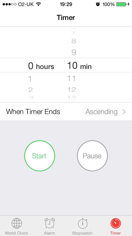
As you can see, this specific picker view has two separate and independent visual elements. One is on the left, and one is on the right. The element on the left is displaying hours (such as 0, 1, 2 hours, etc.) and the one on the right is displaying minutes (such as 10, 11, 12 mins, etc.). These two items are called components. Each component has rows. Any item in any of the components is in fact represented by a row, as we will soon see. For instance, in the left component, “0 hours” is a row, “1” is a row, etc.
Let’s go ahead and create a picker view on our view controller’s view.
importUIKitclassViewController:UIViewController{varpicker:UIPickerView!}
Now let’s create the picker view in the viewDidLoad method of our view
controller:
importUIKitclassViewController:UIViewController{varpicker:UIPickerView!overridefuncviewDidLoad(){super.viewDidLoad()picker=UIPickerView()picker.center=view.centerview.addSubview(picker)}}
It’s worth noting that in this example, we are centering our picker view at the center of our view. When you run this app on the simulator, you will see a blank screen because the picker is white and so is the view controller’s background.
The reason this picker view is showing up as a plain white color
is that we have not yet populated it with any values. Let’s do that. We
do that by specifying a data source for the picker view and then making
sure that our view controller sticks to the protocol that the data
source requires. The data source of an instance of UIPickerView must conform to the UIPickerViewDataSource protocol, so let’s go
ahead and make our view controller conform to this protocol:
classViewController:UIViewController,UIPickerViewDataSource
Good. Let’s now change our code to make sure we select the current view controller as the data source of the picker view:
overridefuncviewDidLoad(){super.viewDidLoad()picker=UIPickerView()picker.dataSource=selfpicker.center=view.centerview.addSubview(picker)}
After this, if you try to compile your application, you will get
errors from the compiler telling you that you have
not yet implemented some of the methods that the
UIPickerViewDataSource protocol wants
you to implement. The way to fix this is to press Command+Shift+O, type
UIPickerViewDataSource, and press the
Enter key on your keyboard. That will send you to the place in your code
where this protocol is defined. Let’s go and implement them in our view
controller:
funcnumberOfComponentsInPickerView(pickerView:UIPickerView)->Int{ifpickerView==picker{return1}return0}funcpickerView(pickerView:UIPickerView,numberOfRowsInComponentcomponent:Int)->Int{ifpickerView==picker{return10}return0}
So what is happening here? Let’s have a look at what each one of these data source methods expects:
numberOfComponentsInPickerView:This method passes you a picker view object as its parameter and expects you to return an integer, telling the runtime how many components you want that picker view to render.
pickerView:numberOfRowsInComponent:For each component that gets added to a picker view, you will need to tell the system how many rows you want to render in that component. This method passes you an instance of picker view, and you will need to return an integer indicating the number of rows to render for that component.
So in the previous code listing, we are asking the system to display 1 component with only 10 rows for a picker view that we have created before.
Compile and run your application now. Ewww, what is that? Yes,
indeed, we can now see the picker view, but all the items are populated
incorrectly and not with the values that we have in mind. Actually, that
doesn’t have to worry you too much. The reason behind this is that the
picker view knows the number of sections and items that we want to
display but doesn’t precisely know the items we need to show. That is
something that we need to do now, and we do that by providing a delegate
to the picker view. The delegate of an instance of UIPickerView has to conform to the UIPickerViewDelegate protocol and must
implement all the @required methods
of that protocol.
There is only one method in the UIPickerViewDelegate we are interested in: the
pickerView:titleForRow:forComponent:
method. This method will pass you the index of the current section and
the index of the current row in that section for a picker view, and it
expects you to return an instance of NSString. This string will then get rendered for that specific row inside
the component. In here, I would simply like to display the first row as
Row 1, and then continue to Row 2, Row 3, etc., until the end. Remember,
we also have to set the delegate
property of our picker view:
picker!.delegate=self
And now we will handle the delegate method we just learned about:
funcpickerView(pickerView:UIPickerView,titleForRowrow:Int,forComponentcomponent:Int)->String!{return"\(row + 1)"}
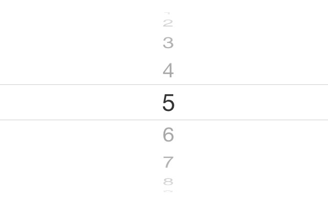
Now let’s run our app and see what happens (Figure 1-19).
Now imagine that you created this picker view in your final
application. What is the use of a picker view if we cannot detect what
the user has actually selected in each one of its components? Well, it’s
good that Apple has already thought of that and given us the
ability to ask the picker view what is selected. Call the selectedRowInComponent: method of a UIPickerView and pass the zero-based index of
a component. The method will return an integer indicating the zero-based
index of the row that is currently selected in that component.
If you need to modify the values in your picker view at runtime,
you need to make sure that your picker view reloads its data from its
data source and delegate. To do that, you can either force all the
components to reload their data, using the reloadAllComponents method, or you can ask a
specific component to reload its data, using the reloadComponent: method and passing the index
of the component that has to be reloaded.
See Also
1.9. Picking the Date and Time with UIDatePicker
Problem
You want to allow the users of your app to select a date and time using an intuitive and ready-made user interface.
Solution
Use the UIDatePicker
class.
Discussion
UIDatePicker is very similar to
the UIPickerView class. The date
picker is in fact a prepopulated picker view. A good example of the
date picker control is in the Calendar app on the iPhone.
Let’s get started by first declaring a property of type UIDatePicker. Then we’ll allocate and
initialize this property and add it to the view of our view
controller:
importUIKitclassViewController:UIViewController{vardatePicker:UIDatePicker!overridefuncviewDidLoad(){super.viewDidLoad()datePicker=UIDatePicker()datePicker.center=view.centerview.addSubview(datePicker)}}
Now let’s run the app and see how it looks in Figure 1-20.
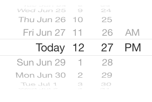
You can see that the date picker, by default, has picked today’s
date. The first thing that we need to know about date pickers is that
they can have different styles or modes. This mode can be changed
through the datePickerMode property,
which is of type UIDatePickerMode.
Depending on what you need, you can set the mode of your date
picker to any of the values listed in the UIDatePickerMode enumeration. I’ll show some of these as we go along.
Now that you have successfully displayed a date picker on the
screen, you can attempt to retrieve its currently selected date using
its date property. Alternatively, you
can call the date method on the date
picker, like so:
letcurrentDate=datePicker.dateprintln(currentDate)
Just like the UISwitch class, a
date picker sends action messages to its targets whenever the user has
selected a different date. To respond to these messages, the receiver
must add itself as the target of the date picker, using the addTarget:action:forControlEvents: method,
like so:
importUIKitclassViewController:UIViewController{vardatePicker:UIDatePicker!funcdatePickerDateChanged(datePicker:UIDatePicker){println("Selected date = \(datePicker.date)")}overridefuncviewDidLoad(){super.viewDidLoad()datePicker=UIDatePicker()datePicker.center=view.centerview.addSubview(datePicker)datePicker.addTarget(self,action:"datePickerDateChanged:",forControlEvents:.ValueChanged)}}
Now, every time the user changes the date, you will get a message from the date picker.
A date picker also lets you set the minimum and the maximum dates
that it can display. For this, let’s first switch our date picker mode
to UIDatePickerModeDate and then,
using the maximumDate and the
minimumDate properties, adjust this
range:
importUIKitclassViewController:UIViewController{vardatePicker:UIDatePicker!overridefuncviewDidLoad(){super.viewDidLoad()datePicker=UIDatePicker()datePicker.center=view.centerview.addSubview(datePicker)letoneYearTime:NSTimeInterval=365*24*60*60lettodayDate=NSDate()letoneYearFromToday=todayDate.dateByAddingTimeInterval(oneYearTime)lettwoYearsFromToday=todayDate.dateByAddingTimeInterval(2*oneYearTime)datePicker.minimumDate=oneYearFromTodaydatePicker.maximumDate=twoYearsFromToday}}
With these two properties, we can then limit the user’s selection on the date to a specific range. In this example code, we limited the user’s input of dates to the range of one year to two years from now.
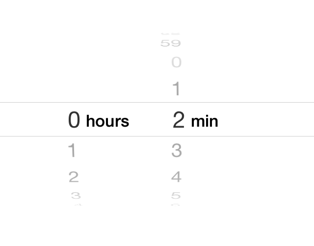
If you want to use the date picker as a countdown timer, you must
set your date picker mode to UIDatePickerModeCountDownTimer and use the
countDownDuration property of the
date picker to specify the default countdown duration. For instance, if
you want to present a countdown picker to the user and set the default
countdown duration to two minutes, write code like this:
importUIKitclassViewController:UIViewController{vardatePicker:UIDatePicker!overridefuncviewDidLoad(){super.viewDidLoad()datePicker=UIDatePicker()datePicker.center=view.centerdatePicker.datePickerMode=.CountDownTimerlettwoMinutes=(2*60)asNSTimeIntervaldatePicker.countDownDuration=twoMinutesview.addSubview(datePicker)}}
The results are shown in Figure 1-21.
1.10. Implementing Range Pickers with UISlider
Problem
You want to allow your users to specify a value within a range, using an easy-to-use and intuitive UI.
Solution
Use the UISlider class.
Discussion
You’ve certainly seen sliders before. Figure 1-22 shows an example.
To create a slider, instantiate an object of type UISlider. Let’s dive right in and create a
slider and place it on our view controller’s view. First, let’s go to the viewDidLoad method and create our slider
component. In this code, we are going to give our slider a range between
0 and 100 and set its default position to be halfway between start and
end.
Note
The range of a slider has nothing to do
with its appearance. We use the range specifiers of a slider to tell
the slider to calculate its value based on the relative position
within the range. For instance, if the range of a slider is provided
as 0 to 100, when the knob on the slider is on the leftmost part, the
value property of the slider is 0,
and if the knob is to the rightmost side of the slider, the value property is 100.
importUIKitclassViewController:UIViewController{varslider:UISlider!overridefuncviewDidLoad(){super.viewDidLoad()slider=UISlider(frame:CGRect(x:0,y:0,width:200,height:23))slider.center=view.centerslider.minimumValue=0slider.maximumValue=100slider.value=slider.maximumValue/2.0view.addSubview(slider)}}
What do the results look like? You can now run the app on the simulator and you’ll get results like those shown in Figure 1-23.
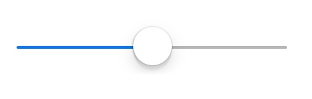
We used a few properties of the slider to get the results we wanted. What were they?
minimumValueSpecifies the minimum value of the slider’s range.
maximumValueSpecifies the maximum value of the slider’s range.
valueThe current value of the slider. This is a read/write property, meaning that you can both read from it and write to it. If you want the slider’s knob to be moved to this value in an animated mode, you can call the
setValue:animated:method of the slider and passtrueas theanimatedparameter.
The little knob on a slider is called the thumb. If you wish to
receive an event whenever the slider’s thumb has moved, you must
add your object as the target of the slider, using the slider’s
addTarget:action:forControlEvents: method:
importUIKitclassViewController:UIViewController{varslider:UISlider!funcsliderValueChanged(slider:UISlider){println("Slider's new value is \(slider.value)")}overridefuncviewDidLoad(){super.viewDidLoad()slider=UISlider(frame:CGRect(x:0,y:0,width:200,height:23))slider.center=view.centerslider.minimumValue=0slider.maximumValue=100slider.value=slider.maximumValue/2.0slider.addTarget(self,action:"sliderValueChanged:",forControlEvents:.ValueChanged)view.addSubview(slider)}}
If you run the application on the simulator now, you will notice
that the sliderValueChanged: target
method gets called whenever and as soon as the
slider’s thumb moves. This might be what you want, but in some cases,
you might need to get notified only after the user has let go of the
thumb on the slider and let it settle. If you want to wait to be
notified, set the continuous property
of the slider to false. This
property, when set to true (its
default value), will call the slider’s targets continuously
while the thumb moves.
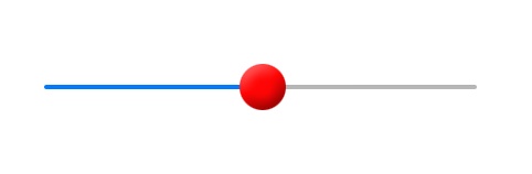
The iOS SDK also gives you the ability to modify how a slider
looks. For instance, the thumb on the slider can have a different image.
To change the image of the thumb, simply use the setThumbImage:forState: method and pass an
image along with a second parameter that can take any of these
values:
UIControlStateNormalThe normal state of the thumb, with no user finger on this component.
UIControlStateHighlightedThe image to display for the thumb while the user is moving her finger on this component.
I have prepared two images: one for the normal state of the thumb and the other one for the highlighted (touched) state of the thumb. Let’s go ahead and add them to the slider:
importUIKitclassViewController:UIViewController{varslider:UISlider!overridefuncviewDidLoad(){super.viewDidLoad()slider=UISlider(frame:CGRect(x:0,y:0,width:200,height:23))slider.center=view.centerslider.minimumValue=0slider.maximumValue=100slider.value=slider!.maximumValue/2.0slider.setThumbImage(UIImage(named:"ThumbNormal"),forState:.Normal)slider.setThumbImage(UIImage(named:"ThumbHighlighted"),forState:.Highlighted)view.addSubview(slider)}}
And now let’s have a look and see how our normal thumb image looks in the simulator (Figure 1-24).
1.11. Grouping Compact Options with UISegmentedControl
Problem
You would like to present a few options to your users from which they can pick an option through a UI that is compact, simple, and easy to understand.
Solution
Use the UISegmentedControl
class, an example of which is shown in Figure 1-25.
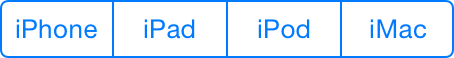
Discussion
A segmented control is a UI component that allows you to display, in a compact UI, a
series of options for the user to choose from. To show a segmented
control, create an instance of UISegmentedControl. First, we will create the
segmented control in the viewDidLoad
method of your view controller:
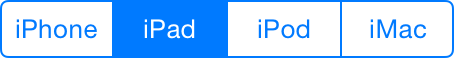
importUIKitclassViewController:UIViewController{varsegmentedControl:UISegmentedControl!overridefuncviewDidLoad(){super.viewDidLoad()letsegments=["iPhone","iPad","iPod","iMac"]segmentedControl=UISegmentedControl(items:segments)segmentedControl.center=view.centerself.view.addSubview(segmentedControl)}}
We are simply using an array of strings to provide the different
options that our segmented control has to display. We initialize our
segmented control using the init constructor
and pass the array of strings and images to the segmented control. The
results will look like what we saw in Figure 1-25.WithObjects:
Now the user can pick one of the options in the segmented control. Let’s say she picked iPad. The segmented control will then change its user interface to show the user the option she has selected, as depicted in Figure 1-26.
Now the question is, how do you recognize when the user selects a
new option in a segmented control? The answer is simple. Just as with a
UISwitch or a UISlider, use the addTarget:action:forControlEvents: method of
the segmented control to add a target to it. Provide the value of
UIControlEventValueChanged for the
forControlEvents parameter, because
that is the event that gets fired when the user selects a new option in
a segmented control:
importUIKitclassViewController:UIViewController{varsegmentedControl:UISegmentedControl!funcsegmentedControlValueChanged(sender:UISegmentedControl){letselectedSegmentIndex=sender.selectedSegmentIndexletselectedSegmentText=sender.titleForSegmentAtIndex(selectedSegmentIndex)println("Segment \(selectedSegmentIndex) with text"+" of \(selectedSegmentText) is selected")}overridefuncviewDidLoad(){super.viewDidLoad()letsegments=["iPhone","iPad","iPod","iMac"]segmentedControl=UISegmentedControl(items:segments)segmentedControl.center=view.centersegmentedControl.addTarget(self,action:"segmentedControlValueChanged:",forControlEvents:.ValueChanged)self.view.addSubview(segmentedControl)}}
If the user starts from the left side and selects each of the options in Figure 1-25, all the way to the right side of the control, the following text will print out to the console:
Segment0withtextofiPhoneisselectedSegment1withtextofiPadisselectedSegment2withtextofiPodisselectedSegment3withtextofiMacisselected
As you can see, we used the selectedSegmentIndex method of the segmented
control to find the index of the currently selected item. If no item is
selected, this method returns the value –1. We also used the titleForSegmentAtIndex: method. Simply pass
the index of an option in the segmented control to this method, and the
segmented control will return the text for that item. Simple, isn’t
it?
As you might have noticed, when the user selects an option in a
segmented control, that option will get selected and
remain selected, as shown in Figure 1-26.
If you want the user to be able to select an option but you want the
button for that option to bounce back to its original shape after it has
been selected (just like a normal button that bounces back up after it
is tapped), you need to set the momentary property of the segmented control to
true:
segmentedControl.momentary=true
One of the really neat features of segmented controls is that they
can contain images instead of text. To do this, simply use the initWithObjects: constructor method of the
UISegmentedControl class and pass the
strings and images that will be used to initialize the segmented
UI control:
importUIKitclassViewController:UIViewController{varsegmentedControl:UISegmentedControl!overridefuncviewDidLoad(){super.viewDidLoad()letsegments=NSArray(objects:"Red",UIImage(named:"blueDot")!,"Green","Yellow")segmentedControl=UISegmentedControl(items:segments)segmentedControl.center=view.centerself.view.addSubview(segmentedControl)}}
Note
In this example, the blueDot file is simply a blue circle image with the dimensions of 32x32@2x and 16x16@1x.
1.12. Presenting Sharing Options with UIActivityViewController
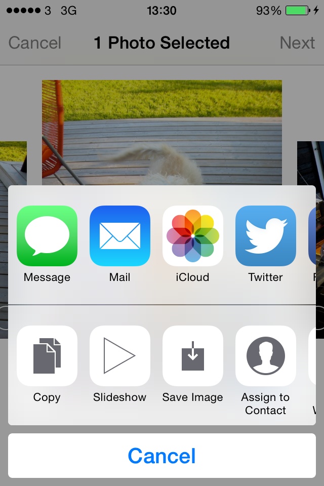
Problem
You want to be able to allow your users to share content inside your apps with their friends via an interface similar to that shown in Figure 1-27 that provides different sharing options available in iOS, such as Facebook and Twitter.
Solution
Create an instance of the UIActivityViewController class and share your
content through this class, as we will see in the Discussion section of
this recipe.
Note
The instances of UIActivityViewController must be presented
modally on the iPhone and inside a popover on an iPad. For more
information about popovers, refer to Recipe 1.2.
Discussion
There are many sharing options inside iOS, all built into the core of the OS. For instance, Facebook and Twitter integration is an integral part of the core of iOS, and you can share pretty much any content from anywhere you want. Third-party apps like ours can also use all the sharing functionalities available in iOS without having to think about the low-level details of these services and how iOS provides these sharing options. The beauty of this whole thing is that you mention what you want to share, and iOS will pick the sharing options that are capable of handling those items. For instance, if you want to share images and text, iOS will display many more items to you than if you want to share an audio file.
Sharing data is very easy in iOS. All you have to do is
instantiate the UIActivityViewController class using its
initWithActivityItems:applicationActivities:
constructor. Here are the parameters to this method:
initWithActivityItemsThe array of items that you want to share. These can be instances of
NSString,UIImage, or instances of any of your custom classes that conform to theUIActivityItemSourceprotocol. We will talk about this protocol later in detail.applicationActivitiesAn array of instances of
UIActivitythat represent the activities that your own application supports. For instance, you can indicate here whether your application can handle its own sharing of images and strings. We will not go into detail about this parameter for now and will simply passnilas its value, telling iOS that we want to stick to the system sharing options.
So let’s say that you have a text field where the user can enter
text to be shared, and a Share button near it. When the user presses the
Share button, you will simply pass the text of the text field to your
instance of the UIActivityViewController class. We are writing
this code for iPhone, so we will present our activity view controller as
a modal view controller.
Because we are putting a text field on our view controller, we
need to make sure that we are handling its delegate messages, especially
the textFieldShouldReturn: method of
the UITextFieldDelegate protocol.
Therefore, we are going to elect our view controller as
the delegate of the text field. Also, we are going to attach an action
method to our Share button. When the button is tapped, we want to make
sure there is something in the text field to share. If there isn’t, we
will simply display an alert to the user telling him why we cannot share
the content of the text field. If there is some text in the text field,
we will pop up an instance of the UIActivityViewController class.
We start off with writing two methods for our view controller, each of which is able to create one of our UI components and place it on our view controller’s view. One will create the text field, and the other will create the button next to it:
importUIKitclassViewController:UIViewController,UITextFieldDelegate{vartextField:UITextField!varbuttonShare:UIButton!funccreateTextField(){textField=UITextField(frame:CGRect(x:20,y:35,width:280,height:30))textField.borderStyle=.RoundedRect;textField.placeholder="Enter text to share..."textField.delegate=selfview.addSubview(textField)}funccreateButton(){buttonShare=UIButton.buttonWithType(.System)as?UIButtonbuttonShare.frame=CGRect(x:20,y:80,width:280,height:44)buttonShare.setTitle("Share",forState:.Normal)buttonShare.addTarget(self,action:"handleShare:",forControlEvents:.TouchUpInside)view.addSubview(buttonShare)}}
When we are done with that, we just have to call these two methods
in the viewDidLoad method of our view
controller. This will allow the UI components to be placed on the view
of our view controller:
overridefuncviewDidLoad(){super.viewDidLoad()createTextField()createButton()}
In the textFieldShouldReturn:
method, all we do is dismiss the keyboard in order to resign the text
field’s active state. This simply means that when a user has been
editing the text field and then presses the Return or Enter key on the
keyboard, the keyboard should be dismissed. Bear in mind that the
createTextField method that we just
coded has set our view controller as the delegate of the text field. So
we have to implement the aforementioned method as follows:
functextFieldShouldReturn(textField:UITextField!)->Bool{textField.resignFirstResponder()returntrue}
Last but not least is the handler method of our button. As you
saw, the createButton method creates
the button for us and elects the handleShare: method to handle the touch down
inside action of the button. So let’s code this method:
funchandleShare(sender:UIButton){if(textField.text.isEmpty){letmessage="Please enter a text and then press Share"letalertController=UIAlertController(title:nil,message:message,preferredStyle:.Alert)alertController.addAction(UIAlertAction(title:"OK",style:.Default,handler:nil))presentViewController(alertController,animated:true,completion:nil)return}/* it is VERY important to cast your strings to NSStringotherwise the controller cannot display the appropriate sharing options */activityViewController=UIActivityViewController(activityItems:[textField.textasNSString],applicationActivities:nil)presentViewController(activityViewController,animated:true,completion:{})}
Note
If you want to present sharing options for textual items, you
need to ensure that your strings are typecast to strings of type NSString.
Swift’s string of type String
cannot be handled by an activity view controller.
Now if you run the app, enter some text in the text field, and then press the Share button, you will see something similar to Figure 1-28.
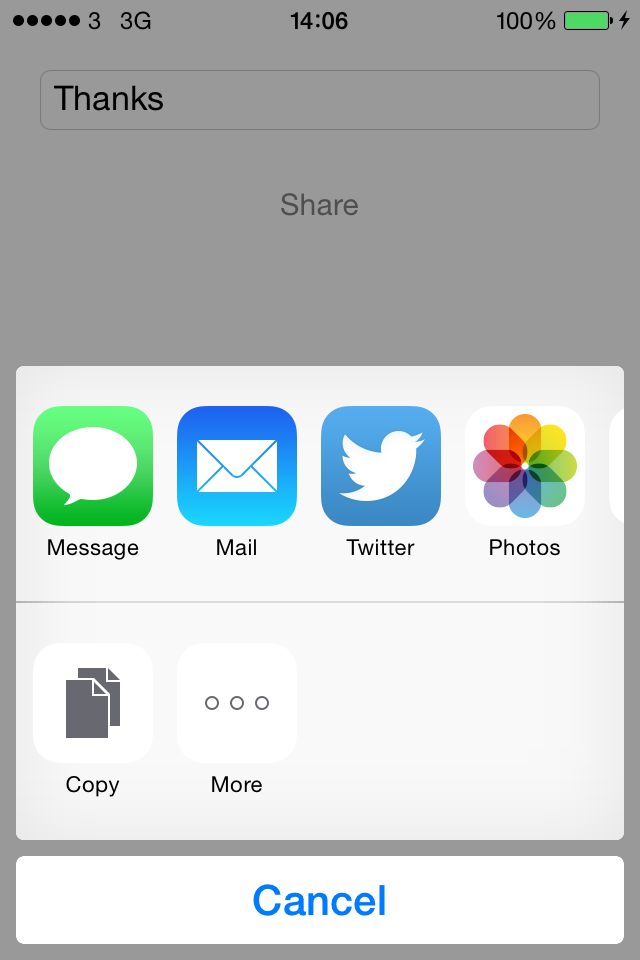
You can also have sharing options displayed as soon as your view
controller is displayed on the screen. The viewDidAppear method of your view controller
will be called when the view of your view controller is displayed on the
screen and is guaranteed to be in the view hierarchy of your app,
meaning that you can now display other views on top of your view
controller’s view.
Warning
Do not attempt to present the activity view controller in the
viewDidLoad method of your view
controller. At that stage in the app, your view controller’s view is
still not attached to the view hierarchy of the application, so
attempting to present a view controller on the view will not work.
Your view must be present in the hierarchy of the views for your modal
views to work.
For this reason, you need to present the sharing view controller
in the viewDidAppear method of your
view controller.
See Also
1.13. Presenting Custom Sharing Options with UIActivityViewController
Problem
You want your app to participate in the list of apps that can handle sharing in iOS and appear in the list of available activities displayed in the activity view controller (see Figure 1-27).
For example, you might need something like this if you have a text-editing app and you want a custom item that says “Archive” to appear in the activity view controller when the user presses the Share button. When the user presses the Archive button, the text inside your app’s editing area will get passed to your custom activity, and your activity can then archive that text on the iOS device.
Solution
Create a class of type UIActivity. In other words, subclass the
aforementioned class and give a name (whatever you like) to your new
class. Instances of the subclasses of this class can be passed to the
initWithActivityItems:applicationActivities:
constructor of the UIActivityViewController class, and if they
implement all the required methods of the UIActivity class, iOS will display them in the activity view controller.
Discussion
The initWithActivityItems:applicationActivities:
method’s first parameter accepts values of different types. These values
can be strings, numbers, images, etc.—any object, really. When you
present an activity controller with an array of arbitrary objects passed
to the initWithActivityItems
parameter, iOS will go through all the available system activities, like
Facebook and Twitter, and ask the user to pick an activity that suits
her needs best. After the user picks an activity, iOS will pass the
type of the objects in your array to the registered
system activity that the user picked. Those activities can then check
the type of the objects you are trying to share and decide whether they
can handle those objects or not. They communicate this to iOS through a
specific method that they will implement in their classes.
So let’s say that we want to create an activity that can reverse
any number of strings that are handed to it. Remember that when your app
initializes the activity view controller through the initWithActivityItems:applicationActivities:
method, it can pass an array of arbitrary objects to the first parameter
of this method. So our activity is going to peek at all these objects in
this arbitrary array, and if they are all strings, it is going to
reverse them and then display all the reversed strings in the
console.
Subclass
UIActivityas shown here:
importUIKitclassStringReverserActivity:UIActivity{/*This will aggregate all the activity items that are acceptable by us.We will be passed an array of various class types and we will go throughthem all and only select the string items and put them in this array.*/varactivityItems=[NSString]()}
Next, override the
activityTypemethod of your activity. The return value of this method is an object of typeNSStringthat is a unique identifier of your activity. This value will not be displayed to the user and is just for iOS to keep track of your activity’s identifier. There are no specific values that you are asked to return from this method and no guidelines available from Apple, but we will follow the reverse-domain string format and use our app’s bundle identifier and append the name of our class to the end of it. So if our bundle identifier is equal tocom.pixolity.ios.cookbook.myappand our class name isStringReverserActivity, we will returncom.pixolity.ios.cookbook.myapp.StringReverserActivityfrom this method, like so:
overridefuncactivityType()->String{returnNSBundle.mainBundle().bundleIdentifier!+".StringReverserActivity"}
The next method to override is the
activityTitlemethod, which should return a string to be displayed to the user in the activity view controller. Make sure this string is short enough to fit into the activity view controller:
overridefuncactivityTitle()->String{return"Reverse String"}
The next method is
activityImage, which has to return an instance ofUIImagethat gets displayed in the activity view controller. Make sure that you provide both Retina and non-Retina versions of the image for both iPad and iPhone/iPod. The iPad Retina image has to be 110×110 pixels and the iPhone Retina image has to be 86×86 pixels. Obviously, divide these dimensions by 2 to get the width and the height of the non-Retina images. iOS uses only the alpha channel in this image, so make sure your image’s background is transparent and that you illustrate your image with the color white or the color black. I have already created an image in my app’s image assets section, and I’ve named the image “Reverse,” as you can see in Figure 1-29. Here is our code, then:
overridefuncactivityImage()->UIImage{returnUIImage(named:"Reverse")!}
Implement the
canPerformWithActivityItems:method of your activity. This method’s parameter is an array that will be set when an array of activity items is passed to the constructor of the activity view controller. Remember, these are objects of arbitrary type. The return value of your method will be a Boolean indicating whether you can perform your actions on any of the given items or not. For instance, our activity can reverse any number of strings that it is given. So if we find one string in the array, that is good enough for us because we know we will later be able to reverse that string. If we are given an array of 1,000 objects that contains only 2 strings, we will still accept it. But if we are given an array of 1,000 objects, none of which are of our acceptable type, we will reject this request by returningfalsefrom this method:
overridefunccanPerformWithActivityItems(activityItems:[AnyObject])->Bool{forobject:AnyObjectinactivityItems{ifobjectisString{returntrue}}returnfalse}
Now implement the
prepareWithActivityItems:method of your activity, whose parameter is of typeNSArray. This method gets called if you returnedtruefrom thecanPerformWithActivityItems:method. You have to retain the given array for later use or you may choose to retain only the objects that you need in this array, such as the string objects. You may choose to retain only the objects you need in this array, such as the string objects.
overridefuncprepareWithActivityItems(paramActivityItems:[AnyObject]){forobject:AnyObjectinparamActivityItems{ifobjectisString{activityItems.append(objectasString)}}}
Last but not least, you need to implement the
performActivitymethod of your activity, which gets called when iOS wants you to actually perform your actions on the list of previously-provided arbitrary objects. In this method, basically, you have to perform your work. In our activity, we are going to go through the array of string objects that we extracted from this arbitrary array, reverse all of them, and display them in the console. You can come up with a better way of displaying these items or doing something more useful with them perhaps. But for the purpose of this recipe, we are simply going to display them in the console.
funcreverseOfString(string:NSString)->NSString{varresult=""varcharacters=[Character]()forcharacterinstringasString{characters.append(character)}forcharacterincharacters.reverse(){result+="\(character)"}returnresult}overridefuncperformActivity(){varreversedStrings=""forstringinactivityItems{reversedStrings+=reverseOfString(string)+"\n"}/* Do whatever you need to do with all thesereversed strings */println(reversedStrings)}
We are done with the implementation of our activity class. Now let’s go to our view controller’s implementation file and display the activity view controller with our custom activity in the list:
importUIKitclassViewController:UIViewController{overridefuncviewDidAppear(animated:Bool){super.viewDidAppear(animated)letitemsToShare=["Item 1"asNSString,"Item 2"asNSString,"Item 3"asNSString]letactivityController=UIActivityViewController(activityItems:itemsToShare,applicationActivities:[StringReverserActivity()])presentViewController(activityController,animated:true,completion:nil)}}
When the app runs for the first time, you will see something similar to Figure 1-30 on the screen.
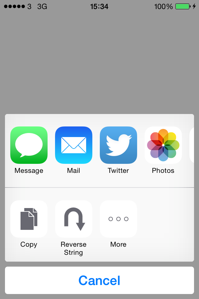
See Also
1.14. Displaying an Image on a Navigation Bar
Problem
You want to display an image instead of text as the title of the current view controller on the navigation controller.
Solution
Use the titleView property of
the view controller’s navigation item:
importUIKitclassViewController:UIViewController{overridefuncviewDidLoad(){super.viewDidLoad()/* Create an Image View to replace the Title View */letimageView=UIImageView(frame:CGRect(x:0,y:0,width:100,height:40))imageView.contentMode=.ScaleAspectFitletimage=UIImage(named:"Logo")imageView.image=image/* Set the Title View */navigationItem.titleView=imageView}}
Note
The preceding code must be executed in a view controller that is placed inside a navigation controller.
I have already loaded an image into my project’s assets group and named it “Logo.” When you run this app with the given code snippet, you’ll see something similar to that shown in Figure 1-31.
Discussion
The navigation item of every view controller can display two types of content in the title area of the view controller to which it is assigned:
Simple text
A view
If you want to use text, you can use the title property of the navigation item.
However, if you want more control over the title or if you simply want
to display an image or any other view on the navigation bar, you can use
the titleView property of the
navigation item of a view controller. You can assign any object that is
a subclass of the UIView
class. In our example, we created an image view and assigned an image to
it. Then we displayed it as the title of the current view controller on
the navigation controller.
The titleView property of the
navigation bar is just a simple view, but Apple recommends that you
limit the height of this view to no more than 128 points. So think about
it in terms of the image. If you are loading an image that is 128
pixels in height, that will translate to 64 points on a Retina
display, so in that case you are fine. But if you are loading
an image that is 300 pixels in height, on a Retina display, that will
translate to 150 points in height, so you’ll be well over the 128-point
limit that Apple recommends for the title bar view height. To remedy
this situation, you need to ensure that your title view is never taller
than 128 points height-wise and set the view’s content mode to fill the
view, instead of stretching the view to fit the content. This can be
done by setting the contentMode
property of your title bar view to UIViewContentModeScaleAspectFit.
1.15. Adding Buttons to Navigation Bars Using UIBarButtonItem
Solution
Use the UIBarButtonItem
class.
Discussion
A navigation bar can contain different items. Buttons are often
displayed on the left and the right sides. These buttons are of class
UIBarButtonItem and can take many
different shapes and forms. Let’s have a look at an example in Figure 1-32.
Navigation bars are of class UINavigationBar and can be created at any time and added to any view. Just
look at all the different buttons with different shapes that have been
added to the navigation bar in Figure 1-32. The ones
on the top right have up and down arrows, and the one on the top left
has an arrow pointing to the left. We will have a look at creating some
of these buttons in this recipe.
In order to create a navigation button, we must do the following:
Create an instance of
UIBarButtonItem.Add that button to the navigation bar of a view controller using the view controller’s
navigationItemproperty. ThenavigationItemproperty allows us to interact with the navigation bar. This property has two properties:rightBarButtonItemandleftBarButtonItem. Both of these properties are of typeUIBarButtonItem.
Let’s have a look at an example where we add a button to the right side of our navigation bar. In this button, we will display the text “Add”:
importUIKitclassViewController:UIViewController{funcperformAdd(sender:UIBarButtonItem){println("Add method got called")}overridefuncviewDidLoad(){super.viewDidLoad()navigationItem.rightBarButtonItem=UIBarButtonItem(title:"Add",style:.Plain,target:self,action:"performAdd:")}}
Now when we run our app we will see something similar to Figure 1-33.
That was easy. But if you are an iOS user, you have probably noticed that the system apps that come preconfigured on iOS have a different Add button. Figure 1-34 shows an example in the Alarm section of the Clock app on the iPhone (notice the + button on the top right of the navigation bar).
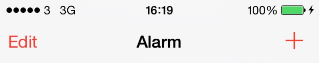
It turns out that the iOS SDK allows us to create
system buttons on the navigation bar. We do that by
using the initWithBarButtonSystemItem:target:action:
constructor of the UIBarButtonItem
class:
importUIKitclassViewController:UIViewController{funcperformAdd(sender:UIBarButtonItem){println("Add method got called")}overridefuncviewDidLoad(){super.viewDidLoad()navigationItem.rightBarButtonItem=UIBarButtonItem(barButtonSystemItem:.Add,target:self,action:"performAdd:")}}
And the results are exactly what we were looking for (Figure 1-35).
The first parameter of the initWithBarButtonSystemItem:target:action:
constructor method of the navigation button can have any of the
values listed in the UIBarButtonSystemItem enumeration.
One of the really great constructors of the UIBarButtonItem class is the initWithCustomView: method. As its parameter,
this method accepts any view. This means we can even add a UISwitch (see
Recipe 1.7) as a
button on the navigation bar. This won’t look very good, but let’s give
it a try:
importUIKitclassViewController:UIViewController{funcswitchIsChanged(sender:UISwitch){ifsender.on{println("Switch is on")}else{println("Switch is off")}}overridefuncviewDidLoad(){super.viewDidLoad()letsimpleSwitch=UISwitch()simpleSwitch.on=truesimpleSwitch.addTarget(self,action:"switchIsChanged:",forControlEvents:.ValueChanged)self.navigationItem.rightBarButtonItem=UIBarButtonItem(customView:simpleSwitch)}}
And Figure 1-36 shows the results.
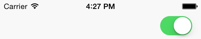
You can create pretty amazing navigation bar buttons. Just take a look at what Apple has done with the up and down arrows on the top-right corner of Figure 1-32. Let’s do the same thing, shall we? Well, it looks like the button actually contains a segmented control (see Recipe 1.11). So we should create a segmented control with two segments, add it to a navigation button, and finally place the navigation button on the navigation bar. Let’s get started:
importUIKitclassViewController:UIViewController{letitems=["Up","Down"]funcsegmentedControlTapped(sender:UISegmentedControl){ifsender.selectedSegmentIndex<items.count{println(items[sender.selectedSegmentIndex])}else{println("Unknown button is pressed")}}overridefuncviewDidLoad(){super.viewDidLoad()letsegmentedControl=UISegmentedControl(items:items)segmentedControl.momentary=truesegmentedControl.addTarget(self,action:"segmentedControlTapped:",forControlEvents:.ValueChanged)navigationItem.rightBarButtonItem=UIBarButtonItem(customView:segmentedControl)}}
And Figure 1-37 shows what the output looks like.
The navigationItem of every
view controller also has two very interesting methods:
setRightBarButtonItem:animated:Sets the navigation bar’s right button.
setLeftBarButtonItem:animated:Sets the navigation bar’s left button.
Both methods allow you to specify whether you want the placement
to be animated. Pass the value of true to the animated parameter if you want the placement
to be animated. Here is an example:
letrightBarButton=UIBarButtonItem(customView:segmentedControl)navigationItem.setRightBarButtonItem(rightBarButton,animated:true)
See Also
1.16. Accepting User Text Input with UITextField
Solution
Use the UITextField
class.
Discussion
A text field is very much like a label in that it can display text, but a text field can also accept text entry at runtime.
Note
A text field allows only a single line of text to be input/displayed. As a result, the default height of a text field is system defined. In Interface Builder, this height cannot be modified, but if you are creating your text field in code, you can change the text field’s height. A change in height, though, will not change the number of lines you can render in a text field, which is always 1.
Let’s start to define our text field:
importUIKitclassViewController:UIViewController{vartextField:UITextField!}
And then let’s create the text field:
importUIKitclassViewController:UIViewController{vartextField:UITextField!overridefuncviewDidLoad(){super.viewDidLoad()textField=UITextField(frame:CGRect(x:0,y:0,width:200,height:31))textField.borderStyle=.RoundedRecttextField.contentVerticalAlignment=.CentertextField.textAlignment=.CentertextField.text="Sir Richard Branson"textField.center=view.centerview.addSubview(textField)}}
Before looking at the details of the code, let’s first have a look at the results (Figure 1-38).
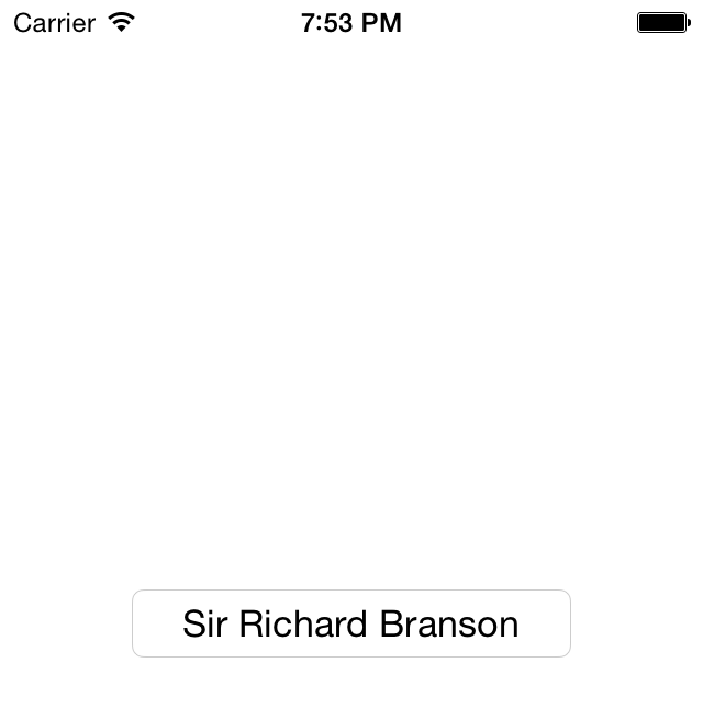
In order to create this text field, we used various properties of
UITextField.
borderStyleThis property is of type
UITextBorderStyleand specifies how the text field should render its borders.contentVerticalAlignmentThis value is of type
UIControlContentVerticalAlignmentand tells the text field how the text should appear, vertically, in the boundaries of the control. If we didn’t center the text vertically, it would appear on the top-left corner of the text field by default.textAlignmentThis property is of type
NSTextAlignmentand specifies the horizontal alignment of the text in a text field. In this example, we centered the text horizontally.textThis is a read/write property: you can both read from it and write to it. Reading from it will return the text field’s current text, and writing to it will set the text field’s text to the value that you specify.
A text field sends delegate messages to its delegate object. These
messages get sent, for instance, when the user starts editing the text
inside a text field, when the user enters any character into the text
field (changing its contents in any way), and when the user finishes
editing the field (by leaving the field). To get notified of these
events, set the delegate property of
the text field to your object. The delegate of a text field must conform
to the UITextFieldDelegate protocol, so let’s first
take care of this:
importUIKitclassViewController:UIViewController,UITextFieldDelegate{<#therestofyourcodegoeshere#>}
Hold down the Command key on your computer and click the UITextFieldDelegate protocol in Xcode. You
will see all the methods that this protocol gives you control over. Here
are those methods with descriptions of when they get called:
textFieldShouldBeginEditing:A method that returns a
BOOLtelling the text field (the parameter to this method) whether it should start getting edited by the user or not. Returnfalseif you don’t want the user to edit your text field. This method gets fired as soon as the user taps on the text field with the goal of editing its content (assuming the text field allows editing).textFieldDidBeginEditing:Gets called when the text field starts to get edited by the user. This method gets called when the user has already tapped on the text field and the
textFieldShouldBeginEditing:delegate method of the text field returnedtrue, telling the text field it is OK for the user to edit the content of the text field.textFieldShouldEndEditing:Returns a
BOOLtelling the text field whether it should end its current editing session or not. This method gets called when the user is about to leave the text field or the first responder is switching to another data entry field. If you returnfalsefrom this method, the user will not be able to switch to another text entry field, and the keyboard will stay on the screen.textFieldDidEndEditing:Gets called when the editing session of the text field ends. This happens when the user decides to edit some other data entry field or uses a button provided by the supplier of the app to dismiss the keyboard shown for the text field.
textField:shouldChangeCharactersInRange:replacementString:Gets called whenever the text inside the text field is modified. The return value of this method is a Boolean. If you return
true, you say that you allow the text to be changed. If you returnfalse, the change in the text of the text field will not be confirmed and will not happen.textFieldShouldClear:Each text field has a clear button that is usually a circular X button. When the user presses this button, the contents of the text field will automatically get erased. We need to manually enable the clear button, though. If you have enabled the clear button and you return
falseto this method, that gives the user the impression that your app isn’t working, so make sure you know what you are doing. It is a very poor user experience if the user sees a clear button and presses it but doesn’t see the text in the text field get erased.textFieldShouldReturn:Gets called when the user has pressed the Return/Enter key on the keyboard, trying to dismiss the keyboard. You should assign the text field as the first responder in this method.
Let’s mix this recipe with Recipe 1.4 and create a dynamic text label under our text field. We’ll also display the total number of characters entered in our text field in the label.
importUIKitclassViewController:UIViewController,UITextFieldDelegate{vartextField:UITextField!varlabel:UILabel!}
We skip implementing many of the UITextFieldDelegate methods, because we don’t
need all of them in this example:
importUIKitclassViewController:UIViewController,UITextFieldDelegate{vartextField:UITextField!varlabel:UILabel!funccalculateAndDisplayTextFieldLengthWithText(text:String){varcharacterOrCharacters="Character"ifcountElements(text)!=1{characterOrCharacters+="s"}letstringLength=countElements(text)label.text="\(stringLength) \(characterOrCharacters)"}functextField(paramTextField:UITextField,shouldChangeCharactersInRangerange:NSRange,replacementStringstring:String)->Bool{lettext=paramTextField.textasNSStringletwholeText=text.stringByReplacingCharactersInRange(range,withString:string)calculateAndDisplayTextFieldLengthWithText(wholeText)returntrue}functextFieldShouldReturn(paramTextField:UITextField)->Bool{paramTextField.resignFirstResponder()returntrue}overridefuncviewDidLoad(){super.viewDidLoad()textField=UITextField(frame:CGRect(x:38,y:30,width:220,height:31))textField.delegate=selftextField.borderStyle=.RoundedRecttextField.contentVerticalAlignment=.CentertextField.textAlignment=.CentertextField.text="Sir Richard Branson"view.addSubview(textField)label=UILabel(frame:CGRect(x:38,y:61,width:220,height:31))view.addSubview(label)calculateAndDisplayTextFieldLengthWithText(textField.text)}}
One important calculation we are doing takes place in the textField:shouldChangeCharactersInRange:replacementString:
method. There, we declare and use a variable called wholeText. When this method gets called, the
replacementString parameter specifies
the string that the user has entered into the text field. You might be
thinking that the user can enter only one character at a time, so why
can’t this field be a char? But don’t
forget that the user can paste a whole chunk of text into a text field,
so this parameter needs to be a string. The shouldChangeCharactersInRange parameter
specifies where, in terms of location inside the text field’s text, the
user is entering the text. So using these two parameters, we will create
a string that first reads the whole text inside the text field and then
uses the given range to place the new text inside the old text. With
this, we will come up with the text that will appear in the text field
after the textField:shouldChangeCharactersInRange:replacementString:
method returns true. Figure 1-39 shows how
our app looks when it gets run on the simulator.
In addition to displaying text, a text field can also display a
placeholder. A placeholder is the text displayed before the
user has entered any text in the text field, while the text field’s text
property is empty. This can be any string that you wish, and setting it
will help give the user an indication as to what this text field is for.
Many use this placeholder to tell the user what type of value she can
enter in that text field. You can use the placeholder property of the text field to set
or get the current placeholder. Here is an example:
importUIKitclassViewController:UIViewController{vartextField:UITextFieldoverridefuncviewDidLoad(){super.viewDidLoad()textField=UITextField(frame:CGRect(x:38,y:30,width:220,height:31))textField.borderStyle=.RoundedRecttextField.contentVerticalAlignment=.CentertextField.textAlignment=.CentertextField.placeholder="Enter your text here..."view.addSubview(textField)}}
The results are shown in Figure 1-40.
Text fields have two really neat properties called leftView and rightView. These two properties are of type
UIView and are read/write. They
appear, as their names imply, on the left and the right side of a text
field if you assign a view to them. One place you might use a left view,
for instance, is if you are displaying a currency text field where you
would like to display the currency of the user’s current country in the
left view as a UILabel. Here is
how we can accomplish that:
letcurrencyLabel=UILabel(frame:CGRectZero)currencyLabel.text=NSNumberFormatter().currencySymbolcurrencyLabel.font=theTextField.fontcurrencyLabel.textAlignment=.RightcurrencyLabel.sizeToFit()/* Give more width to the label so that it aligns properly on thetext field's left view when the label's text itself is right aligned*/currencyLabel.frame.size.width+=10theTextField.leftView=currencyLabeltheTextField.leftViewMode=.Alwaysview.addSubview(theTextField)
If we simply assign a view to the leftView or to the rightView properties of a text field, those
views will not appear automatically by default. When they show up on the
screen depends on the mode that governs their appearance, and you can
control that mode using the leftViewMode and rightViewMode properties, respectively. These
modes are of type UITextFieldViewMode.
So if, for instance, you set the left view mode to UITextFieldViewModeWhileEditing and assign a
value to it, it will appear only while the user is editing the text
field. Conversely, if you set this value to UITextFieldViewModeUnlessEditing, the left
view will appear only while the user is not editing
the text field. As soon as editing starts, the left view will disappear.
Let’s have a look at our code now in the simulator (Figure 1-41).
See Also
1.17. Displaying Long Lines of Text with UITextView
Solution
Use the UITextView
class.
Discussion
The UITextView class can
display multiple lines of text and contain scrollable content, meaning
that if the contents run off the boundaries of the text view, the text
view’s internal components allow the user to scroll the text up and down
to see different parts of the text. An example of a text view is shown
in Figure 1-42.
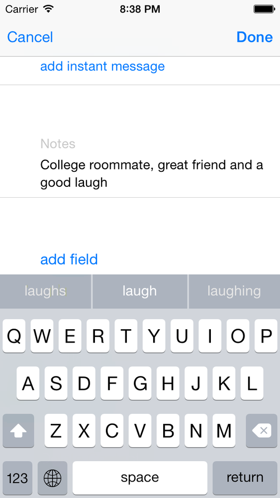
Let’s create a text view and see how it works. We start off by declaring the text view in our view controller:
importUIKitclassViewController:UIViewController{vartextView:UITextView?}
Now it’s time to create the text view itself. We will make the text view as big as the view controller’s view:
importUIKitclassViewController:UIViewController{vartextView:UITextView?overridefuncviewDidLoad(){super.viewDidLoad()textView=UITextView(frame:view.bounds)iflettheTextView=textView{theTextView.text="Some text goes here..."theTextView.contentInset=UIEdgeInsets(top:10,left:0,bottom:0,right:0)theTextView.font=UIFont.systemFontOfSize(16)view.addSubview(theTextView)}}}
Now let’s run the app and see how it looks (Figure 1-43).
If you tap on the text field, you will notice a keyboard pop up from the bottom of the screen, concealing almost half the entire area of the text view. That means if the user starts typing text and gets to the middle of the text view, the rest of the text that she types will not be visible to her.
To remedy this, we have to listen for certain notifications:
UIKeyboardWillShowNotificationGets sent by the system whenever the keyboard is brought up on the screen for any component, be it a text field, a text view, etc.
UIKeyboardDidShowNotificationGets sent by the system when the keyboard has already been displayed.
UIKeyboardWillHideNotificationGets sent by the system when the keyboard is about to hide.
UIKeyboardDidHideNotificationGets sent by the system when the keyboard is now fully hidden.
Note
The keyboard notifications contain a dictionary, accessible
through the userInfo property, that
specifies the boundaries of the keyboard on the screen. This property
is of type NSDictionary. One
of the keys in this dictionary is UIKeyboardFrameEndUserInfoKey, which
contains an object of type NSValue that
itself contains the rectangular boundaries of the keyboard when it is
fully shown. This rectangular area is denoted with a CGRect.
So our strategy is to find out when the keyboard is getting
displayed and then somehow resize our text view. For this, we will use
the contentInset property of UITextView to specify the margins of contents
in the text view from top, left, bottom, and right:
importUIKitclassViewController:UIViewController{vartextView:UITextView?letdefaultContentInset=UIEdgeInsets(top:10,left:0,bottom:0,right:0)funchandleKeyboardDidShow(notification:NSNotification){/* Get the frame of the keyboard */letkeyboardRectAsObject=notification.userInfo![UIKeyboardFrameEndUserInfoKey]asNSValue/* Place it in a CGRect */varkeyboardRect=CGRectZerokeyboardRectAsObject.getValue(&keyboardRect)/* Give a bottom margin to our text view that makes itreach to the top of the keyboard */textView!.contentInset=UIEdgeInsets(top:defaultContentInset.top,left:0,bottom:keyboardRect.height,right:0)}funchandleKeyboardWillHide(notification:NSNotification){textView!.contentInset=defaultContentInset}overridefuncviewDidLoad(){super.viewDidLoad()textView=UITextView(frame:view.bounds)iflettheTextView=textView{theTextView.text="Some text goes here..."theTextView.font=UIFont.systemFontOfSize(16)theTextView.contentInset=defaultContentInsetview.addSubview(theTextView)NSNotificationCenter.defaultCenter().addObserver(self,selector:"handleKeyboardDidShow:",name:UIKeyboardDidShowNotification,object:nil)NSNotificationCenter.defaultCenter().addObserver(self,selector:"handleKeyboardWillHide:",name:UIKeyboardWillHideNotification,object:nil)}}deinit{NSNotificationCenter.defaultCenter().removeObserver(self)}}
In this code, we start looking for keyboard notifications in
viewWillAppear: and we stop listening
to keyboard notifications in viewWillDisappear:. Removing your view
controller as the listener is important, because when your view
controller is no longer displayed, you probably don’t want to receive
keyboard notifications fired by any other view controller. There may be
times when a view controller in the background needs to receive
notifications, but these are rare, and you must normally make sure to
stop listening for notifications in viewWillDisappear:. I’ve seen many programmers
break their apps by not taking care of this simple logic.
Note
If you intend to change your UI structure when the keyboard gets
displayed and when the keyboard is dismissed, the only method that you
can rely on is to use the keyboard notifications. Delegate messages of
UITextField get fired when the text
field is getting edited, whether there is a soft keyboard on the
screen or not. Remember, a user can have a Bluetooth keyboard
connected to his iOS device and use it to edit the content of text
fields and any other data entry in your apps. In the case of a
Bluetooth keyboard, no soft keyboard will be displayed
on the screen—and if you change your UI when your text fields start to
get edited, you might unnecessarily change the UI while the Bluetooth
keyboard user is editing text.
Now, if the user tries to enter some text into the text view, the keyboard will pop up, and we take the height of the keyboard and assign that value as the bottom margin of the contents inside the text view. This makes our text view’s contents smaller in size and allows the user to enter as much text as she wishes without the keyboard blocking her view.
1.18. Creating Scrollable Content with UIScrollView
Problem
You have content that needs to get displayed on the screen, but it requires more real estate than what the device’s screen allows for.
Solution
Use the UIScrollView
class.
Discussion
Scroll views are one of the features that make iOS a really neat operating system. They are practically everywhere. You’ve been to the Clock or the Contacts apps, haven’t you? Have you seen how the content can be scrolled up and down? Well, that’s the magic of scroll views.
There really is one basic concept you need to learn about scroll
views: the content size, which lets the
scroll view conform to the size of what it’s displaying. The content
size is a value of type CGSize that
specifies the width and the height of the contents of a scroll view. A
scroll view, as its name implies, is a subclass of UIView, so you can simply add your views to a scroll view using its
addSubview: method. However, you need
to make sure that the scroll view’s content size is set properly;
otherwise, the contents inside the scroll view
won’t scroll.
As an example, let’s find a big image and load it to an image
view. I will add the same image that I used in Recipe 1.3: Safari’s icon. I will
add it to an image view and place it in a scroll view. Then I will use
the contentSize of the scroll view to
make sure this content size is equal to the size of the image (width and
height). First, let’s define our image view and the scroll view:
importUIKitclassViewController:UIViewController{varimageView:UIImageView!varscrollView:UIScrollView!letimage=UIImage(named:"Safari")}
And let’s place the image view inside the scroll view:
importUIKitclassViewController:UIViewController{varimageView:UIImageView!varscrollView:UIScrollView!letimage=UIImage(named:"Safari")overridefuncviewDidLoad(){super.viewDidLoad()imageView=UIImageView(image:image)scrollView=UIScrollView(frame:view.bounds)scrollView.addSubview(imageView)scrollView.contentSize=imageView.bounds.sizeview.addSubview(scrollView)}}
If you now load up the app in iOS Simulator, you will see that you can scroll the image horizontally and vertically. The challenge here, of course, is to provide an image that is bigger than the screen’s boundaries. For example, if you provide an image that is 20×20 pixels, the scroll view won’t be of much use to you. In fact, it would be wrong to place such an image into a scroll view, as the scroll view would practically be useless in that scenario. There would be nothing to scroll because the image is smaller than the screen size.
One of the handy features of UIScrollView is support for delegation, so
that it can report really important events to the app through a
delegate. A delegate for a scroll view must conform to the UIScrollViewDelegate protocol. Here are some of the methods defined in this
protocol:
scrollViewDidScroll:Gets called whenever the contents of a scroll view get scrolled.
scrollViewWillBeginDecelerating:Gets called when the user scrolls the contents of a scroll view and lifts his finger off the screen as the scroll view scrolls.
scrollViewDidEndDecelerating:Gets called when the scroll view has finished scrolling its contents.
scrollViewDidEndDragging:willDecelerate:Gets called when the user finishes dragging the contents of the scroll view. This method is very similar to the
scrollViewDidEndDecelerating:method, but you need to bear in mind that the user can drag the contents of a scroll view without scrolling the contents. She can simply put her finger on the content, move her finger to any location on the screen, and lift her finger without giving the contents any momentum to move. This is dragging as opposed to scrolling. Scrolling is similar to dragging, but the user will give momentum to the contents’ movement by lifting her finger off the screen while the content is being dragged around, and not waiting for the content to stop before lifting her finger off the screen. Dragging is comparable to holding down the accelerator in a car or pedaling on a bicycle, whereas scrolling is comparable to coasting in a car or on a bicycle.
So let’s add some fun to our previous app. Now the goal is to set
the alpha level of the image inside our image view to 0.50f (half
transparent) when the user starts to scroll the scroll view and set this
alpha back to 1.0f (opaque) when the user finishes scrolling. Let’s
begin by conforming to the UIScrollViewDelegate protocol:
importUIKitclassViewController:UIViewController,UIScrollViewDelegate{varimageView:UIImageView!varscrollView:UIScrollView!letimage=UIImage(named:"Safari")}
Then let’s implement this functionality:
funcscrollViewDidScroll(scrollView:UIScrollView){/* Gets called when user scrolls or drags */scrollView.alpha=0.50}funcscrollViewDidEndDecelerating(scrollView:UIScrollView){/* Gets called only after scrolling */scrollView.alpha=1}funcscrollViewDidEndDragging(scrollView:UIScrollView!,willDeceleratedecelerate:Bool){scrollView.alpha=1}overridefuncviewDidLoad(){super.viewDidLoad()imageView=UIImageView(image:image)scrollView=UIScrollView(frame:view.bounds)iflettheScrollView=scrollView{theScrollView.addSubview(imageView!)theScrollView.contentSize=imageView!.bounds.sizetheScrollView.delegate=selfview.addSubview(theScrollView)}}
As you might have noticed, scroll views have indicators. An indicator is the little tracking line that appears on the sides of a scroll view when its contents are getting scrolled and moved.
Indicators simply show the user where the current view is in
relation to the content (top, halfway down, etc.). You can control what
the indicators look like by changing the value of the indicatorStyle property. For instance, here I
have changed the indicator style of my scroll view to white:
theScrollView.indicatorStyle=.White
1.19. Loading Web Pages with WebKit
Problem
You want to display web pages to your user and be able to customize the user’s interaction and experience with the web pages.
Solution
Use a blend of the following classes and protocols to load web pages to your UI:
WKWebViewThis is a web view that can load web contents. We will need to create an instance of
NSURLto contain the URL that we want to load and then place that URL inside an instance ofNSURLRequestthat will encapsulate our request to the web view. Once the request is ready, we will ask the web view to load it.WKPreferencesThis class will encapsulate our preferences for rendering web views. For instance, you can specify in your preferences that you do not want JavaScript to be loaded as part of loading the web page. When you are done creating your preferences, you should place them inside a web view configuration object.
WKWebViewConfigurationAfter the preferences are created, you must place them inside a configuration object and pass the configuration to the web view.
WKNavigationDelegateWhatever instance is assigned to the
navigationDelegateproperty of your web view must confirm to this protocol. Using this protocol, you can, for instance, detect when the user taps on a link in the web view and then either accept or reject that request. There are many other things that you can do with the navigation delegate, as we shall soon see.
Let’s start off by conforming to the WKNavigationDelegate protocol:
classViewController:UIViewController,WKNavigationDelegate
Then we define our web view as a property of our controller:
varwebView:WKWebView?
After that, we create our web view preferences, followed by the configuration objects, stating that we don’t want our web view to process any JavaScript:
/* Create our preferences on how the web page should be loaded */letpreferences=WKPreferences()preferences.javaScriptEnabled=false/* Create a configuration for our preferences */letconfiguration=WKWebViewConfiguration()configuration.preferences=preferences
The next step is to create and configure the web view and add it to our view hierarchy:
/* Now instantiate the web view */webView=WKWebView(frame:view.bounds,configuration:configuration)iflettheWebView=webView{/* Load a web page into our web view */leturl=NSURL(string:"http://www.apple.com")leturlRequest=NSURLRequest(URL:url!)theWebView.loadRequest(urlRequest)theWebView.navigationDelegate=selfview.addSubview(theWebView)}
Our web view, depending on what page it is loading and which
device it is loading the page on, may take a while to process our
request. This calls for displaying the default system activity indicator
to the user while the web view is processing the page for her. For that,
we will implement two of the most important methods that are defined in
the WKNavigationDelegate protocol,
like so:
/* Start the network activity indicator when the web view is loading */funcwebView(webView:WKWebView!,didStartProvisionalNavigationnavigation:WKNavigation!){UIApplication.sharedApplication().networkActivityIndicatorVisible=true}/* Stop the network activity indicator when the loading finishes */funcwebView(webView:WKWebView!,didFinishNavigationnavigation:WKNavigation!){UIApplication.sharedApplication().networkActivityIndicatorVisible=false}
The webView:didStartProvisionalNavigation: method
gets called on the navigation delegate of your web view whenever a
navigation has been provisioned to happen, before the web view asks you
whether it is OK to make that navigation. We will give the answer to
that question later. But for now, we see that the web view lets us know
that a navigation is about to happen. The webView:didFinishNavigation: method of the
navigation delegate gets called on our view controller when the web view
has finished doing whatever navigation was requested of it. Here, we
will use the opportunity to hide the network activity indicator that was
previously displayed to the user.
The next thing we have to look at is the webView:decidePolicyForNavigationAction:decisionHandler:
method of our web view’s navigation delegate, which gets called whenever
a navigation of any sort is about to happen in the web view. The
navigationAction parameter will give
you more information about what type of navigation is about to happen.
If you inspect the navigationType
property of the navigationAction
parameter, you will be able to tell between the various types of
navigations that can occur on a web view. One sort of navigation is when
the user taps on a link—any link! The other is when the user submits a
form for processing on a server or (for instance) when the user reloads
a page.
We are now going to take advantage of the presence of this method on the navigation delegate of our web view and block the user from tapping on any link in the web page that we are displaying. Whenever she attempts to tap on a link, we will display an alert informing her that she is not allowed to tap on a link inside our application. This is for demonstration purposes, to give an example of how you can tap into the power of WebKit to control how your users interact with a web view. You may not necessarily be interested in blocking your user from tapping on various links on a web page.
/* Do not allow links to be tapped */funcwebView(webView:WKWebView!,decidePolicyForNavigationActionnavigationAction:WKNavigationAction!,decisionHandler:((WKNavigationActionPolicy)->Void)!){/* Do not allow links to be tapped */ifnavigationAction.navigationType==.LinkActivated{decisionHandler(.Cancel)letalertController=UIAlertController(title:"Action not allowed",message:"Tapping on links is not allowed. Sorry!",preferredStyle:.Alert)alertController.addAction(UIAlertAction(title:"OK",style:.Default,handler:nil))presentViewController(alertController,animated:true,completion:nil)return}decisionHandler(.Allow)}
Discussion
One of the really powerful frameworks in the iOS SDK is the WebKit framework. Using this framework, you can tap into many preferences and settings that Apple has enabled us to take control of. For instance, you can detect when the user wants to go back to the previous page or go forward to the next page. After you detect the type of event, you can then choose whether to allow it or to reject it.
As you saw earlier in the Solution section of this recipe, you can
instantiate an instance of WKWebView
using its constructor. This method takes the frame for the web view and
the configuration, which must be of type WKWebViewConfiguration. You can leave this
configuration empty, or create a proper instance of the aforementioned
class and create your configuration as you will. Configurations for
WebKit web views allow you to customize how users are able to interact
with the web view. For instance, you can decide what happens if the user
taps on a link that opens a new window.
Another handy navigation method that has been defined in the
WKNavigationDelegate protocol is the
webView:decidePolicyForNavigationResponse:decisionHandler:
method. This method gets called when the navigation of a certain request
on the web view has been finished and the results are now known by the
web view. For instance, if the user taps on a link, the web view won’t
know what the content will be and what type it will have, whether it
will be a media file, etc. until the content is loaded. But after the
request is sent to the server and the response has been received, the
aforementioned method gets called on the navigation delegate of the web
view, informing it of content that is about to be loaded on the web
view. You can implement this method to understand what content your web
view is loading, such as the MIME type of the content. You can also
allow or cancel the loading of these contents into your web view.
See Also
1.20. Loading Web Pages with UIWebView
Solution
Use the UIWebView class.
Discussion
A web view is what the Safari browser uses on iOS to load web
content. You have the whole power of Safari in your iOS apps through the
UIWebView class. All you have to do
is place a web view on your UI and use one of its loading
methods:
loadData:MIMEType:textEncodingName:baseURL:loadHTMLString:baseURL:Loads an instance of
NSStringinto the web view. The string should be valid HTML, or in other words, something that a web browser can render.loadRequest:Loads an instance of
NSURLRequest. This is useful when you want to load the contents of a remote URL into a web view inside your application.
Let’s see an example. I would like to load the string
iOS Programming into the web view. To prove
things are working as expected and that our web view is capable of
rendering rich text, I will go ahead and make the
Programming part bold while leaving the rest
of the text intact:
importUIKitclassViewController:UIViewController{overridefuncviewDidLoad(){super.viewDidLoad()letwebView=UIWebView(frame:view.bounds)lethtmlString="<br/>iOS <strong>Programming</strong>"webView.loadHTMLString(htmlString,baseURL:nil)view.addSubview(webView)}}
Another way to use a web view is to load a remote URL into it. For
this purpose, we can use the loadRequest: method. Let’s go ahead and look
at an example where we will load Apple’s main page into a web view in
our iOS app:
importUIKitclassViewController:UIViewController{/* Hide the status bar to give all the screen real estate */overridefuncprefersStatusBarHidden()->Bool{returntrue}overridefuncviewDidLoad(){super.viewDidLoad()letwebView=UIWebView(frame:view.bounds)webView.scalesPageToFit=trueview.addSubview(webView)leturl=NSURL(string:"http://www.apple.com")letrequest=NSURLRequest(URL:url!)webView.loadRequest(request)view.addSubview(webView)}}
It might take quite a while for a web view to load the contents that you pass to it. You might have noticed that when loading content in Safari, you get a little activity indicator in the top-left corner of the screen telling you that the device is busy loading the contents. Figure 1-44 shows an example.
iOS accomplishes this through delegation. We will subscribe as the
delegate of a web view, and the web view will notify us when it starts
to load content. When the content is fully loaded, we get a message from
the web view informing us about this. We do this through the delegate property of the web view. A delegate
of a web view must conform to the UIWebViewDelegate
protocol.
Let’s go ahead and implement the little activity indicator in our
view controller. Please bear in mind that the activity indicator is
already a part of the application and we don’t have to create it. We can
control it using the setNetworkActivityIndicatorVisible: method
of UIApplication. So
let’s start:
importUIKitclassViewController:UIViewController,UIWebViewDelegate
Then do the implementation. Here we will use three of the methods
declared in the UIWebViewDelegate
protocol:
webViewDidStartLoad:This method gets called as soon as the web view starts loading content.
webViewDidFinishLoad:This method gets called as soon as the web view finishes loading content.
webView:didFailLoadWithError:This method gets called when the web view stops loading content, for instance because of an error or a broken network connection.
funcwebViewDidStartLoad(webView:UIWebView!){UIApplication.sharedApplication().networkActivityIndicatorVisible=true}funcwebViewDidFinishLoad(webView:UIWebView!){UIApplication.sharedApplication().networkActivityIndicatorVisible=false}funcwebView(webView:UIWebView!,didFailLoadWithErrorerror:NSError!){UIApplication.sharedApplication().networkActivityIndicatorVisible=false}overridefuncviewDidLoad(){super.viewDidLoad()/* Render the web view under the status bar */varframe=view.boundsframe.origin.y=UIApplication.sharedApplication().statusBarFrame.heightframe.size.height-=frame.origin.yletwebView=UIWebView(frame:frame)webView.delegate=selfwebView.scalesPageToFit=trueview.addSubview(webView)leturl=NSURL(string:"http://www.apple.com")letrequest=NSURLRequest(URL:url!)webView.loadRequest(request)view.addSubview(webView)}
1.21. Displaying Progress with UIProgressView
Problem
You want to display a progress bar on the screen depicting the progress of a certain task; for instance, the progress of downloading a file from a URL.
Solution
Instantiate a view of type UIProgressView and place it on another
view.
Discussion
A progress view is what programmers generally call a progress bar. An example of a progress view is depicted in Figure 1-45.
Progress views are generally displayed to users to show them the
progress of a task that has a well-defined starting and ending point.
For instance, downloading 30 files is a well-defined task with a
specific starting and ending point. This task obviously finishes when
all 30 files have been downloaded. A progress view is an instance of
UIProgressView and is initialized
using the designated constructor of this class, the initWithProgressViewStyle: method. This method
takes in the style of the progress bar to be created as a parameter.
This parameter is of type UIProgressViewStyle and can therefore be one
of the following values:
UIProgressViewStyleDefaultThis is the default style of the progress view. An example of this is the progress view shown in Figure 1-45.
UIProgressViewStyleBarThis is similar to the
UIProgressViewStyleDefaultbut is meant to be used for progress views that are to be added to a toolbar.
An instance of UIProgressView
defines a property called progress
(of type float). This property tells
iOS how the bar inside the progress view should be rendered. This value
must be in the range +0 to +1.0. If the value of +0 is given, the
progress bar won’t appear to have started yet. A value of +1.0 shows
progress of 100%. The progress depicted in Figure 1-45 is 0.5 (or 50%).
To get used to creating progress views, let’s create one similar
to what we saw in Figure 1-45. Instantiate
an object of type UIProgressView:
importUIKitclassViewController:UIViewController{overridefuncviewDidLoad(){super.viewDidLoad()letprogressView=UIProgressView(progressViewStyle:.Bar)progressView.center=view.centerprogressView.progress=1/2progressView.trackTintColor=UIColor.lightGrayColor()progressView.tintColor=UIColor.blueColor()view.addSubview(progressView)}}
Obviously, creating a progress view is very straightforward. All
you really need to do is display your progress correctly, because the
progress property of a progress view
should be in the range +0 to +1.0, which is a normalized value. So if
you have 30 tasks to take care of and you have completed 20 of them so
far, you need to assign the result of the following equation to the
progress property of your progress
view:
progressView.progress=20.0/30.0
In this code, we are explicitly creating two double values, 20 and
30, and then dividing the 20 by 30 in order to create the resulting
value as a double value as well. Because the progress property of the progress view itself
is a floating point value, the result of this division will be created
as a floating point value instead of an integer. So we don’t really have
to worry about type casting or loss of precision in this division.
1.22. Creating a Provision Profile
Problem
You want to to set up a provision profile that you can use for your app development. You might also be interested in setting up an Ad Hoc or a distribution provision profile for deploying your app to an enterprise or series of testers, or for submitting your app to the App Store.
Solution
Follow these steps:
Create a certificate request using Keychain Access.
Create a development or a distribution certificate.
Create an App ID that corresponds to your application.
Create a provision profile that is linked to your certificate and your App ID, as is explained in the Discussion section of this recipe.
Discussion
Throughout the years that I’ve been working as an iOS engineer, I have seen many engineers who do not really understand the whole flow of creating provision profiles, or sometimes even what provision profiles are and what they do. That is not their fault. Apple has made this extremely difficult. Even though Xcode has tried to make this process easier, it still fails often and can’t really read the developer’s mind. For this reason, I’ve decided to explain the whole thing once and for all so that we are all on the same page.
Xcode’s flow for creating provision profiles looks deceptively simple and fun, but don’t be fooled. Xcode has a long way to go before it can really read your mind and create your profiles exactly how you would want them to be created. For this reason, Apple has kept the “Certificates, Identifiers & Profiles” section of the developer page updated regularly.
So let’s get cracking. In this recipe, we are going to focus on creating a provision profile for debugging our app. This is also called a development profile. It’s a profile that can only be used for development purposes and for debugging your apps on test devices.
The first thing that we need to do is to create a certificate signing request. Every profile is linked to a certificate and every certificate is linked to a private key. When you use Keychain (as we will soon see) to create a certificate signing request to send to Apple, your Keychain will create a private key for you and keep it ready for later. After we send our signing request to Apple, Apple will create a certificate for us. We will then need to import this certificate into our Keychain by double-clicking it. Once imported, Keychain will find the relevant private key that was generated before and will hook it up to the certificate so they become a pair.
So open up Keychain Access on your computer now, go to the Keychain Access menu, then Certificate Assistant, and choose “Request a Certificate From a Certificate Authority.” You will then be presented with a screen similar to that shown in Figure 1-46. Enter your email address and your full name, then choose the “Save to disk” option. When you are done, press the Continue button and save the resulting code signing request file to your desktop.
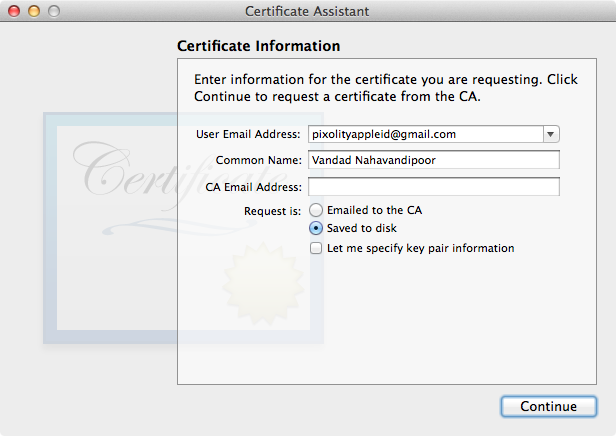
At this point, Keychain Access has already created a private key for you, but that private key is not yet associated with any certificates. That’s OK, though, because soon we are going to download a certificate from Apple and import it into Keychain.
Now you have a file named CertificateSigningRequest.certSigningRequest on your desktop. Navigate to the iOS Dev Center website and log in there if you are not already logged in. Then move to the “Certificates, Identifiers & Profiles” section of the portal and choose Certificates. On the lefthand side, under Certificates, choose Development as shown in Figure 1-47.
Now press the plus button (+) to create a new development certificate. You can only have one development certificate, so if you have already created one, you might decide to revoke it and create a new one. Simply select the old certificate and press the Revoke button as shown in Figure 1-48.
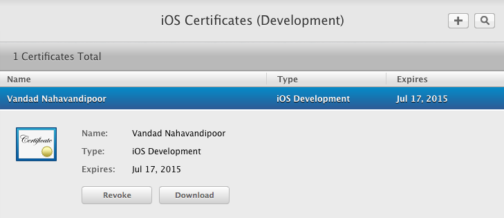
After pressing the plus (+) button, choose the option indicating that you want to create a development certificate and then move to the next step. You will be prompted to upload your code signing request file, which is currently saved on your desktop, to Apple’s web site. Then wait a few seconds. After the wait is over, you will be given the ability to download the certificate. Please do so, and after your download is complete, double-click on your certificate to import it into Keychain Access.
Now navigate to the certificates section of your Keychain, find the certificate that was imported, and note that it is associated with the private key that was generated for you when you created the certificate signing request earlier, as shown in Figure 1-49.
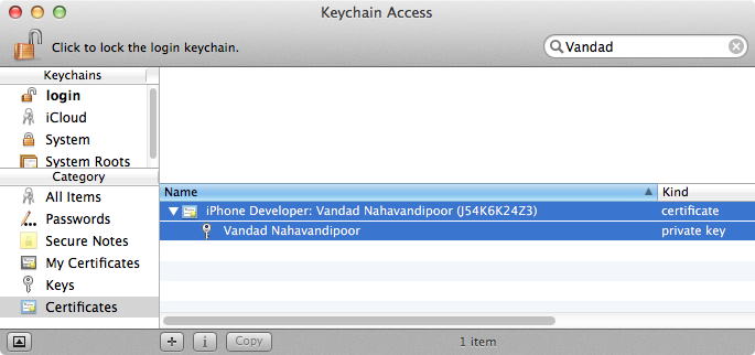
Now in the same Certificates, Identifiers & Profiles page of iOS Dev Center, move to the Identifiers section and then choose App IDs, as shown in Figure 1-50.
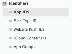
Press the plus (+) button to create a new App ID. In the App ID Description section, enter a description for your application. For instance, I have entered “iOS Cookbook App.” This name will appear only in this list and not in Xcode, so if you are working in a team where a lot of people have access to one portal, make sure that you give meaningful names to your apps.
In the App ID Prefix section, ensure the default value of “Team ID” is selected. In the App ID Suffix section, ensure that the Explicit App ID is selected and in the Bundle ID: section, enter a reverse-domain-style identifier for your bundle. This identifier needs to uniquely identify your application and you have to use the same identifier in the bundle-identifier section of your app’s plist. I have chosen the value of “com.pixolity.ios.cookbook.app” for this section.
Under the App Services section, choose all the services that you want your application to be able to use. For the purpose of this recipe, I have chosen every item in this list so that my test application will be able to take advantage of all these functionalities should I need them, but you can be more selective and choose only the items that make the most sense to you and your app. After you are done, press the Continue button.
Now you are on the Confirm your App ID page. Simply review your settings for your App ID and press the Submit button. When you are done, your App ID is ready. Bear in mind that an App ID is not something you can download or import. It is just an identifier for your app that will be associated with your provision profile in the portal.
Before you move on to creating your profile, you might want to register a few devices on which your app is able to run. You can do so by navigating to the All item under the Devices section of the portal. Now press the plus (+) button to add a new device. Enter a descriptive name for your device and the UDID of your device. You can find the UDID of the device by connecting it to your computer and then looking at the UDID in iTunes. Alternatively, if the device doesn’t belong to you, you can ask the owner to use iTunes or the iPhone Configuration Utility to find the device’s UDID. When you are done with that, press the Continue button to go to the review section. If all the details are correct, move past the review section to add the device to your portal.
Please note that any device added to your portal will count towards your total device quota for your membership. Most members can only add 100 devices per year, and any device that is deleted during this period will still count towards your quota until the membership period is over, upon which you can reset your list. This is to prevent people from adding billions of devices to their portal and creating an App Store competitor on their own where they can sign their apps with their own profiles and avoid having to send their apps to Apple for approval.
Next stop is creating the profile. In the same Certificates, Identifiers & Profiles page of iOS Dev Center, navigate to the Development item of the Provision Profiles section, as shown in Figure 1-51.
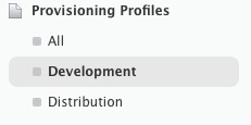
Press the plus (+) button to start generating a new development provision profile. Then choose the iOS App Development option and move on to the next stage. In the Select App ID section, choose the App ID that you just generated and move to the next stage. In the “Select certificates” section, choose the development certificate that you just created and move on to the next stage. When you get to the “Select devices” section, choose the devices that you want your app to be able to run on. After this, give a meaningful name to your profile and press the Generate button. This profile name will be visible in Xcode, so please, just like all the other names, ensure that this name is descriptive and not something similar to My Profile.
After you are done generating the profile, you can download it to your computer. After the profile is downloaded, install it by dragging it and dropping it into iTunes. Do not double-click on this profile because doing so will install the profile in your system with its MD5 hash value as its name. Thus, when you move to the ~/Library/MobileDevice/Provisioning Profiles folder on your computer to see the list of your profiles, you will see really cryptic names like that shown in Figure 1-52. As you can see, only one of the profiles has a meaningful name. The others have cryptic names because they were either installed on this sytem by Xcode or installed when the user double-clicked on them. If you want to see meaningful names on your computer and be able to manage these profiles easily, I suggest that you either copy and paste the profile directly to the aforementioned folder or drag and drop the profile onto iTunes for installation.
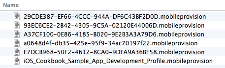
Congratulations. You have now created your profile. All you have to do in order to use it is to go to your app in Xcode and ensure that your info.plist has the same bundle identifier as the one that you designated in your profile, as shown in Figure 1-53.
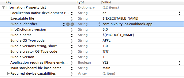
As the last step, move to the Build Settings of your project and set the correct certificate and the profile, as shown in Figure 1-54.
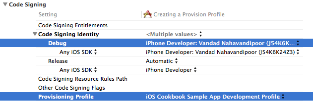
Build your project and ensure that it builds without errors. If it doesn’t, make sure that you have followed all the steps explained in this recipe and attempt to build again until you get it right.
Get iOS 8 Swift Programming Cookbook now with the O’Reilly learning platform.
O’Reilly members experience books, live events, courses curated by job role, and more from O’Reilly and nearly 200 top publishers.

