Just wait, Gretel, until the moon rises, and then we shall see the crumbs of bread which I have strewn about, they will show us our way home again.
As our fairy tales suggest, getting lost is often a bad thing. It is associated with confusion, frustration, anger, and fear. In response to this danger, we have developed navigation tools to prevent people from getting lost. From bread crumbs to compass and astrolabe to maps, street signs, and global positioning systems, people have demonstrated great ingenuity in the design and use of navigation tools.
We use them to chart our course, to determine our position, and to find our way back. They provide a sense of context and comfort as we explore new places. Anyone who has driven through an unfamiliar city as darkness falls understands the importance that navigation tools play in our lives.
On the Web, navigation is rarely a life or death issue. However, getting lost in a large web site can be confusing and frustrating. While a well-designed hierarchical organization scheme will reduce the likelihood that users will become lost, a complementary navigation system is often needed to provide context and to allow for greater flexibility of movement within the site.
Navigation systems can be designed to support associative learning by featuring resources that are related to the content currently being displayed. For example, a page that describes a product may include see also links to related products and services (this type of navigation can also support a company’s marketing goals). As users move through a well-designed navigation system, they learn about products, services, or topics associated to the specific content they set out to find.
Any page on a web site may have numerous opportunities for interesting see also connections to other areas of the site. The constant challenge in navigation system design is to balance this flexibility of movement with the danger of overwhelming the user with too many options.
Navigation systems are composed of a variety of elements. Some, such as graphical navigation bars and pop-up menus, are implemented on the content-bearing pages themselves. Others, such as tables of contents and site maps, provide remote access to content within the organization structure. While these elements may be implemented on each page, together they make up a navigation system that has important site-wide implications. A well-designed navigation system is a critical factor in determining the success of your web site.
When designing a navigation system, it is important to consider the environment the system will exist in. On the Web, people use web browsers such as Netscape Navigator and Microsoft Internet Explorer to move around and view web sites. These browsers sport many built-in navigation features.
Open URL allows direct access to any page on a web site. Back and Forward provide a bidirectional backtracking capability. The History menu allows random access to pages visited during the current session, and Bookmark enables users to save the location of specific pages for future reference. Web browsers also go beyond the Back button to support a “bread crumbs” feature by color-coding hypertext links. By default, unvisited hypertext links are one color and visited hypertext links are another. This feature helps users understand where they have and haven’t been and can help them to retrace their steps through a web site.
Finally, web browsers allow for a prospective view that can influence how users navigate. As the user passes the cursor over a hypertext link, the destination URL appears at the bottom of the browser window, ideally hinting about the nature of that content (see Figure 4.1). If files and directories have been carefully labeled, prospective view gives the user context within the content hierarchy. If the hypertext link leads to another web site on another server, prospective view provides the user with basic information about this off-site destination.
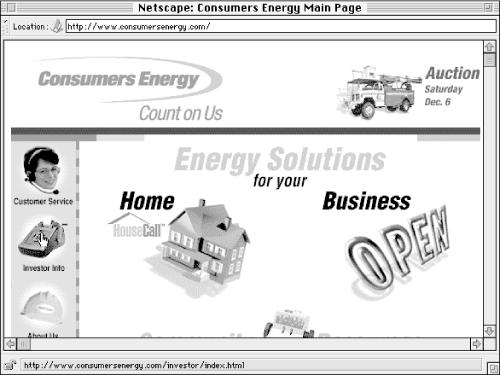
Figure 4-1. In this example, the cursor is positioned over the Investor Info button. The prospective view window at the bottom shows the URL of the Investor Info page.
Much research, analysis, and testing has been invested in the design of these browser-based navigation features. However, it is remarkable how frequently site designers unwittingly override or corrupt these navigation features. For example, designers often modify the unvisited and visited link colors with no consideration for the bread crumbs feature. They focus on aesthetics, attempting to match link colors with logo colors. It’s common to see a complete reversal of the blue and purple standard. This is a classic sacrifice of usability[5] for aesthetics and belies a lack of consideration for the user and the environment. It’s like putting up a green stop sign at a road intersection because it matches the color of a nearby building.
Given proper understanding of the aesthetic and usability issues, you can in fact modify the link colors and create an intelligent balance.[6] Unfortunately, this convention has been violated so frequently, the standard may no longer be standard.
A second common example of inadvertently disabling valuable browser navigation features involves prospective view. Image maps have become a ubiquitous navigation feature on web sites. The graphic navigation bar allows the aesthetically pleasing presentation of navigation options. Unfortunately, server-side image maps completely disable the prospective view feature of web browsers. Instead of the destination URL preview, the XY coordinates of the image map are presented. This information is distracting, not useful. Again, a solution that balances aesthetics and usability is available. Through an elegant use of tables (or by using client-side image maps), you can present a graphical navigation bar that leverages the browser-based prospective view feature.
Once you are sensitive to the built-in navigation features of web browsers, it is easy to avoid disabling or duplicating those features. In fact, it is both possible and desirable to find ways to leverage them. In designing navigation systems, you should consider all elements of that system. Web browsers are an extremely common and integral part of the user’s navigation experience. From a philosophical perspective, we might say that web pages do not exist in the absence of a web browser. So, don’t override or corrupt the browser!
[5] Analysis of a usability test that explored the impact of graphic design on users’ ability to find information lead to the following conclusion: “Of all the graphic design elements we looked at, the only one that is strongly tied to user success was the use of browser-default link color....Our theory is that use of the default colors is helpful because users don’t have to relearn every time they go to a new site.” Jared Spool et al., Web Site Usability (Andover, MA: User Interface Engineering, 1997).
[6] For an example, see Michigan Comnet at http://comnet.org/. The link colors have been modified slightly to match the logo colors, but the red:purple/visited:unvisited link standard is maintained.
Get Information Architecture for the World Wide Web now with the O’Reilly learning platform.
O’Reilly members experience books, live events, courses curated by job role, and more from O’Reilly and nearly 200 top publishers.

