In the preceding chapters, we discussed information architecture from a conceptual perspective. This chapter presents a more concrete view of what information architecture actually is, which should help you to recognize information architecture when you see it. We also introduce the components of an architecture; these are important to understand because they make up the information architect’s palette. We’ll cover them in greater detail in Chapter 5 through Chapter 9.
Why is it important to be able to visualize information architecture? There are several answers. One is that the field is new, and many people don’t believe that things exist until they can see them. Another is that the field is abstract, and many who might conceptually understand the basic premise of information architecture won’t really “get it” until they see it and experience it.
All information architects are salespeople to some degree. As it’s highly probable that you’ll need to explain information architecture to important people, such as colleagues, managers, prospects, and clients, it’s in your interests to be able to actually show them what information architecture is.
Let’s start by looking at a site’s main page. Figure 4-1 shows the main page for Dartmouth College in Hanover, NH, USA.
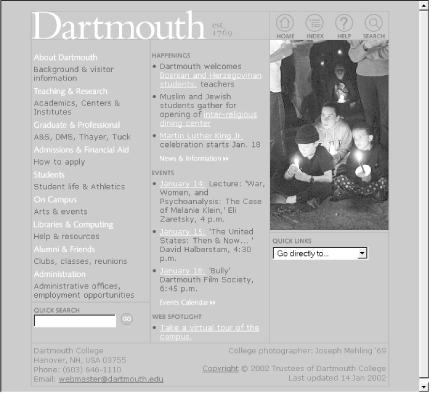
What’s obvious here? Most immediately, you see that aspects of the site’s visual design stand out. You can’t help but notice the site’s colors (you’ll have to take our word for it), font styles, and image selection. You also notice aspects of the site’s information design; for example, it is laid out in three columns and uses icons for such main options as “home,” “index,” “help,” and “search.”
What else? With a careful eye you can detect aspects of the site’s interaction design, such as the use of linked images for such category labels as “About Dartmouth” and “Teaching & Research,” and the use of a pull-down menu for “quick links.” The site’s content is prominent, and communicates something about the organization behind the site—the activities going on there, as well as the resources it makes available via the Web. Finally, you might learn something about the technology (and related expertise) that went into this site from the main page—especially if the page loads very slowly or is full of broken images and links.
Thus far, we’ve noticed all sorts of things that aren’t information architecture. So what is recognizable as information architecture? You might be surprised by how much information architecture you can see if you know how to look. Information has been organized in some important ways:
The left-hand column contains major categories of content that pertain to the entire campus, while the center column’s content is grouped into “Happenings” and “Events,” with an additional link to a campus tour.
The labels of those categories were selected with some consideration by the site’s information architects. That’s why, for example, it’s “Teaching & Research” instead of “Academics.”
In the upper right-hand corner are links to other ways to navigate the site: a way to return to the main page, a site index, a help option, and a link to a search interface.
A search interface embedded in the lower left-hand corner of the page.
Figure 4-2 provides a visualization of these architectural components.
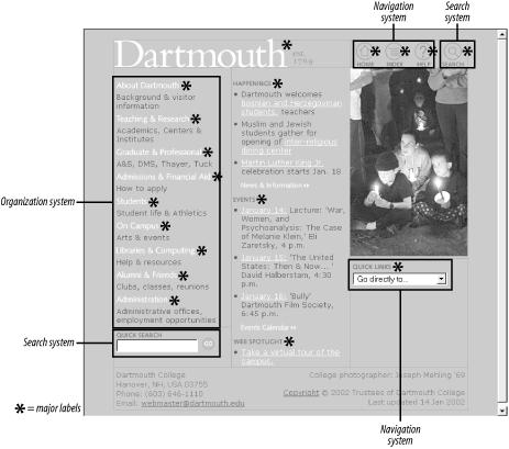
As we can see from this figure and from Figure 4-3, these areas are just the tip of the iceberg. Categories group pages and applications throughout the site; labels systematically represent the site’s content; navigation systems and a search system can be used to move through the site. That’s quite a lot of information architecture to cram into one screen shot!

In effect, a main page tries to anticipate the major questions that users bring with them when they reach the site, such as “How do I find out about financial aid?” or “What’s going on this week on campus?” The site’s information architects have worked hard to determine the most common questions, and have designed the site to meet those needs. This is top-down information architecture.
Whether they’re aware of it or not, users almost always come to a site with a list of questions in mind. Where are the answers to users’ questions? They’re generally deep within the site, either surrounding or embedded within the actual content. Figure 4-3 illustrates the typical questions users might have when they come to Dartmouth’s main page and where on the page the answers can be found.
Where am I?
How do I find out about something? What’s available on this site?
I know what I’m looking for; how do I search for it?
How can I communicate with Dartmouth in some other way besides this web site?
What’s happening at Dartmouth?
What’s happening at Dartmouth right now?
Do these Dartmouth people do any cool web stuff?
How do I get back to the main page or start over again?
I know what I’m looking for; how do I browse around for it? What’s available on this site?
Where can I get some help with this site or with Dartmouth?
I know what I want (I’ve been there before); can I jump straight to it? What’s available on this site?
Figure 4-4 shows a slightly different example—a page of content from the archive of SIGIA-L, the primary information architecture discussion list.
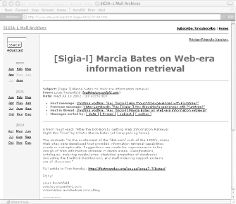
There is little to see here besides the information architecture and the content itself. In fact, as the content is minimal, the architecture is the bulk of the page. The architecture provides context for the content, and tells us what we can do while we’re here.
It makes it clear where we are (we’re in the “SIGIA-L Mail Archives”).
It allows us to manipulate the content for better browsing (we can sort this and other messages by date, thread, subject, and author).
It tells us where we can go (we can return to the main page, learn how to subscribe or unsubscribe, move to other months in this archive, and click through to related messages).
Content itself can have information architecture embedded within it. The recipe in Figure 4-5 shows a nutritious drink from the Epicurious site.
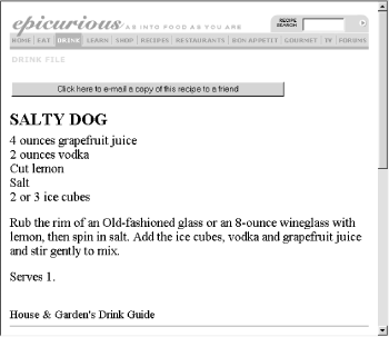
Beyond the navigational options at the top of the page, there’s not much information architecture here. Or is there?
The recipe itself has a clear, strong structure: a title at the top, a list of ingredients, then preparation directions and serving information. This information is “chunked” so you know what’s what, even without subtitling. Chunking could also support searching and browsing; for example, users might be able to search on the chunks known as “recipe titles” for “salty dog” and retrieve this one. And these chunks are sequenced in a logical manner; after all, you’ll want to know the ingredients (“Do I have 4 ounces of grapefruit juice?”) before you start mixing the drink. The definition and placement of chunks and the links between chunks help you to learn what this content is about and how to find it, move around it, and go somewhere else from it.
So, if you look closely enough, you can see information architecture even when it’s embedded in the guts of your content. In fact, by supporting searching and browsing, the structure inherent in content enables the answers to users’ questions to rise to the surface. This is bottom-up information architecture.
You now know that information architecture is something that can be seen, if you know what to look for. But it’s important to understand that information architecture is often invisible. For example, Figure 4-6 shows some search results from the Hewlett-Packard site.
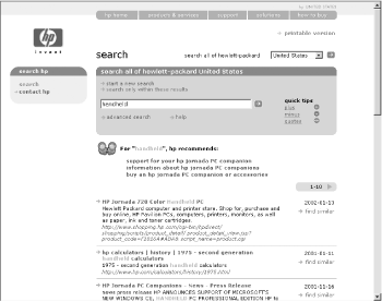
What’s going on here? We’ve searched for “handheld,” and the site has presented us with a couple of different things: three results listed under “hp recommends,” and more results that trail off the page. The latter were retrieved by a piece of software—a search engine—that the user never sees. The search engine has been configured to index and search certain parts of the site, to display certain kinds of information in each search result (i.e., page title, extract, URL, and date), and to handle search queries in certain ways, such as removing “stop words” (e.g., “a,” “the,” and “of”). All these decisions regarding search system configuration are unknown to users, and are integral aspects of information architecture design.
The “hp recommends” results are arrived at manually: someone at HP decided that “handheld” is an important yet ambiguous term that, when entered into a search engine, could retrieve some questionable results (for example, the second one is “HP calculators,” probably not a big seller these days). So they went through the arduous process of identifying some highly relevant pages and associated them with the term “handheld,” thereby ensuring that these three items are displayed when someone searches for “handheld.” Users might assume these results are automatically generated; this is another example of invisible information architecture.
Information architecture is much more than just blueprints that portray navigational routes and wireframes that inform visual design. Our field involves more than meets the eye, and both its visible and invisible aspects help define what we do and illustrate how challenging it really is.
Get Information Architecture for the World Wide Web, Second Edition now with the O’Reilly learning platform.
O’Reilly members experience books, live events, courses curated by job role, and more from O’Reilly and nearly 200 top publishers.

