
Chapter 4. Design for Understanding
A frame is a way of creating a little world round something...Is there anything in a work that is not frame, actually?
Brian Eno
In this chapter, we’ll cover:
-
How people make sense of where they are and what they can do there
-
Placemaking in the physical world and in information environments
-
Basic organizing principles to make information environments more understandable
We only understand things in relationship to something else. The frame around a painting changes how we perceive it, and the place the frame is hanging in changes it even more: we understand an image displayed in New York’s Museum of Modern Art differently than one hanging in a shared bathroom in a ratty hotel. Context matters.
When designing an information architecture, we are engaging in a new type of placemaking: one that alters how we perceive and understand information. As with (building) architects, information architects are concerned with creating environments that are understandable and usable by human beings, and which can grow and adapt over time to meet the needs of users and their organizations.
In Chapter 3, we saw how the lens of information architecture can help designers make stuff easier to find by setting it in structures made of information. Now we’ll explore how these structures can make stuff more understandable by shaping the context that we perceive it in.
A Sense of Place
You get out of bed. You stumble clumsily to the bathroom, use the toilet, then walk to the kitchen to brew a cup of coffee and toast some bread. It’s not even 6:00 a.m. yet, and you have already traversed three distinct places with different uses and configurations: bedroom, bathroom, and kitchen.
Humans—perceptive, self-ambulatory organisms that we are—have a complex, symbiotic relationship with our surroundings. We have senses that allow us to detect where we are at any given moment, and to move around from place to place. We can also change these places to suit our needs. The differences between places play a critical role in how we understand one another and the things we can (or can’t) do in each of those places: this is where we get food, this is where we sleep, this is where we defecate. As a result, our ability to perceive and make places has been very important in our evolution as a species, and is deeply ingrained in who we are. Over time, our ability to set apart and reconfigure places for special use has evolved along with us: we have gone from “this is the clearing where we worship” to building Chartres Cathedral in a relatively short amount of time (Figure 4-1).
We bring this awareness of place—and the placemaking drive—to information environments as well. When we talk about digital media, we use metaphors that betray a sense of place: we “go” online, “visit” a website, “browse” Amazon.com. Increasingly, these environments are also taking over many of the functions we’ve traditionally associated with physical places: we meet with our friends in WhatsApp, pay our bills in our bank’s website, learn in Khan Academy. As with physical places, we experience them as contexts that differ from one another, supporting different needs.
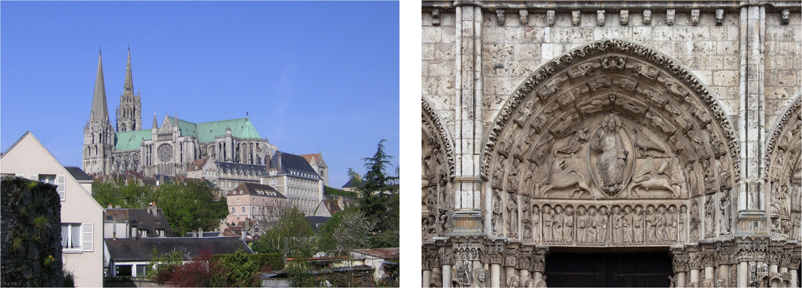
Figure 4-1. Chartres Cathedral is a place that communicates at more than one level: at a base level, it appeals to our animal nature: “here is shelter from the elements”; at a higher level, it communicates “place of worship”; at an even higher level, it tells stories about the Christian religion (images: Wikipedia, http://bit.ly/chartres_cathedral and http://bit.ly/Chartres_central_tympanum)
The Architecture of (Real-World) Places
We go from one place to another in our day-to-day lives without paying too much attention to where we are: we subconsciously know when we’re in the bedroom, and that it is a place for resting, and we know when we’re in the kitchen, and that it is a place for nourishing. The kitchen has a refrigerator, sink, stovetop, and counter, set in a particular configuration,1 while the bedroom has a bed and dresser in a configuration specific to it. Our senses and nervous systems pick up environmental cues that let us know the difference between one and the other.2
The world outside our home is also made up of a variety of different places, with configurations and signs of their own that give us clues to their use. Churches are different from banks, which are different from police stations, which are different from fast food restaurants, and so on. Over time, cultural convention and patterns of use have led to the evolution of these spaces, objects, and forms into the structures we recognize today. The differences between them make it possible for us to navigate and make sense of the world around us; we learn them when we are very young, and they become second nature.
In the “real” world, the discipline of (building) architecture has advanced and guided this cultural evolution of placemaking forms. Working from historical models, architects—both trained and untrained—adapt building and urban models that work well to new contexts and uses as required by the needs of society at a particular moment in time. Architects must make sure that a bank’s building functions well as a bank. This means they must accommodate both the things that all buildings must have in common to make them usable by human beings (e.g., ceilings with enough height clearance to allow people to walk around) and those that are specific to banks and which make them different from other building types (e.g., having a large, secure vault in the middle of the space).3
Places Made of Information
We also experience information environments as types of places. When you visit a bank’s website and peruse its navigation structures, headlines, section headings, images, and other information elements, your senses and nervous system are picking up semantic cues that tell you that you are now “in a bank.” You would be hard-pressed to confuse the bank’s site with that of a teaching hospital; just as you can tell the difference between a bank and a hospital in the real world by picking up on features of their respective physical environments, you can tell the difference between a bank’s website and a hospital’s website by picking up on semantic elements of their user interfaces (Figure 4-2). You understand the information presented in the site differently because you perceive it as “a bank.”

Figure 4-2. Banks and hospitals serve different information needs; their website navigation structures highlight the differences between them, and you understand the information they present in the context of the roles and functions these organizations serve in society
It’s worth noting that because banks are also places in the real world, and because their information needs tend to be transactional, we think of their information environments as more place-like than we would a collection of recipes, as shown in Figure 4-3, which we perceive as being more analogous to a book or magazine.
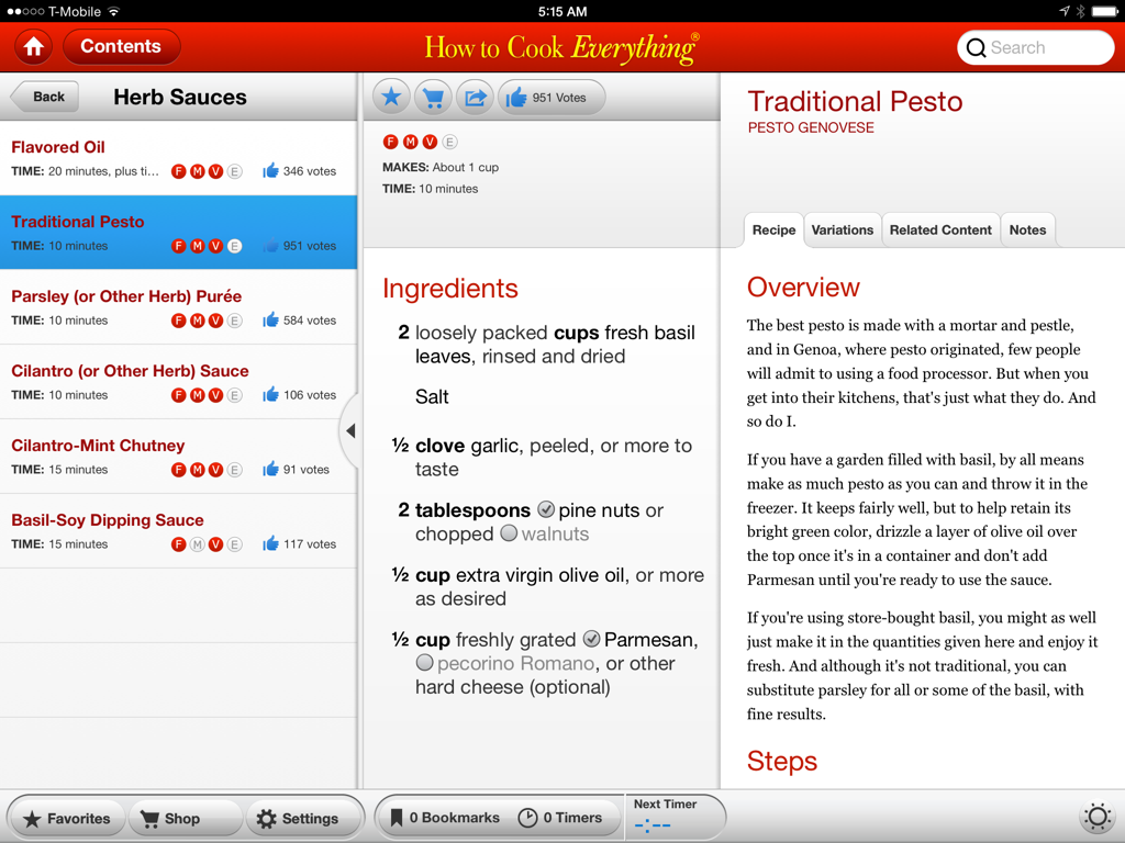
Figure 4-3. The content-centric “How to Cook Everything” iPad app feels more like a recipe book than like a place
Some information environments exist primarily to allow people to interact and socialize with one another. Facebook, for example, serves to bring together people who already know one another in an information environment where they can share pictures/videos/stories, play games, chat in real time, and more. We perceive these social information environments as places as well. Like their real-world counterparts, they also offer places within places—subenvironments—for groups of people to congregate around shared interests that may not be of interest to everyone else. For example, there is a Facebook group for people who are interested in information architecture (Figure 4-4).
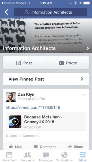
Figure 4-4. The Information Architects Facebook group
Building architecture aims to produce physical environments that can serve and communicate their social functions effectively, and information architecture aims to do the same for information environments. The main difference is that instead of defining compositions of forms, spaces, and objects such as walls, roofs, and furniture, information architecture defines compositions of semantic elements such as navigation labels, section headings, and keywords, and produces the design principles, goals, and guidelines that capture the intended feeling of the place (e.g., is this a serious, solitary place, or a fun, social space?).
Organizing Principles
Architects employ a variety of time-tested organizing principles to give physical environments structure and narrative. Information environments, too, have organizing principles that help bring coherence and structure to the whole.
One important difference between information architecture and building architecture is that the products of the latter are exclusive instances of a particular design in space and time. There is only one Guggenheim Museum like the one Frank Gehry designed for Bilbao, and although it is experienced quite differently by different people (e.g., children, people in wheelchairs, blind people), its structure and other formal elements are unique to it, as is its relationship with its context.
Information environments, on the other hand, can be manifested in various different ways. For example, a website can look and feel very differently when accessed using a desktop browser with a mouse and a large screen than when it is accessed on the four-inch touchscreen of a mobile phone. However, navigation and structural elements such as section headers tend to use the same terminology in both cases.
As a result, the semantic structures that information architecture produces are more abstract than the products of other design disciplines. Coherence between different instances of the architecture is achieved by consistent use of language, and by establishing a particular relationship, or order, between the linguistic elements that comprise it.
Structure and Order
The hierarchy and order of elements in an information architecture infuse the resulting products with meaning and a sense of place. It is an important part of what makes them different from other products or services in the same industry.
In buildings, hierarchy and order are conveyed using various compositional and structural patterns that have evolved over time. For example, building entrances are often highlighted with porticos that serve as visual indicators pointing to the way in (Figure 4-5). Changes in the roof, as well as the deep shadows and colonnades that characterize porticos, serve as signs that say to people, “this opening is more important than others in the skin of this building.”
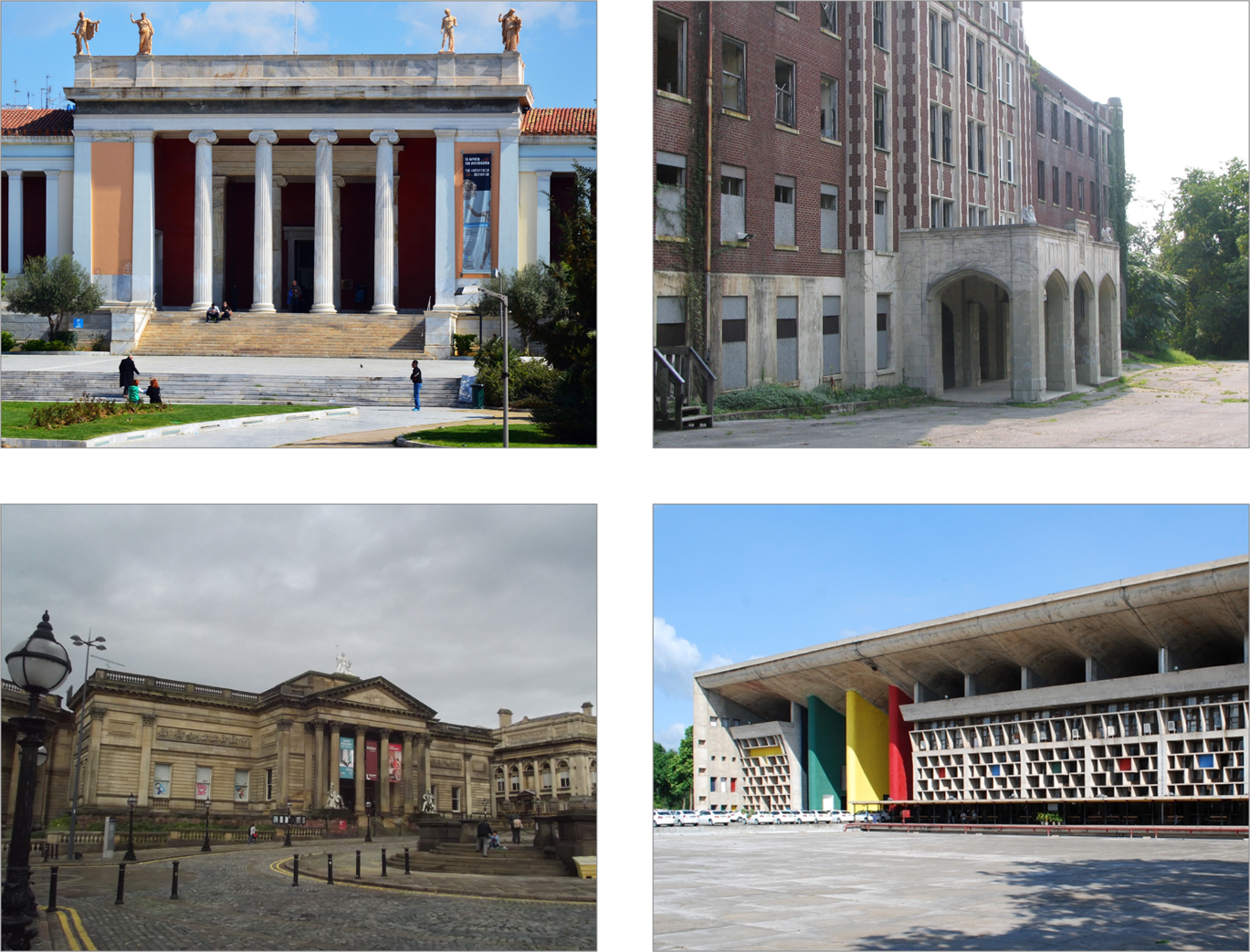
Figure 4-5. Buildings using common patterns to let users know where their entrances are (images: http://bit.ly/greek_nat_archaeological, http://bit.ly/building_front, http://bit.ly/walker_art_gallery, http://bit.ly/capitol_high_court)
The semantic structures in an information architecture also have hierarchies that indicate the relative importance of individual components within the whole. For example, navigation structures for large-scale websites or content-rich apps usually have “top-level” links that are limited to the highest-level elements in a hierarchical structure. (When discussing these structures conceptually, we often render them in diagrams such as sitemaps.) This first-level order plays a large role in defining the conceptual boundaries and overall perceived “form” of the information environment, much as the primary structural supports of a building tend to define its physical form, use, and adaptability over time.
Another common ordering principle in buildings is rhythm, usually the result of patterns evident in the structural grid, skin ornamentation, or both. These patterns can add interest, dynamism, and scale, and help smooth the transition between the street and the interior of the building. Rhythms and patterns are also important ordering principles in information environments, which change the way we perceive information. For example, how search results are presented can suggest different “beats,” with some environments requiring denser patterns than others (Figure 4-6).
We also experience a strong sense of rhythm in information environments that show a constant feed or stream of similar information nuggets, such as Twitter and Flipboard (shown in Figure 4-7). This sense of rhythm is not just the result of the interaction design of these products, but a manifestation of architectural decisions that affect how they are experienced across various different platforms.
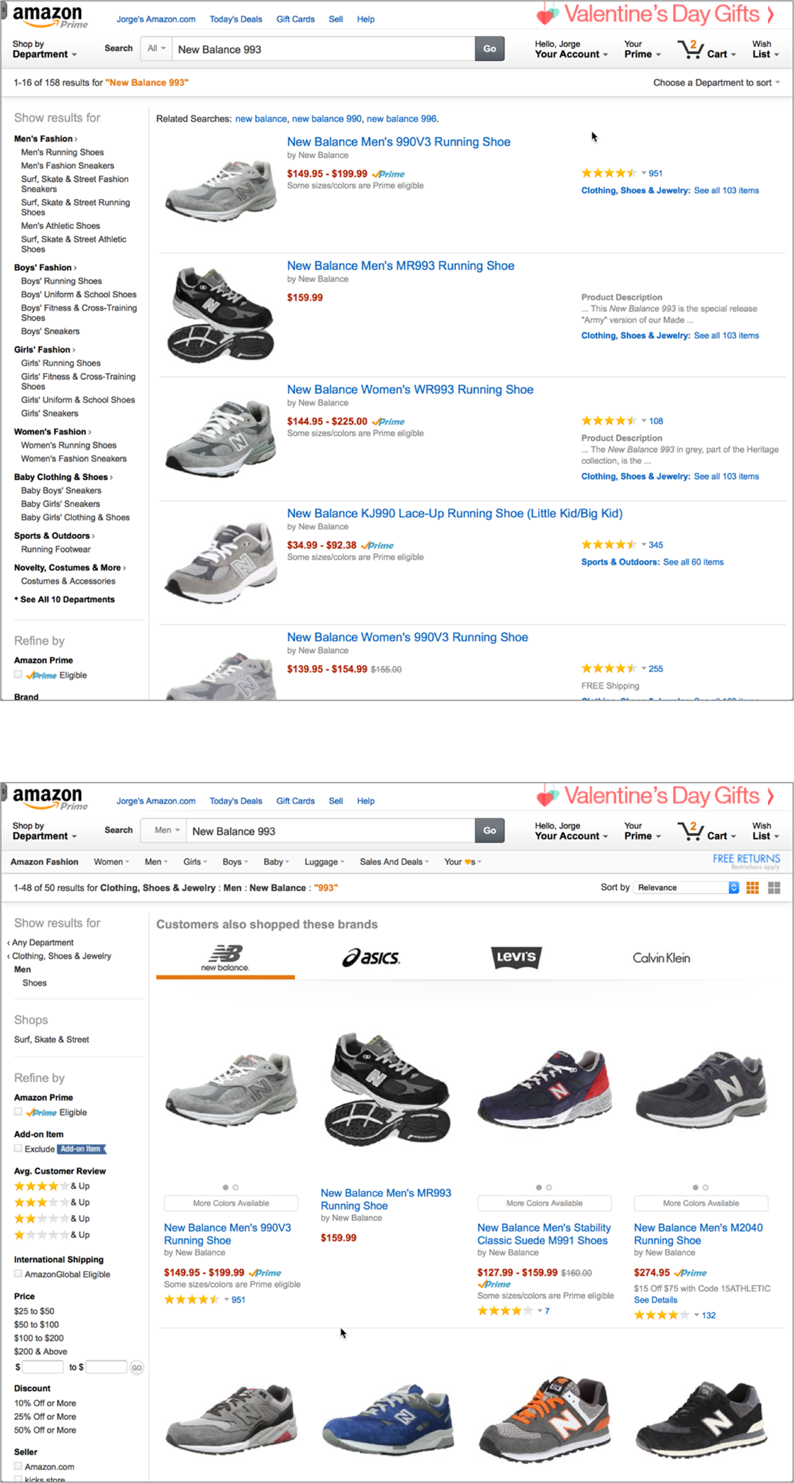
Figure 4-6. When you “choose a department to sort,” the rhythm of Amazon’s search results changes
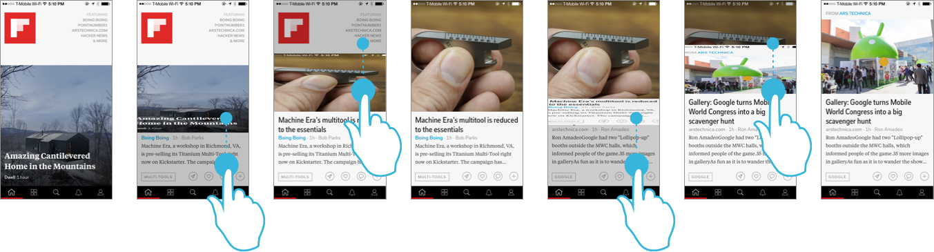
Figure 4-7. Flipboard users experience a clear sense of rhythm as they flip through stories with their finger, one at a time; in this example, we show the iPhone app, but this is true in the other systems in which Flipboard is available as well
Typologies
Earlier in this chapter, we talked about how different building types have evolved in order to serve the needs of the institutions that erect them. For example, today most bank branches—even those from competing firms—are more similar to than different from one another.
These building types have changed and adapted over time. Consider a classic building type called the basilica, shown in Figure 4-8. This type, which consists of a rectangular building with a central nave and two aisles on its sides, was initially used for conducting legal matters during the Roman era. Over time, the basilica form was adopted for use in Christian religious buildings, and many churches are still based on it today. As a result, when they encounter a building with the form of a basilica, many Westerners think of it as a place of worship. They know how they are supposed to interact with the place, given that they have done so in similar places many times in the past.
Digital information environments are much newer than buildings, but they, too, have started to evolve typologies. The information structures that underlie bank websites, for example, tend to be similar to those of competing banks. The same is true for airlines, universities, hospitals, newspapers, online stores, and more.
Having abstract, generalized types of information environments is useful for various reasons. First, it serves as shorthand to communicate to users what type of place they are in. Much like when we enter a basilica-type building we think, “church,” when we enter a site that has navigation elements with labels like “Banking,” “Loans and Credit,” “Investing,” and “Wealth Management,” we think “bank.” Even if we didn’t know the brand, and there were no other indicators that this was a bank, the mere presence of this information structure would offer clues as to the nature of the business that operates the website (Figure 4-9).
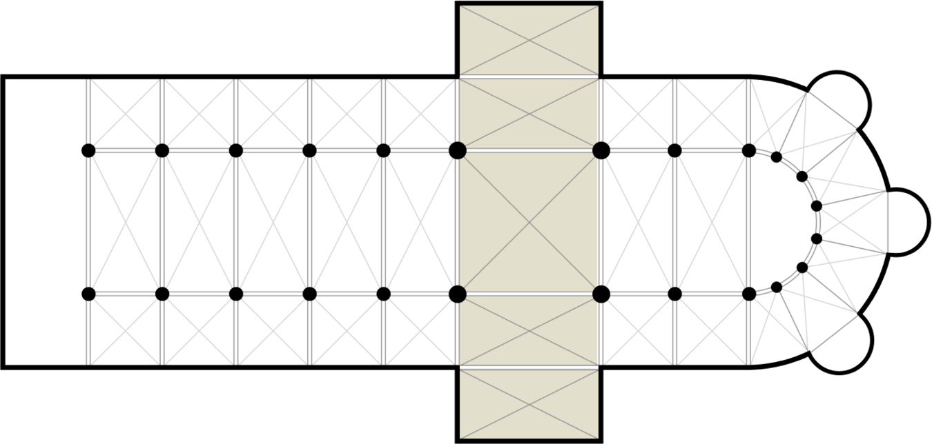
Figure 4-8. Floor plan of a typical Christian basilica form, with a transept added (image: Wikipedia, http://bit.ly/transept_arm)
Second, it makes it easier for users to understand and navigate the environment. If you’re designing a bank’s website today, it will probably not be the first such site your users will have encountered. They will bring to the interaction learned behaviors and expectations of how such an information environment should work, and where they can find the information they are looking for. For organizations operating in a space characterized by common types, such as banks, the understandability and ease of use of your final product will be greatly affected by how closely it hews to the norm.
Finally, having a standard structure to work against makes it easier to differentiate an information environment from those of competitors, as shown in Figure 4-10. This may sound contradictory, but when the overall structure is similar for many organizations in the space, small differences—such as the use of particular words or a different tone—help them stand out. These differences can help define the brand of the organization (as long as they don’t go too far afield and “lose” the user).
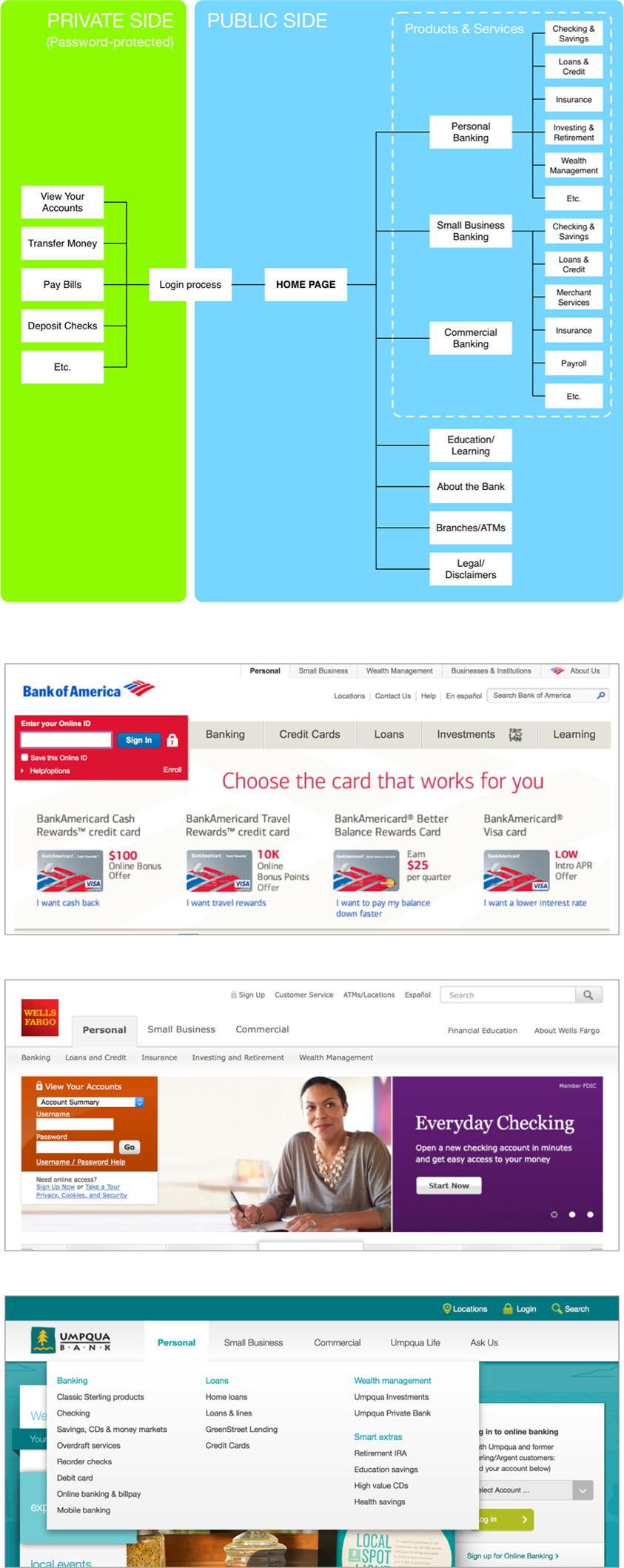
Figure 4-9. A sitemap illustrating the typical semantic structure of bank websites, along with screenshots from three banks that show variants of the typology
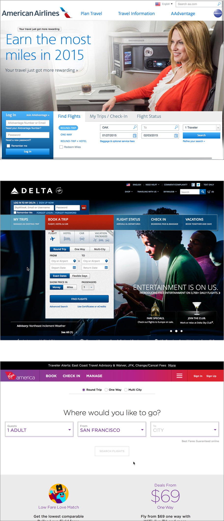
Figure 4-10. Three airline websites with slight structural differences that help set them apart; all three keep enough of the “airline” typology to avoid confusing users
Modularity and Extensibility
Most information environments are dynamic and ephemeral. Driven by changing business needs, popular taste, and new technologies and techniques, they are subject to constant change. However, not all parts of an information environment change at the same rate. For example, a website’s visual design may change considerably over a span of five years, while its underlying information structures remain relatively stable.
In his book How Buildings Learn: What Happens After They’re Built, Stewart Brand explains that buildings are composed of six layers (the “six S’s”), which change at different rates over time (Figure 4-11). In order of slowest to fastest, they are:
- Site
-
The geographical setting of the building; it changes the slowest (“Site is eternal,” says Frank Duffy, who originated this concept of shearing layers)
- Structure
-
The skeleton that holds up the building, including the foundation, columns, slabs, and other support elements
- Skin
-
The exterior surface of the building
- Services
-
The “working guts” of the building (electrical systems, heating, ventilation, air conditioning, plumbing, etc.)
- Space plan
-
The internal layout of the building, including partitions and doors between spaces
- Stuff
-
Furnishings, appliances, day-to-day objects, and the like; these change the fastest, sometimes on a month-to-month basis
So, while the furniture and internal partitions of a building may change relatively frequently, depending on its use, the slower-changing layers such as structure and skin tend to stick around for much longer. A well-designed building can accommodate many different uses over a long span of time. Often, the possible new uses of a building are dictated by the relatively unchanging layers in the system, such as the support structure.
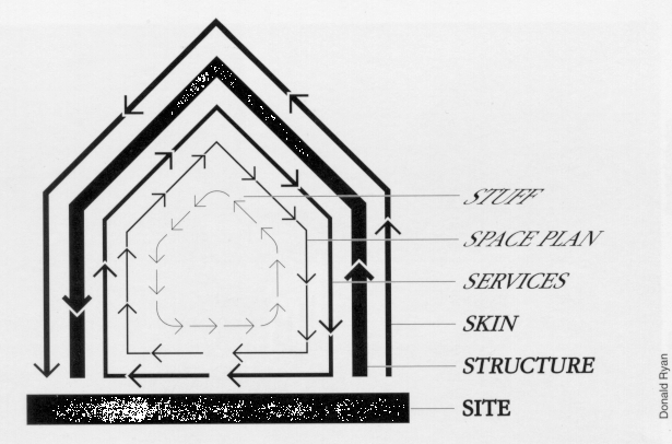
Figure 4-11. Stewart Brand’s “shearing layers of change”
Information environments, too, are composed of different layers that change at different rates over time. While the page layouts, visual design, and interaction mechanisms of websites can change to reflect popular styles, their semantic structures tend to remain relatively stable. Information architecture is primarily focused on defining these semantic structures, which tend to be relatively long lived (Figure 4-12). Users of these systems become used to their semantic structures, and can become disoriented if they change too abruptly.
Given the dynamism of digital information environments, graceful adaptability and extensibility are even more important for information architecture than for building architecture. Any one information architecture can be placed in a continuum that ranges from “very flexible” to “very brittle.” While you would expect that “very flexible” would be the ideal, this is not often the case: suppleness in information architecture usually invites the use of ambiguous language, which is not conducive to clear communication. The ideal is somewhere in the middle, where the environment can accommodate change but is also clear and crisp in its objectives and affordances.
One way to achieve this balance is by setting off parts of the environment that have different rates of change, and making them obviously separate, but related, parts of the whole. If the overall structure can accommodate many of these subenvironments in an obvious way, the whole becomes more flexible and open to change (Figure 4-13).
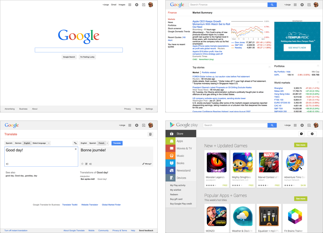
Figure 4-13. Google has a variety of subsites, each with its own subdomain and identity—this allows it the flexibility to create new products and services with little obvious impact on the whole
The Happiest Place(s) on Earth
As with the design of physical places, information architecture aims to bring into balance the needs of the user (who wants to be able to find and understand information in a comfortable, familiar setting) with those of the organization that owns the environment (which usually has business objectives to meet, such as a certain sales target) and those of society as a whole. When the right balance is struck, the result is coherence and understandability in products and services across the organization, from websites to the wayfinding systems of physical environments.
A carefully designed organizational structure can help users understand new and unfamiliar environments. A good illustration of this principle is Disneyland, the first theme park (a new concept in 1955, when Disneyland opened). In its earliest incarnations, the design for the park consisted of a few attractions in a small lot across the street from Disney’s Burbank studio. As Walt Disney’s ideas and ambitions for the park grew, it became evident that an organizing principle was needed.
The eventual solution that emerged was a design with a central hub, with spokes leading to five distinct thematic “lands”: Adventureland, Frontierland, Fantasyland, Tomorrowland, and Main Street, U.S.A. Each “land” contains attractions (rides, shows, exhibits), restaurants, shops, and services such as restrooms, as shown in Figure 4-14. All of them are carefully—and obsessively—themed to make guests feel like they are in the South Pacific, a remote Western town, or Alice’s Wonderland.
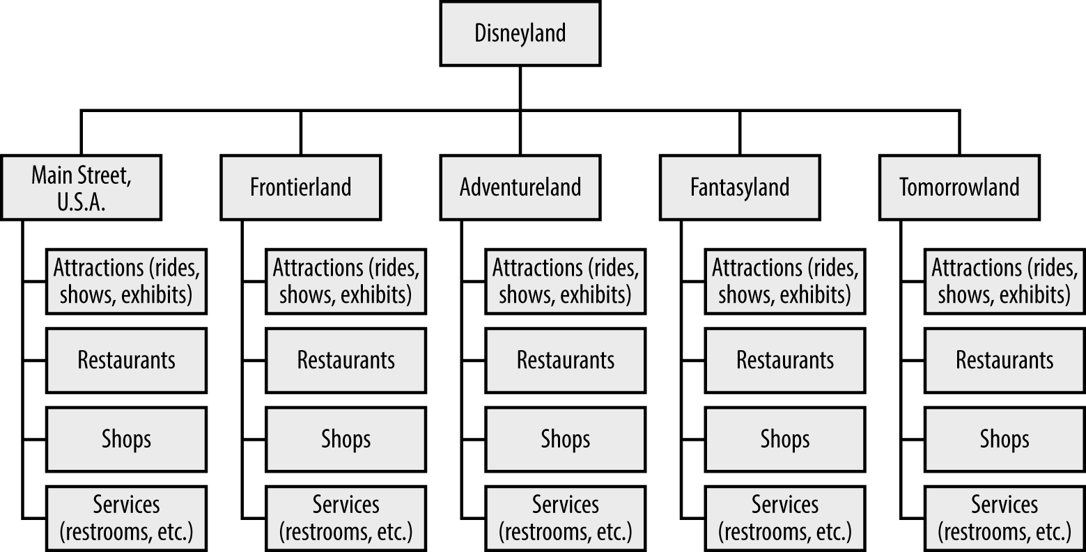
Figure 4-14. The organizational structure of Disneyland made a new, unfamiliar concept—the theme park—easily understandable to mid-1950s Americans by appealing to their emotions and fantasies
The “lands” also introduced structural narrative to the whole. It is no coincidence that the initial set reflects themes that were popular in mid-1950s America: the space race was revving up, Westerns were all the rage, and adults were feeling nostalgic for the Main Streets of their youth (which automobile culture had started to displace). The new, unfamiliar idea of the theme park was made understandable and enticing by giving it a clear organization, based on concepts that the target audience understood and was emotionally engaged with.
This conceptual structure was also reflected in other products of the Disney Company. For example, this division into “lands” was also used to organize Disney’s first television show: one week, it would feature an Adventureland story; the next, viewers would see a tale from Tomorrowland. Disney movies of the period also reflected (and influenced) the themes of the park: Sleeping Beauty manifested the Fantasyland theme, while the True-Life Adventures documentaries manifested the Adventureland theme. (Disney is widely regarded as one of the first and best practitioners of end-to-end corporate synergy.)
The semantic structures that define the Disneyland experience go beyond setting the context for the place itself: they also extend to the people who participate in it. In Disney parks, customers are referred to as “guests” (an innovation introduced to the hospitality industry by Disney) and park employees are referred to as “cast members.” These carefully chosen terms help to define and differentiate how these people act in the environment.
The themed-lands-around-a-hub structure has also served Disney well over time, as it accommodates organic growth and change within a coherent structure. New attractions are added to individual lands to cater to changing tastes (a spate of thrill rides were added in the 1970s) while reinforcing the themes of their respective lands. Although less frequently, whole new lands have been added as well, increasing the variety of experiences available to guests. Because the park is organized around distinct “lands,” guests can more easily accept and understand these (sometimes jarring) changes: there is an overall method to the madness.
Since the early 1970s, Disney has been building a new Disneyland-style park somewhere in the world every 10 years or so, and these new parks follow the original’s organizing scheme with variations to make them contextually relevant to their time and location (Figure 4-15).
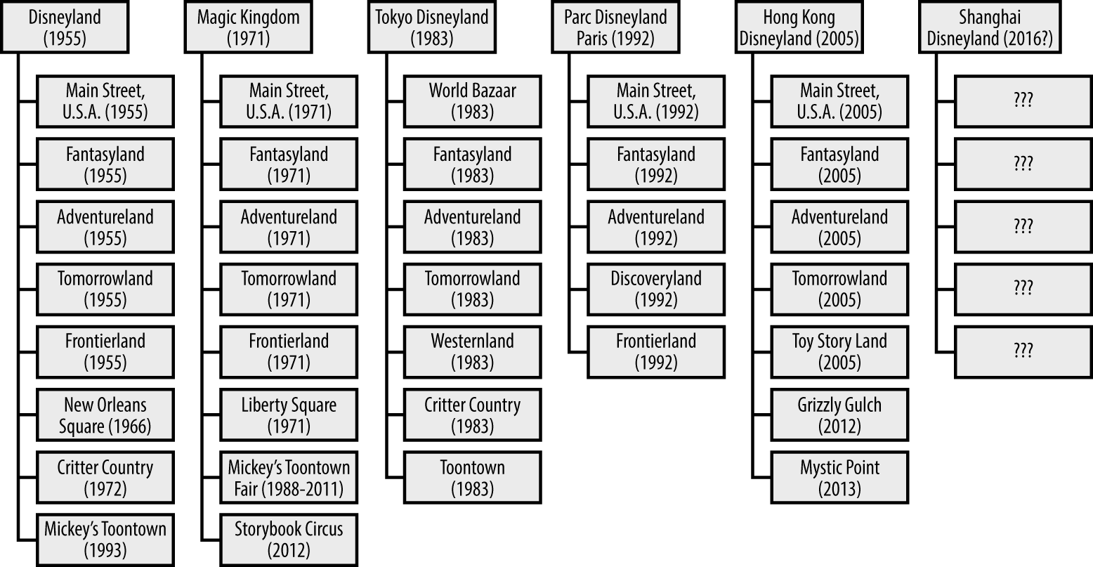
Figure 4-15. The conceptual structure of Disneyland parks allows coherence, extensibility, and adaptability to cultural and temporal context (note that Tokyo Disneyland’s Frontierland is called Westernland, and that Hong Kong Disneyland doesn’t have one at all)
The information architecture of digital products and services functions in a similar placemaking role. An example of an information environment that shows a structure akin to Disneyland’s is eBay. Instead of themed “lands,” eBay has categories that focus the user’s attention on a particular set of goods. Some, such as eBay Motors, are effectively subsites with highly specialized navigation structures (Figure 4-16). eBay also employs carefully chosen labels to define user roles: at any given moment, you can act either as a “buyer” or “seller,” nouns that constrain your expected range of behaviors to a predefined set.
While consistency between channels is important, the information architecture must be tailored to serve the specific information needs of the current users of each channel. It’s important to note that the Disneyland website doesn’t employ the “lands” structure as its primary organizing principle (Figure 4-17). Visitors to the website have different information needs from guests in the park: most of them are not there to experience Disneyland itself, but to book a vacation in the park. As a result, the information architecture of the Disneyland website reflects the typical travel-and-hospitality type, such as that of a hotel. The “lands” structure is still visible—at a much lower level of importance—in the section of the site that describes the attractions in the park.
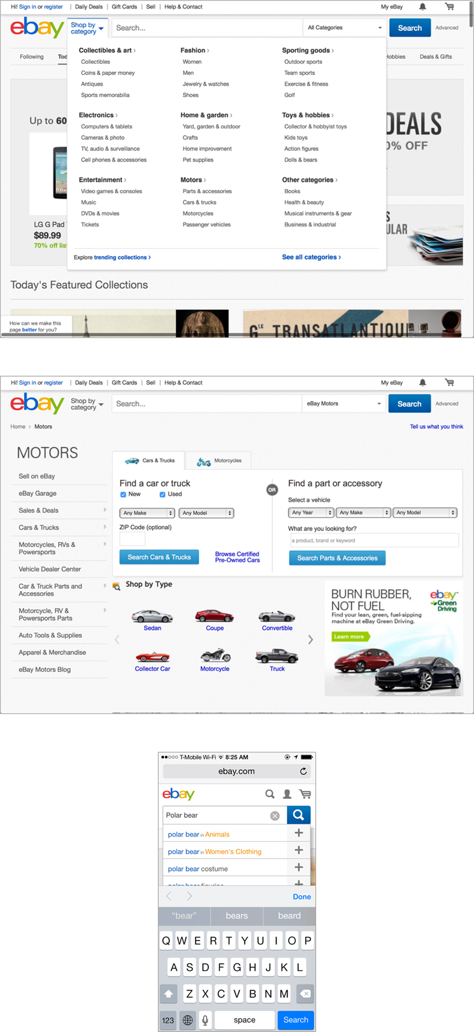
Figure 4-16. eBay’s categories serve a similar role to Disneyland’s “lands”: they help set the context for the user’s experience of the place—search terms are shown alongside suggested categories, attempting to guess the user’s meaning in context

Figure 4-17. The information architecture used on Disneyland’s website is the “travel and hospitality” type; the “lands” structure, which so dominates the parks, plays a minor supporting role in the site
Recap
So, let’s recap what we learned in this chapter:
-
The structure of information environments influences more than how we find stuff: it also changes how we understand it.
-
We experience information environments as places where we go to transact, learn, and connect with other people, among many other activities.
-
When designing information environments, we can learn from the design of physical environments.
-
Some organizing principles that carry over to information environments from physical environments include structure and order, rhythm, typologies, and modularity and extensibility.
As you may have surmised at this point, finding and understanding are not really separate goals: they are flip sides of the same coin. The way we understand an information environment—the context it sets information in—influences how we find information in it, and vice versa. The organizational structure of the environment is a critical factor in influencing how people make sense of what they can do there, and the information they hope to find and produce when participating in the environment.
In any case, we hope we’ve done a good job of setting the stage. We’ll now move on to Part II of the book, in which we explore the basic principles by which information architecture achieves these aims.
1 See “Language + Meaning + User Experience Architecture” by Andy Fitzgerald.
2 To become more aware of these differences, try serving your family dinner in the bathroom one evening.
3 It’s worth noting that architects design for both the reality and the perception of security. The structure of a bank physically protects the safe, but there are additional elements (e.g., video cameras) that protect against theft. There’s a language of security that maps across physical and digital places.
Get Information Architecture, 4th Edition now with the O’Reilly learning platform.
O’Reilly members experience books, live events, courses curated by job role, and more from O’Reilly and nearly 200 top publishers.

