13.3 Graphical Analysis
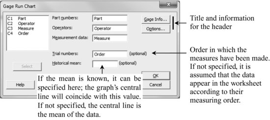
Stat > Quality Tools > Gage Study > Gage Run Chart
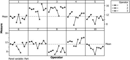
Conclusions that can be drawn from this graph:
- There are differences between the parts. For example, parts 2 and 3 show values larger than the mean, whereas the values of parts 8 and 10 lie below the mean.
- Worker 2 measures with higher variability than the others. In addition, the values of operator 2 are generally smaller than those of operators 1 and 3.
Notice that the graph obtained is the same whether the order of the measures is specified or not, because the data are already sorted according to the measuring order.
Get Industrial Statistics with Minitab now with the O’Reilly learning platform.
O’Reilly members experience books, live events, courses curated by job role, and more from O’Reilly and nearly 200 top publishers.

