3.2 Pareto Charts
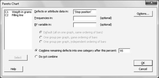
Stat > Quality Tools > Pareto Chart…
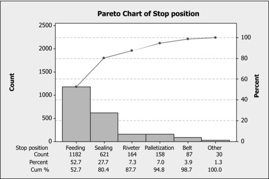
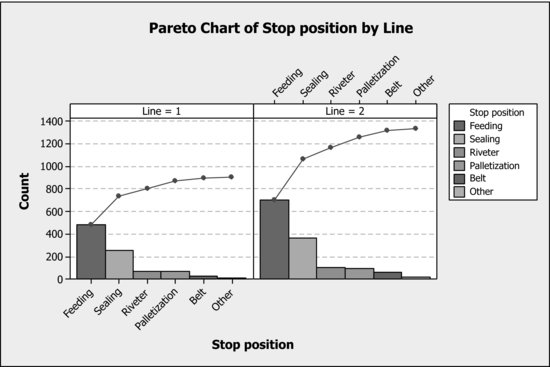
Using all default options, introduce the variable ‘Line’ in ‘BY variable in’ to construct a Pareto chart of the variable ‘Stop position’ stratified by the production ‘line’ variable, as shown below:
3.2.1 Changing Appearance of Pareto Charts
To change the bar colors (something highly recommended if you want to produce black and white graphical outputs), follow the next steps:
- Delete the colors (that is, choose the white color for all bars): Double-click on any bar (all bars are selected at once), then in Fill Pattern choose the Custom option and finally select the desired color (in this case white) in Background color.
- Add the line patterns: once all bars are selected (done as indicated in the previous step), click on any of them (so only this one is selected), and then double-click on it (a dialog box for edition appears). In Fill Pattern, first choose the Custom option and then select the desired Type pattern. Repeat the same procedure with all other bars.
- Remove the grey border: Double-click anywhere in the grey graph region to open a dialog box. in Fill Pattern and Borders and Fill Lines, first choose the Custom option ...
Get Industrial Statistics with Minitab now with the O’Reilly learning platform.
O’Reilly members experience books, live events, courses curated by job role, and more from O’Reilly and nearly 200 top publishers.

