Using chart to turn data
The chart command is useful for "turning" data across two dimensions. It is useful for both tables and charts. Let's start with one of our examples from stats:
sourcetype="impl_splunk_gen" error | chart count over logger by user
The resulting table looks like this:
If you look back at the results from stats, the data is presented as one row per combination. Instead of a row per combination, chart generates the intersection of the two fields. You can specify multiple functions, but you may only specify one field each for over and by.
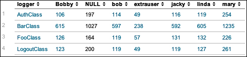
Switching the fields turns the data the other way.
By simply clicking on the chart icon above ...
Get Implementing Splunk: Big Data Reporting and Development for Operational Intelligence now with the O’Reilly learning platform.
O’Reilly members experience books, live events, courses curated by job role, and more from O’Reilly and nearly 200 top publishers.

