One limitation of graphing in Splunk is that only a certain number of events can be drawn, as there are only so many pixels available to draw. When counting or adding values over varying periods of time, it can be difficult to know what timescale is being represented. For example, consider the following query:
earliest=-1h sourcetype=impl_splunk_gen
| timechart count
Splunk will produce this graph for the preceding query:
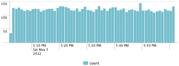
Each of these bars represents 1 minute. Let's change the time frame to 24 hours:
earliest=-24h sourcetype=impl_splunk_gen
| timechart count
We are presented with this graph: ...

