59For Part IV
(A) Figures 59.1 and 59.2 are histograms showing simulation results of correlations between samples of purely random numbers. The first uses sample sizes of 30 pairs of numbers. The second uses larger sample sizes of 100.
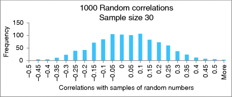
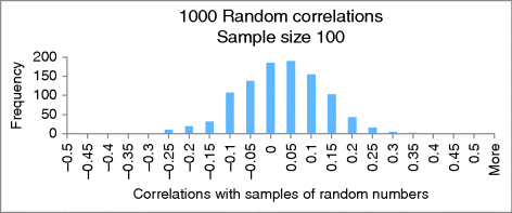
(A1) Does it appear more likely to get a correlation of −0.2 (or less) purely by chance when you have a sample size of 30 or when you have a sample size of 100?
Answer: When you have sample size of 30. In general, the smaller the sample, the more likely it is to have larger correlations (negative or positive) by chance. This is similar to the fact that you are more likely to flip all heads when you flip a coin just a few times rather than many times.
(A2) Using real data with a sample size of 30, let us say you had a sample correlation of −0.25. Using the histogram in Figure 59.1 as a reference, would you expect your sample correlation to be statistically significant at the 0.05 alpha-level?
Answer: No. The area of the bars from −0.25 out to the left is fairly substantial. It looks like well over 50 random correlations are out in the left tail, giving a ![]() -value greater than 0.05 (). That is one-tail. Doubling the ...
-value greater than 0.05 (). That is one-tail. Doubling the ...
Get Illuminating Statistical Analysis Using Scenarios and Simulations now with the O’Reilly learning platform.
O’Reilly members experience books, live events, courses curated by job role, and more from O’Reilly and nearly 200 top publishers.

