14The Standardized Normal Distribution Histogram
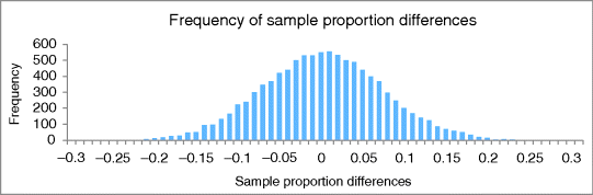
As we have seen, random sampling scenarios for sample proportions and sample proportion differences form normal distributions. And, we can rescale all of them to a common scale: The #SEs scale. Let's put our most recent histogram of sample proportion differences into the standardized form. Figure 14.1 is the original histogram.
In the standardized histogram of Figure 14.2, the horizontal axis is rescaled by using #SEs instead of proportion differences. Since it uses #SEs, it is a general-purpose histogram, as we'll see. The vertical axis is also rescaled by using relative frequency instead of frequency. Since it uses relative frequency, the sum of all the bar heights equals 1. Recall that relative frequencies can serve as probability estimates.
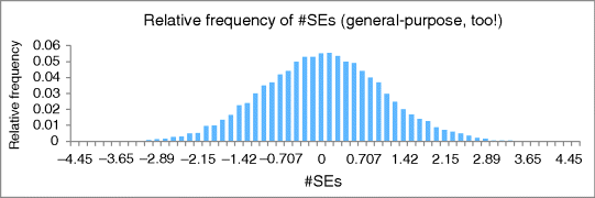
This standardized histogram of results approximates the general-purpose standardized normal distribution, which dovetails with the formulaic methods. Since the #SEs formula takes into account the sample proportions, their variances, and their sample sizes, we can use #SEs and the standardized normal distribution for any scenarios involving any sample proportions (except those too close to 0 or 1) and any sample sizes (except when they are too small). In short, ...
Get Illuminating Statistical Analysis Using Scenarios and Simulations now with the O’Reilly learning platform.
O’Reilly members experience books, live events, courses curated by job role, and more from O’Reilly and nearly 200 top publishers.

