Lesson 28
CSS3 Media Queries
You will end this section by taking a first look at CSS3 media queries. This is a subject you will return to when you look at developing web applications for mobile phones, but this lesson will introduce the fundamentals for developing web applications that render differently on different devices, and in different contexts.
It is now very common for a web application to be used on many different devices. For example:
- In a web browser, on a desktop or laptop
- Output to a printer
- On a small screen device, such as a smart phone
- On an alternative device, such as a TV
Although the basic functionality of the web application may be the same in each case, it may be necessary to reposition, hide, or augment the display of specific elements for each device.
There are several ways to solve this problem. Historically, the most common approach has been for the web server to detect the browser (or user agent) accessing the web page, and directing the user to a page created specifically for this device.
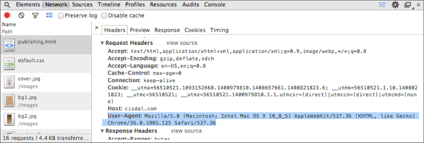
Any time a browser requests a web page, it provides a variety of information in HTTP headers. These can be can be used by the web server to reliably detect the browser and operating system. For example, Figure 28.1 shows the headers that were passed to the web server when performing a simple HTTP GET request, including the User Agent header.
There ...
Get HTML5, JavaScript, and jQuery 24-Hour Trainer now with the O’Reilly learning platform.
O’Reilly members experience books, live events, courses curated by job role, and more from O’Reilly and nearly 200 top publishers.

