Examining the portfolio website layout
Before we start building the blocks and edges of the website, let's take a look the website wireframe. This wireframe will be the reference and give us the picture of how the website layout will be organized both in the mobile and desktop view.
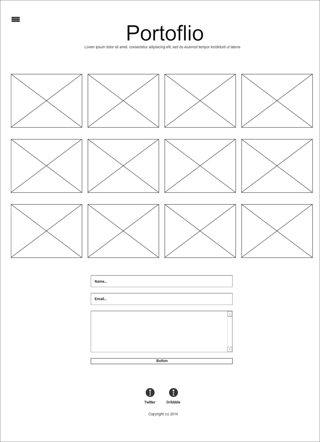
The preceding screenshot shows the website layout for the desktop or—technically—the wide viewport size.
The website will have a button positioned at the top-left of the website with a so-called hamburger icon to slide in the off-canvas menu. Then comes the website's first line, which says the website name and a line of catchphrase. The subsequent section will contain ...
Get HTML5 and CSS3: Building Responsive Websites now with the O’Reilly learning platform.
O’Reilly members experience books, live events, courses curated by job role, and more from O’Reilly and nearly 200 top publishers.

