Optimize the blog for desktop
The blog is currently optimized for mobile, or narrow viewport size. If you view it in a larger viewport size, you will find that some elements are misplaced or are not properly aligned. The blog logo and the navigation, for example, are currently aligned to the center, as you can see in the following screenshot:
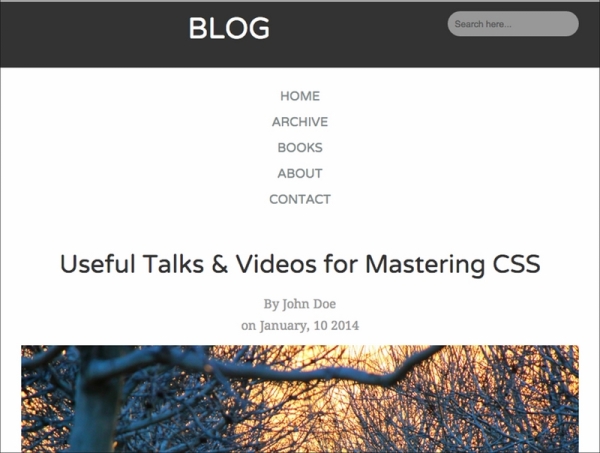
As per our blueprint that we have shown you in Chapter 3, Constructing a Simple Responsive Blog with Responsive.gs, the logo should align to the left-hand side and each menu link should be displayed inline. In the upcoming steps, we will fix these through Media Queries; we will optimize the blog for desktop ...
Get HTML5 and CSS3: Building Responsive Websites now with the O’Reilly learning platform.
O’Reilly members experience books, live events, courses curated by job role, and more from O’Reilly and nearly 200 top publishers.

