Chapter 6. Solving the Puzzle of CSS Layout
When you create site layouts depending upon CSS, your first and
greatest challenge is to put the various pieces of your layout
exactly where you want them. CSS offers three basic
tools for creating layouts: positioning, float, and width/margin.
Unfortunately, the models underlying the use of those techniques are
notoriously hard to master.
The CSS Box Model and Element Size Control
When the browser renders block elements, such as div or p,
each element has four telescoping components: content, padding, borders, and margins (from the inside
out), as shown in Figure 6-1. In current
implementations, the dimensions of such boxes are computed by
adding three of those four components, so that if a
width or height value is applied to an element, that
elementâs borders and padding (as such) make it yet wider. Margins also
affect this process, but only after neighboring margins are taken into
consideration.
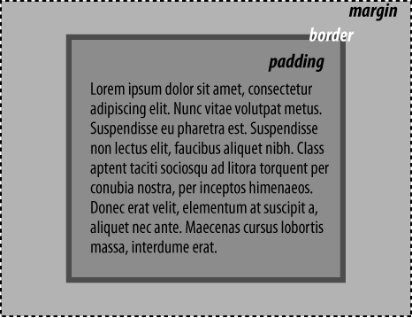
Figure 6-1. The computed width and height of an element are subdivided into four constituent parts: margins, borders, padding, and content
There are two exceptions to this definition of browsersâ layout
behavior: mode resets, and the use of auto values for content boxes.
Get HTML & CSS: The Good Parts now with the O’Reilly learning platform.
O’Reilly members experience books, live events, courses curated by job role, and more from O’Reilly and nearly 200 top publishers.

