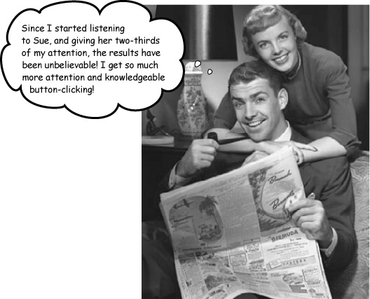
It pays to be a good listener... and to carry a pocket calculator. Weâve been talking about user-centered design for a few chapters, but hereâs where you really put your listening skills to the test. In this chapter, youâll take your usersâ feedback and build a site that meets their needs. From browsers to screen real estate, itâs all about giving your users what they really want. Not only that, youâll learn the secrets of the rule of thirds. Find out how a few easy presses of the calculator, a ruler, and some gridlines can turn your blase web page into a thing of beauty.
The design and layout of your site is the lens though which your users view and experience your content. If you have a confusing layout, your users are going to have a bad experience. However, if you develop a design and layout that is both functional and aesthetically pleasing, your users are not only going to hang around your site longer, but theyâll want to come back.
The first step on the road to putting together a design which appeals to your users is to actually know your users. Itâs a lot harder to come up with a design that meets their needs if you donât know who they are (and what makes them tick).

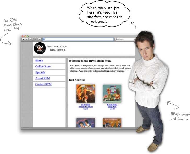
A local record storeâRPM Recordsâdecides they want to redo their horrendous site that was created for them way back in 1998. They not only want to bring their site up to date, but they want something that really meets the needs of their customers. The kicker is that they are also one of the sponsors of an upcoming progressive music festival, and they would look really silly if they were still using their old site by the time the festival starts.
Youâve got to redo RPM, make it look great, and ensure current users can get around easily.
When youâre designing for, a specific audience, youâve got to know what they like, and how theyâd use a site. But you can hardly deal with hundredsâmaybe thousands, even millionsâof users all at once!
This is where a persona comes into the picture. A persona is a single user that stands in for all of your audienceâa fictional user that has the most prominent characteristics of all your intended users. Those characteristics should relate to things that impact their web experience and browsing habits, like the browser your audience favors, or how long your audience spends online each week.
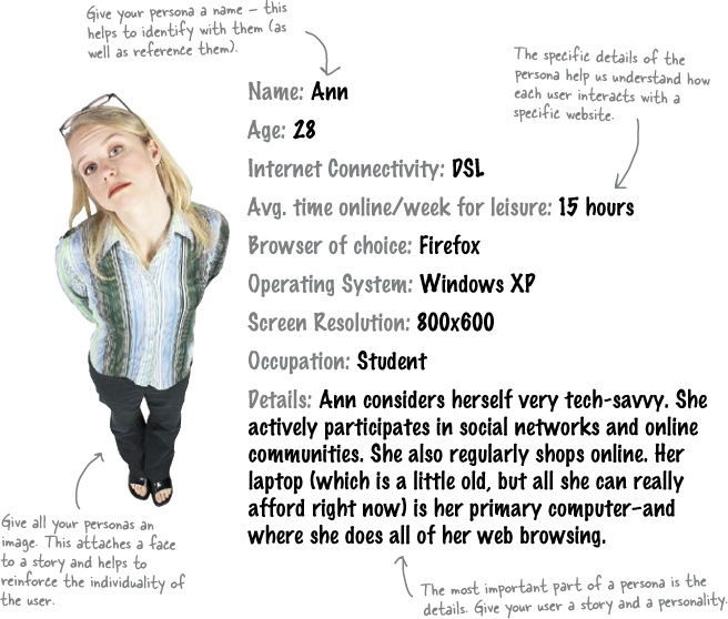
Your personas should be based on real data.
So where exactly does all of the data used to build personas come from? Well, it can come from a lot of different places. Technical stuff (like operating system and browser) can come from server statistics. Information about how your users behave online can come straight from the users themselvesâusing tools like surveys and focus groups. The point is that when you build a persona, you are not pulling characteristics out of thin air.
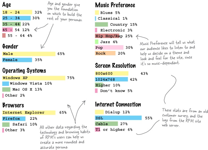
Letâs look at some data about the RPM users that we can use to build accurate personas for the new RPM site. The RPM owner had some old surveys heâs given us to work with:
Exercise
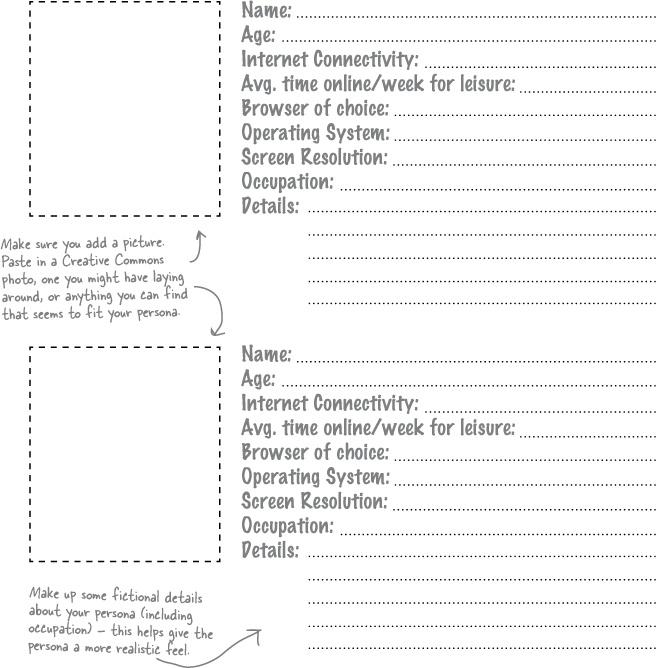
Based on the RPM user data, create two different personas for the RPM Music Store redesign. For the first persona, take the top value for each of the categories. For the second persona, use the secondary value.
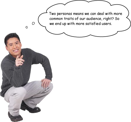
Building two personas widens the audience you can build your site for.
When you are building a persona, youâre creating a representation of the primary characteristics of your audience. But most of the time, your audience isnât composed of just one type of person. Youâll have lots of users who do not fall in line with the characteristics that you identified for your first (primary) persona. This is where the secondary persona enters the picture.
A secondary persona represents the characteristics that are next in line behind the majority characteristics that you used to build your primary persona. So you design first for your primary persona, but then you can also work on meeting the needs of your secondary persona, too. The result? A site that meets more of your audienceâs needs and makes more of them happy.
So now youâve got your two personas, and itâs time to ask: âWhat would Jon do?â âHow would Susan react?â Instead of designing for hundreds or thousands of faceless users, youâre now designing for your personas... and only your personas.
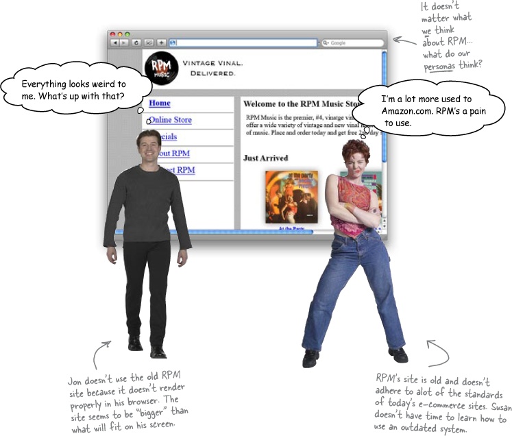
So letâs look at the old RPM site once more, in light of Jon and Susan. What do they think about the site?
Smaller displays limit screen real estate.
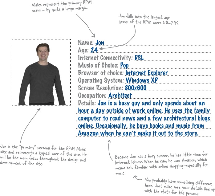
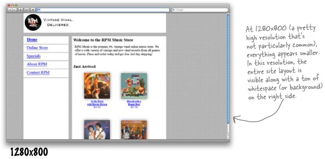
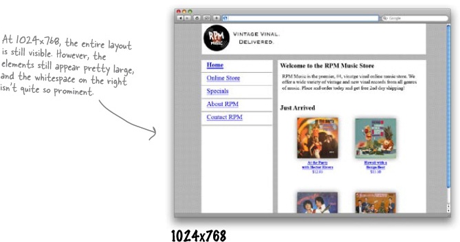
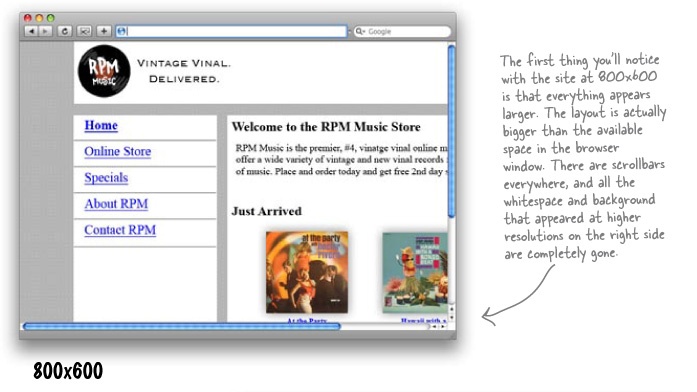
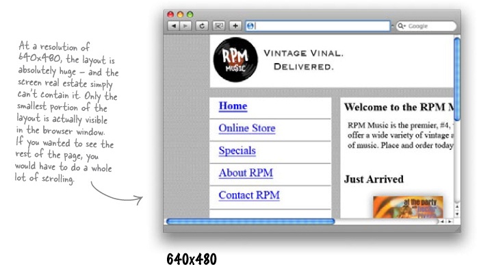
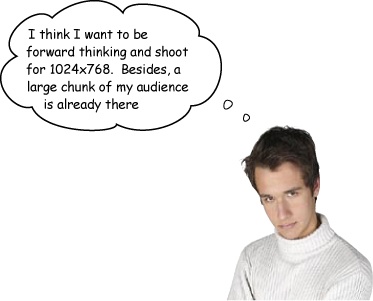
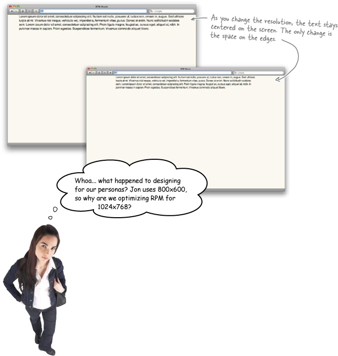
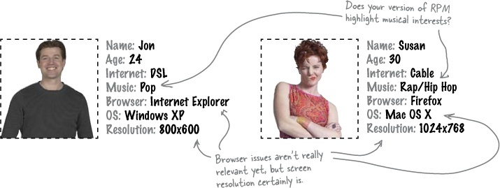
Jon uses an 800x600 screen resolution, which isnât very big... and, of course, if Jon uses that resolution, then most of the RPM users do, too.
With a lower resolution like 800x600, parts of the RPM site arenât showing up, and Jonâs having to scroll all over the place just to see everything. Not so usable... and sure to cause problems.
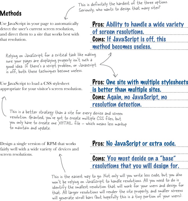
It sounds like RPMâs old site was designed without much regard for screen real estate... and thatâs the first thing we can try and fix.
Screen resolution affects the screen real estate your site has to work with. Higher resolution means more available space... but also tends to make things look smaller to users.
Letâs look at the old RPM site in several different resolutions:
Think about screen real estate as the size of the canvas upon which you will build your website. But the thing is, that canvas size isnât fixed. Some users have large 30â displays, some have nothing but a tiny iPhone. Even worse, a lot of users actually access your site on multiple screens: a phone on the go, a 21â monitor at work, and a 14â AirBook at home.
Then thereâs screen resolution. Even on a 21â monitor, users can choose their resolution: from 640x480 to 1600x1200, with a ton of different (and often unusual) choices in between. A higher resolution means that things appear smallerâand youâll have more virtual space for your site to work with. A lower resolution means that things on our site appear bigger, so youâve got less virtual space to work with.
Your users donât care about screen real estate... they just want sites to âwork.â
Have you ever seen a site that has an opening message like, âSite best viewed in 1024x768?â Have you ever actually gone in and messed with your screen resolution based on one of those messages?
Yeah, not so much.
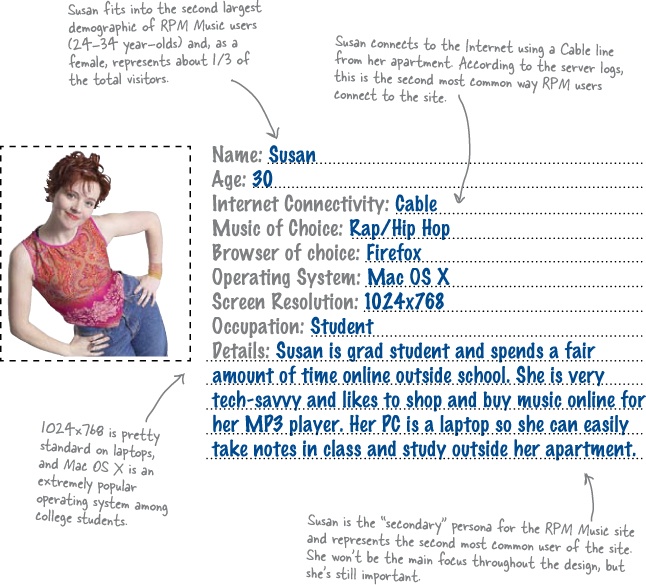
Itâs up to you, the web designer, to make sure a site looks right for your audience. You canât count on users changing their resolution or the device they use your site on... at least not if you (and your client) want to stay in business. So weâve got to figure out a way to make RPM a lot easier to use for Jon, whoâs sporting an 800x600 screen resolution, and Susan, whoâs using 1024x768.
Test Drive
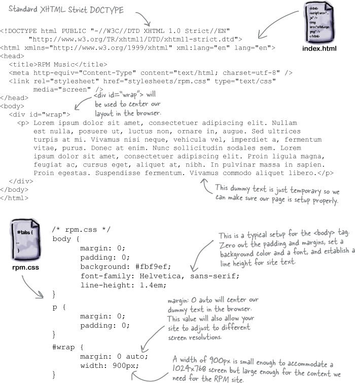
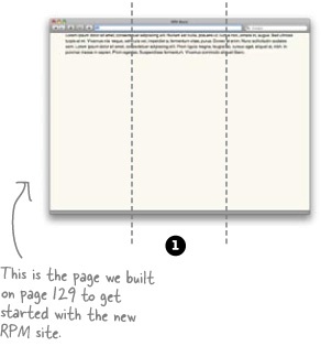
Create a very simple test page.
We donât have much to RPM yet, but go ahead and create index.html and stylesheets/rpm.css, and load them up in your web browser.
Knowing your audience lets you make informed decisions.
Jon uses 800x600, but if you check the RPM user survey back in Data about RPM Musicâs users, 800x600 just barely nudges out 1024x768. Since we know that, we can build a site that actually looks ideal on 1024x768... but that also looks pretty good on 800x600, too. Thatâs the power of personas: youâll have a good idea of how the decisions you make may affect your audience.

Frank:Â Iâm not so sure. I actually think weâve got a good handle on his first requirement: âReach all my current users.â
Joe:Â You mean because we can get text to look right on 1024x768 and 800x600?
Frank:Â Well, thatâs part of it. But our personasâ
Jim:Â Jon and Susan? Enough with the fictional characters already!
Frank:Â No, Iâm serious. I really think if we can please them, weâll have reached RPMâs core audience.
Joe:Â How do you please a persona? I mean, how do you know if youâve designed for them?
Jim:Â Maybe you can send a fictional survey to their fictional address. Offer them a fictional gift for responding...
Frank:Â Okay, okay... yeah, we canât exactly ask Jon or Susan what they think. But we know theyâre young, that theyâve got modern computers...
Joe:Â ...so youâre saying that if we design something thatâs pretty modern, then theyâll like it?
Frank:Â Exactly.
Jim:Â Okay, just for a moment, letâs say I buy into all this persona stuff. What is modern? I mean, how do you make a site look clean and hip and all that stuff? Isnât it just aesthetics? Like itâs all in the mind of the designer?
Frank:Â Not at all. In fact, I was just reading about something pretty cool: the Golden Ratio.
Joe:Â Is that like the Golden Rule? Do unto others...
Frank:Â No, the Golden Ratio is a cool way to make sure a site looks pleasing to the eye. Let me show you...
What makes a beautiful site appealing to us? What makes an ugly site so unattractive? Well, most of the time, itâs all about how our eyes perceive the elements on the site. There is nothing worse than a print document or a web page in which graphics and text have been thrown in haphazardly. Our eye needs predictability and a certain amount of visual logic when absorbing information.
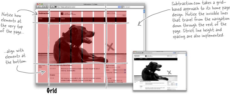
Imagine if you laid out a grid on top of your favorite sites. Do things line up along a grid? Are there strong horizontal and vertical spaces that allow you to group the page into sections? Take a look at a grid-based site... and the old version of RPM:
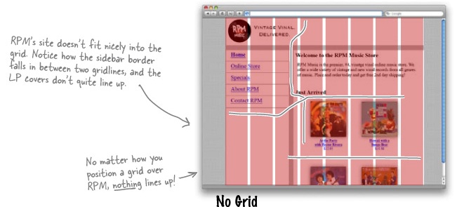
The grid is one of the oldest graphic design tools out there. Itâs so old that it predates âmodernâ graphic design. Way back during the Renaissance, painters started using a grid based on the Golden Ratio in order to compose their paintings. Golden Ratio? What the heck is that? Well, if you take a length of a line and multiply by .62, you get a ratio that can be used to create a pleasing, natural-looking gridâthatâs the Golden Ratio!
The whole idea behind the Golden Ratio is to use a balance that weâve all seen around us our whole lives, and put that balance into use on a website. The result? Sites just âfeelâ and âlookâ right to our eyes. Just take a look at a few examples of the Golden Ratio in action:
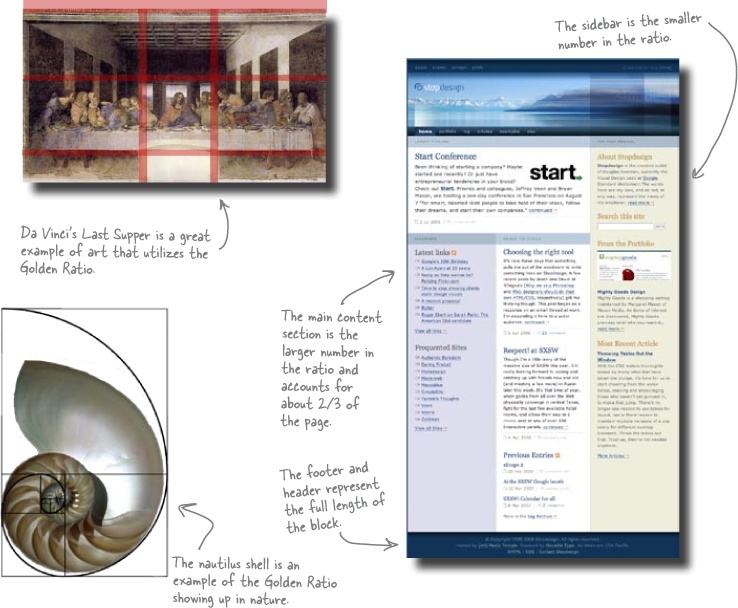
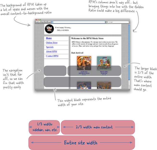
The Golden Ratio says that if you take the entire width of something, and multiply it by 0.62, youâll get a nice wide area that you can put content into. The remaining 0.38 is great for sidebars, extra content, things that the eye should look at second.
But multiplying by 0.62 isnât that handy unless youâre carrying around a pocket calculator (Head First Algebra, anyone?). Fortunately, 0.62 is awfully close to 2/3... and the remaining 0.38 is pretty close to 1/3. So if you divide something into thirds, two of those thirds are perfect for your main content, and the remaining 1/3 is great for sidebars, navigation, blogs...
Hereâs what you should do:
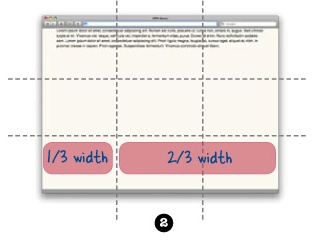
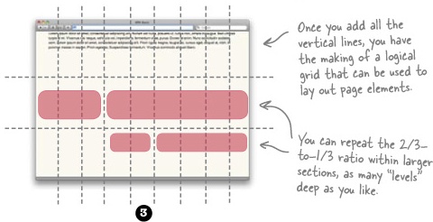
Step 1: Take a piece of paper, and draw a rectangle to represent your site. Then divide your rectangle vertically by thirds (use a ruler, or just estimate carefully).
Step 2: Divide the rectangle horizontally by thirds. Now youâve got a very loose grid.
Step 3: Divide each of your vertical columns into thirds. Now youâve got a sort of grid-within-your-grid so that you can actually use the 2/3-to-1/3 ratio in smaller chunks of your site, too.
Step 4: Lay out your site, aligning things with your gridlines.
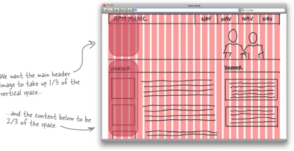
So if the eye really likes to see things in a 2/3-to-1/3 ratio, how does RPMâs site stack up? We already know it doesnât really follow any particular grid alignment. But what if we overlay the 2/3-to-1/3 ratio graphically... what does it tell us about RPM?
Exercise
Based on the grid below, sketch out a storyboard for the RPM Music site. Try and keep up with how your elements are laying out, not only against the grid, but in relation to each other. Is an element part of the main content? Try and make it the 2/3 part of a 2/3-to-1/3 ratio. Just do your best... thereâs no perfect answer if you keep things in proportion.
Important content should âweighâ more.
You should already be putting your most important content into the 2/3 part of your 2/3-to-1/3 page ratios. But is that the only way to draw attention to something? Not at all!
When youâre laying out your page, youâre creating a balance between larger elements and smaller ones. The larger elements have more weight, and the smaller ones have less weight. Plus, thereâs how the elements relate to each other:
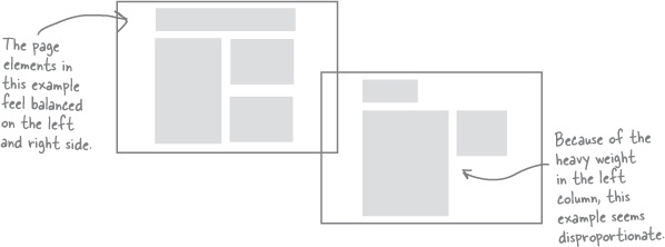
When you are laying out your web page, you need to consider two kinds of balance: symmetrical and asymmetrical.
Symmetrical balance occurs when elements on either side of a line (either horizontal or vertical) have the same weight.
Asymmetrical balance occurs when the weight of a siteâs elements is not evenly distributed around a central line. So youâve got one really large element only partially offset by other, smaller elements.
Take a second and look back at your answer in Exercise Solution. Is it balanced? Symmetrical or asymmetrical is okay. Did you follow the Golden Ratio?
But thatâs not all you have to worry about. Remember, you should be designing for your personas, who have some pretty specific concerns.
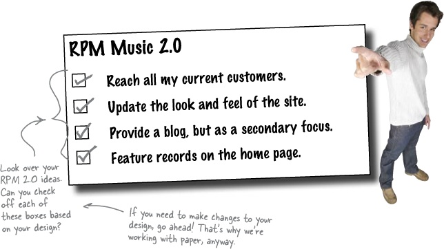
The RPM owner also had a lot of requirements. Did your vision of RPM 2.0 meet what heâs looking for?
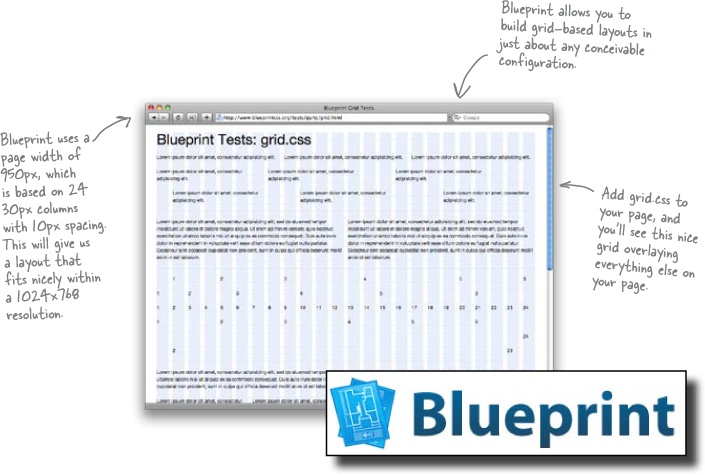
There are CSS frameworks that provide grids for our content to âsitâ against.
When youâre actually building your page in XHTML, itâs not always easy to line things up as well as you can with paper, pencil, and a ruler. Fortunately, there are a lot of cool CSS frameworks that will provide a grid for you. One of the best of these is Blueprint: http://www.blueprintcss.org/
Note
You can Google for âCSS frameworkâ or âCSS grid frameworkâ to find several other options.
One of the best things about Blueprint is that it provides an enormous amount of flexibility in terms of the types of layouts you can create. It also provides support for styling form elements and status messagesâsomething you donât see in a lot of other frameworks.
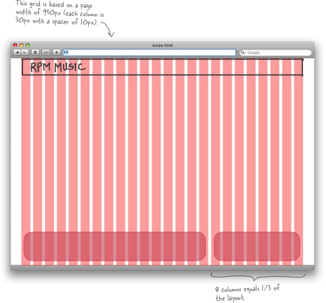
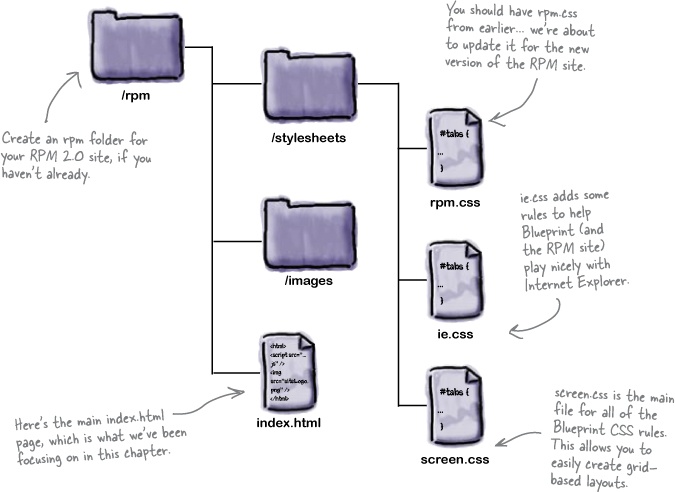
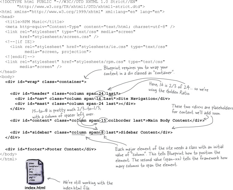
Make sure youâve got the simple version of index.html and rpm.css from Build an XHTML and CSS foundation optimized for 1024x768. Then visit blueprintcss.org and download Blueprint. In the unzipped directory, youâll find a /blueprint folder that has all the files you need. You can drop the stylesheets in this folder right into the stylesheets folder of the RPM 2.0 site youâre building:
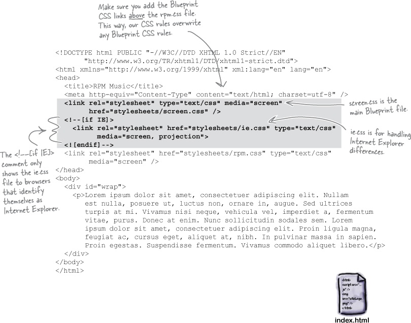
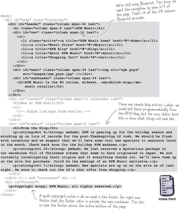
With Blueprint CSS rules available, now you can go to work on RPM 2.0âs XHTML. Just use the class attribute on your divs, like this:

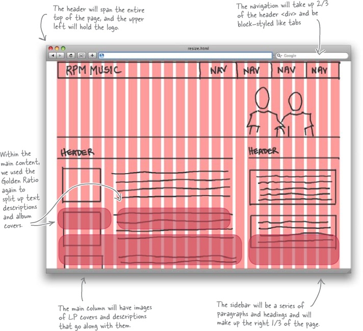
So the âheaderâ div will span 24 30-pixel columns here, which is the entire width of the page. Within that div, you might have other divs that have a span of span-16 and span-8, to get to your Golden Ratio.
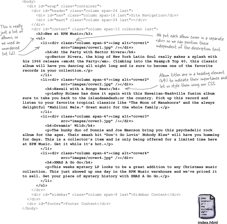
Go ahead and make these additions to your copy of RPMâs index.html:
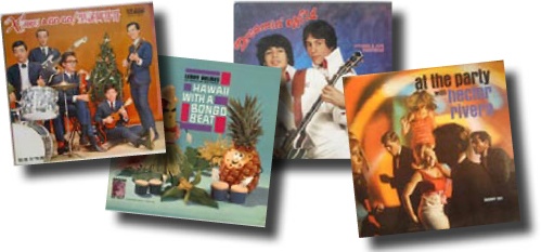

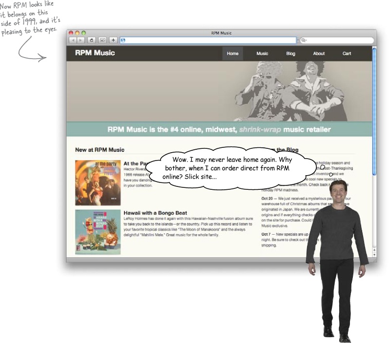
At the Party with Hector Rivera
Hector Rivera, the king of New York Latin Soul, really makes a splash with his 1966 release âAt the Partyâ climbing into the R&B Top 40. This classic album will have you dancing all night long and is sure to become one of the favorite records in your collection.
Hawaii with a Bongo Beat
LeRoy Holmes has done it again with this Hawaiian-Nashville fusion album, sure to take you back to the islands or the country. Pick up this record and listen to your favorite tropical classics like âThe Moon of Manakooraâ and the always delightful âMahilini Mele.â Great music for the whole family.
Dreaminâ Wild
The hunky duo of Donnie and Joe Emerson bring you this psychedelic rock album for the ages. Their smash hit âDonât Go Lovinâ Nobody Elseâ will have you humming for days. This is a collectorâs item and is only being offered for a limited time here at RPM Music. Get it while itâs hot.
XMAS A Go Go
This weekâs mystery LP looks to be a great addition to any Christmas music collection. This just showed up one day in the RPM Music warehouse, and weâve priced it to sell. Get your piece of mystery history with XMAS A Go Go.
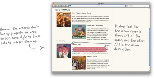
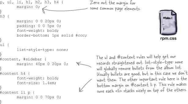
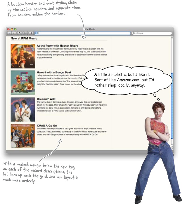
Some simple additions to rpm.css should clean up things considerably:
Letâs add a little more content to show the RPM owner just how far weâve come. Make these changes to your copy of index.html:
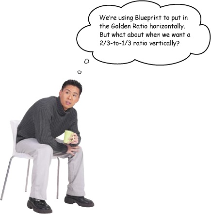
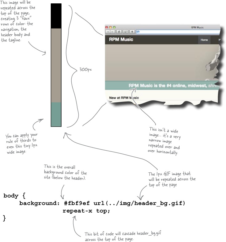
Vertical ratios usually require images and CSS positioning.
Itâs relatively easy to get your horizontal ratios right using a CSS grid framework like Blueprint. But how do you get a vertical ratio going, like between a main header image and the rest of a siteâs content?
You can start by sizing your image to take up about 1/3 of the typical userâs vertical screen real estate. But then youâre having to use a lot of different images, and possibly even the dreaded 1-pixel transparent spacer. And what about the parts of the page within the header: a navigation bar, the site logo, any headings... it can turn into a messâfast.
A better solution is to put together a background image that has things in the correct proportions, like this:
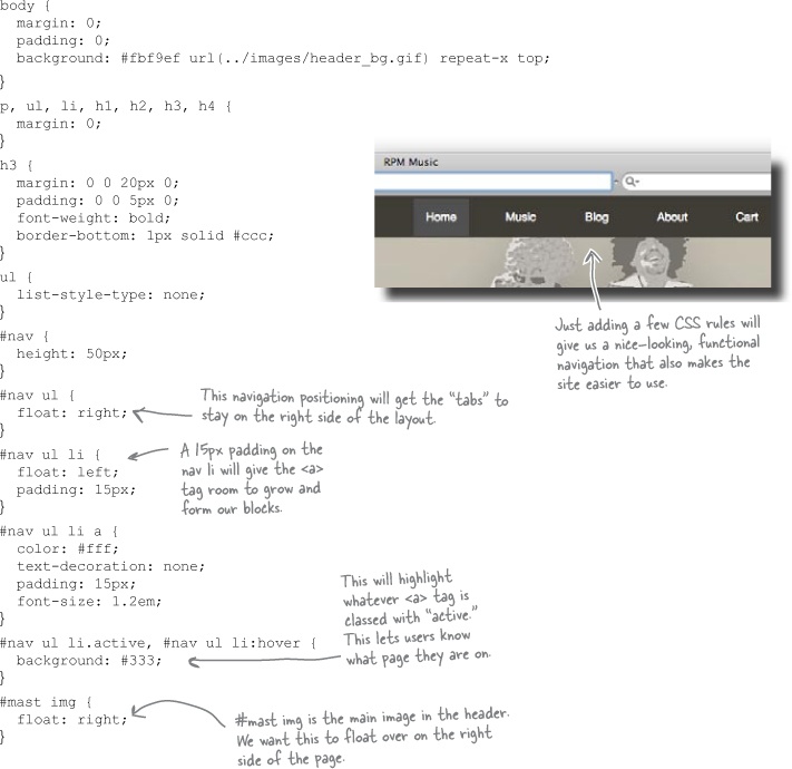
Here are some more CSS rules to help clean up and format all the new XHTML you just added. Make these additions to rpm.css, too:
Relax
Focus on design, not the CSS.
Itâs okay if youâre not 100% sure on all these CSS rules. You can pick up Head First HTML with XHTML & CSS for more details. For now, focus on the look weâre creating, and how itâs balanced, organized, and follows the Golden Ratio.
Get Head First Web Design now with the O’Reilly learning platform.
O’Reilly members experience books, live events, courses curated by job role, and more from O’Reilly and nearly 200 top publishers.

