You need more than a table of numbers.
Your data is brilliantly complex, with more variables than you can shake a stick at. Mulling over mounds and mounds of spreadsheets isn’t just boring; it can actually be a waste of your time. A clear, highly multivariate visualization can in a small space show you the forest that you’d miss for the trees if you were just looking at spreadsheets all the time.
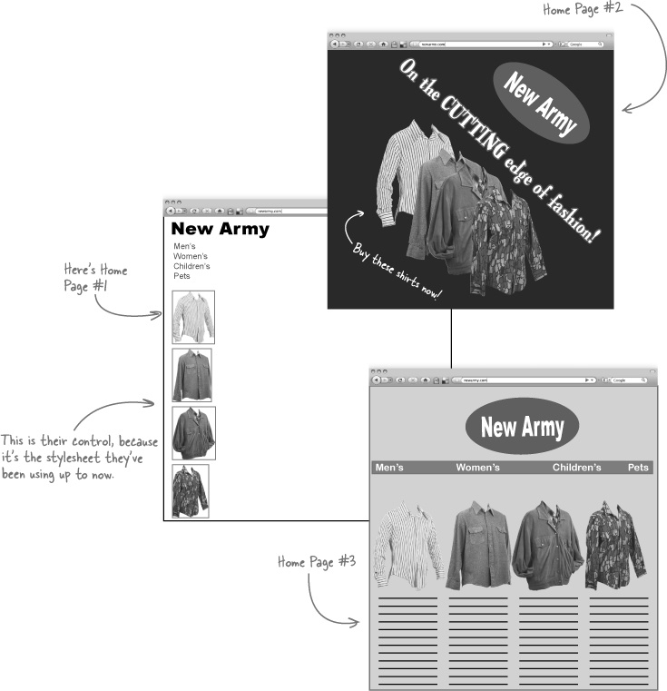
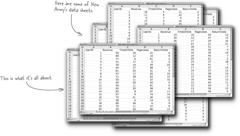
New Army is an online clothing retailer that just ran an experiment to test web layouts. For one month, everyone who came to the website was randomly served one of these three home page designs.
They had their experiment designers put together a series of tests that promise to answer a lot of their questions about their website design.
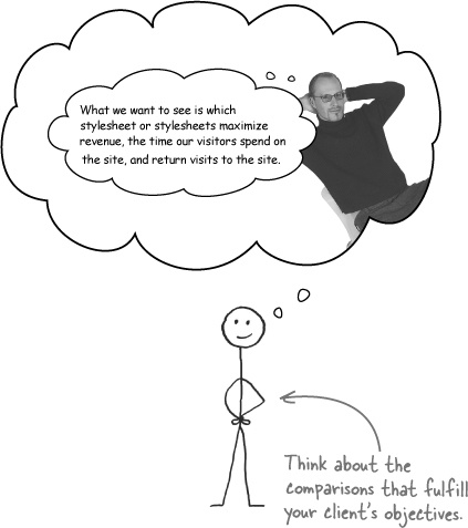
What they want to do is find the best stylesheets to maximize sales and get people returning to their website.
Now that they have a store of fantastic data from a controlled, randomized experiment, they need a way to visualize it all together.
So they hired a fancy information designer and asked him to pull together something that helped them understand the implications of their research. Unfortunately, all did not work out as planned.
You’ll need to redesign the visualizations for the analysis. It could be hard work, because the experiment designers at New Army are an exacting bunch and generated a lot of solid data.
But before we start, let’s take a look at the rejected designs. We’ll likely learn something by knowing what sort of visualizations won’t work.
Let’s take a look at the rejected designs...
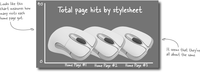
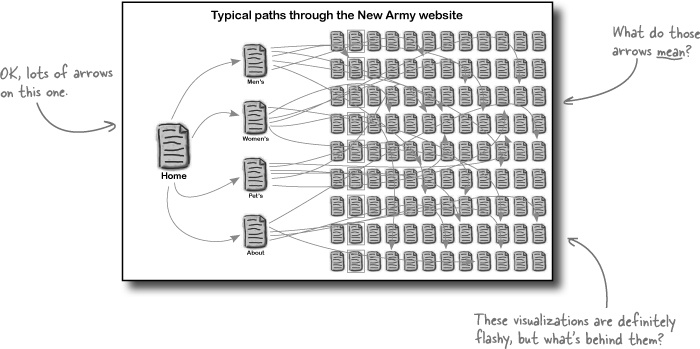
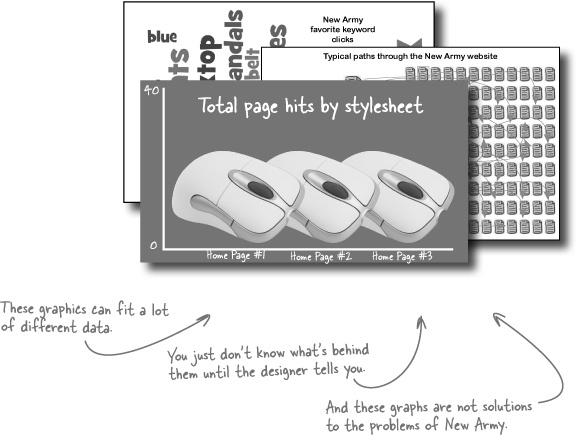
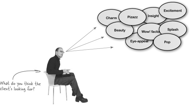
The information designer submitted these three designs to New Army. Take a look at these designs. What are your impressions? Can you see why the client might not have been pleased?
“What is the data behind the visualizations?” is the very first question you should ask when looking at a new visualization. You care about the quality of the data and its interpretation, and you’d hate for a flashy design to get in the way of your own judgments about the analysis.
You can’t tell from these visualizations what data is behind them. If you’re the client, how could you ever expect to be able to make useful judgments with the visualizations if they don’t even say clearly what data they describe?
Show the data. Your first job in creating good data visualizations is to facilitate rigorous thinking and good decision making on the part of your clients, and good data analysis begins and ends with thinking with data.
New Army’s actual data, however, is really rich and has all sorts of great material for your visualizations.
You didn’t ask for it, but it appears that you’re getting it anyway: the outgoing information designer wants to put in his two cents about the project. Maybe his perspective help...
It’s easy to get scared by looking at a lot of data.
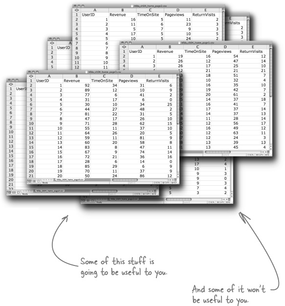
But knowing how to deal with what seems like a lot of data is easy, too.
If you’ve got a lot of data and aren’t sure what to do with it, just remember your analytical objectives. With these in mind, stay focused on the data that speaks to your objectives and ignore the rest.
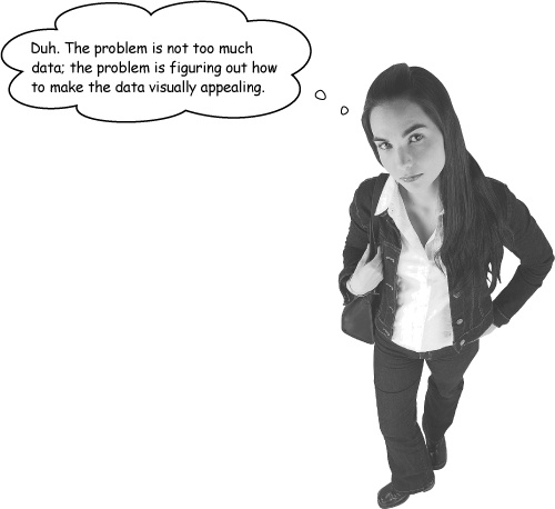
Oh, really? Do you think it’s your job as a data analyst to create an aesthetic experience for your clients?
If the data visualization solves a client’s problem, it’s always attractive, whether it’s something really elaborate and visually stimulating or whether it’s just a plain ol’ table of numbers.
Making good data visualizations is just like making any sort of good data analysis. You just need to know where to start.
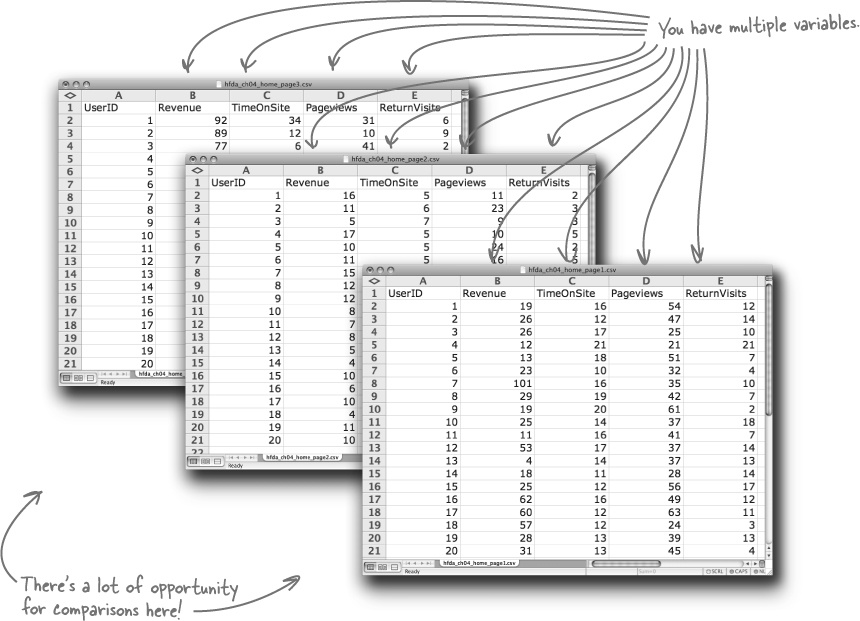
To build good visualizations, first identify what are the fundamental comparisons that will address your client’s objectives. Take a look at their most important spreadsheets:
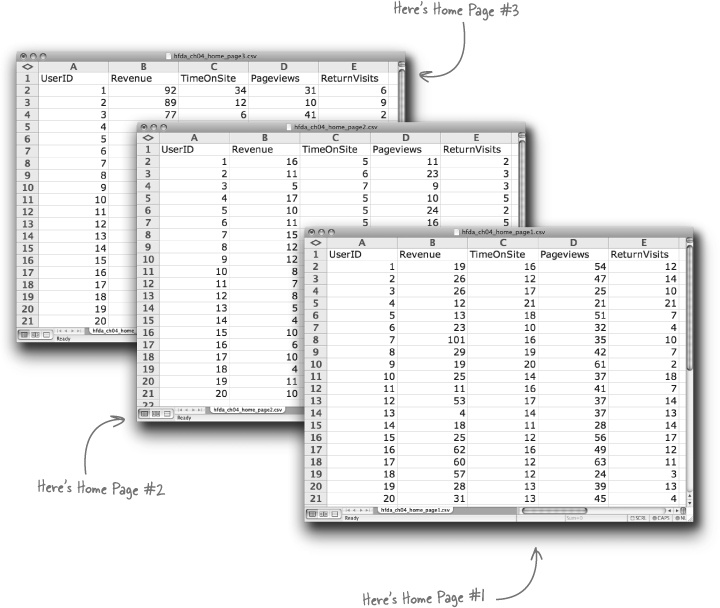
While New Army has more data than these three sheets, these sheets have the comparisons that will speak directly to what they want to know. Let’s try out a comparison now...
Sharpen your pencil
Take look at the statistics that describe the results for Home Page #1. Plot dots to represent each of the users on the axes below.
Use your spreadsheet’s average formula (AVG) to calculate the average Revenue and TimeOnSite figures for Home Page #1, and draw those numbers as horizontal and vertical lines on the chart.
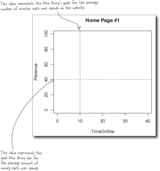
How do the results you see compare to their goals for revenue and time on site?
________________________________________________________________
________________________________________________________________
________________________________________________________________
Sharpen your pencil Solution
How did you visualize the Revenue and TimeOnSite variables for Home Page #1?
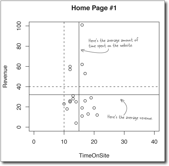
How do the results you see compare to their goals for revenue and time on site?
On average, the time people spend looking at the website under Home Page #1 is greater than New Army’s goal for that statistic. On the other hand, the average amount of revenue for each user is less than their goal.
Now that’s a nice chart, and it’ll definitely be useful to your client. It’s an example of a good data visualization because it...
Shows the data
Makes a smart comparison
Shows multiple variables
Scatterplots are great tools for exploratory data analysis, which is the term statisticians use to describe looking around in a set of data for hypotheses to test.
Analysts like to use scatterplots when searching for causal relationships, where one variable is affecting the other. As a general rule, the horizontal x-axis of the scatterplot represents the independent variable (the variable we imagine to be a cause), and the vertical y-axis of a scatterplot represents the dependent variable (which we imagine to be the effect).
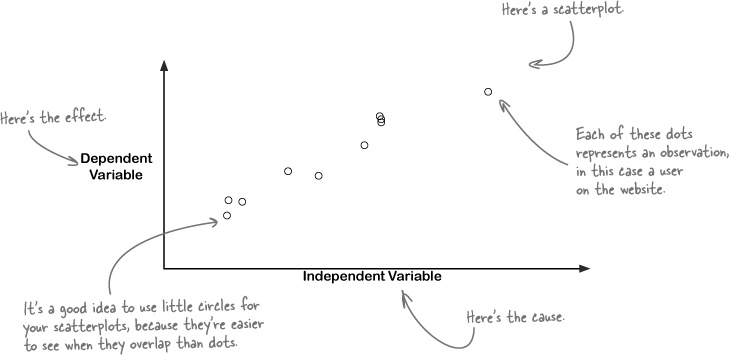
You don’t have to prove that the value of the independent variable causes the value of the dependent variable, because after all we’re exploring the data. But causes are what you’re looking for.
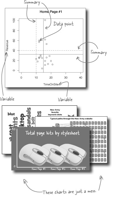
A visualization is multivariate if it compares three or more variables. And because making good comparisons is fundamental to data analysis, making your visualizations as multivariate as possible makes it most likely that you’ll make the best comparisons.
And in this case you’ve got a bunch of variables.
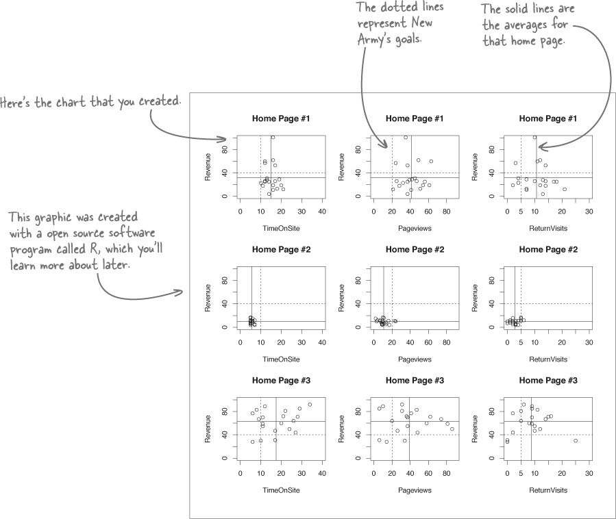
One way of making your visualization more multivariate is just to show a bunch of similar scatterplots right next to each other, and here’s an example of such a visualization.
All of your variables are plotted together in this format, which enables you to compare a huge array of information right in one place. Because New Army is really interested in revenue comparisons, we can just stick with the charts that compare TimeOnSite, Pageviews, and ReturnVisits to revenue.
Let’s see what the client thinks...
You just got an email from your client, the web guru at New Army, assessing what you created for him. Let’s see what he has to say...
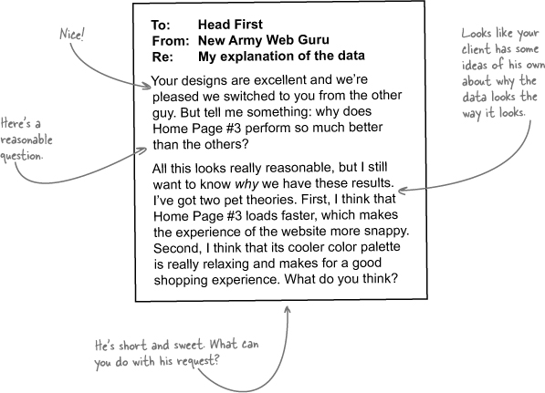

He wants to know about causality.
Knowing what designs work only takes him so far. In order to make his website as powerful as possible, he needs some idea of why people interact with the different home pages the way they do.
And, since he’s the client, we definitely need to address the theories he put forward.
Your and your client’s preferred model will usually fit the data.
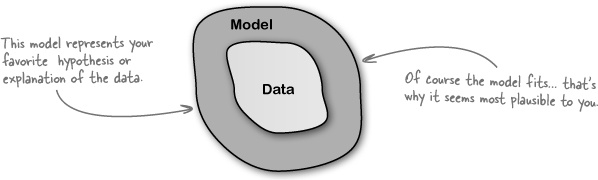
But there are always other possibilities, especially when you are willing to get imaginative about the explanations. What about other models?
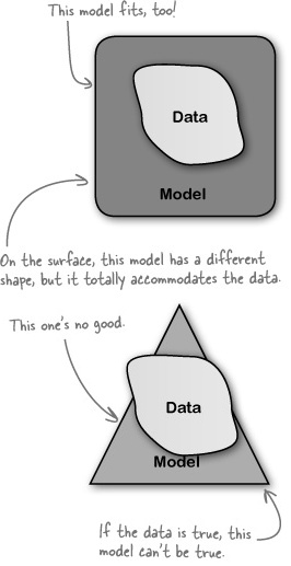
You need to address alternative causal models or explanations as you describe your data visualization. Doing so is a real mark of integrity: it shows your client that you’re not just showing the version of the story that you like best: you’re thinking through possible failure points in your theories.
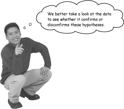
The experiment designers saw the web guru’s theories and sent you some of their thoughts. Perhaps their input will enable you to evaluate the web guru’s hypotheses about why some home pages performed better than others.
To: | Head First |
From: | New Army experiment designers |
Re: | The boss’s ideas |
He thinks that page loads count? That could be. We haven’t taken a look at the data yet to see for sure. But in our testing, #2 was the fastest, followed by #3, and then #1. So, sure, he could be right. | |
As for the cooler color palette, we kind of doubt it. The color palette of Home Page #3 is coolest, followed by #2, then #1, by the way. There’s research to show that people react differently, but none of it has really persuaded us. | |
Sharpen your pencil
Let’s take a look at the data to see whether the bosses hypotheses fit. Does the data fit either of the hypotheses?
Hypothesis 1: The snappy performance of snappy web pages accounts for why Home Page #3 performed best.
___________________________
___________________________
___________________________
___________________________
___________________________
___________________________
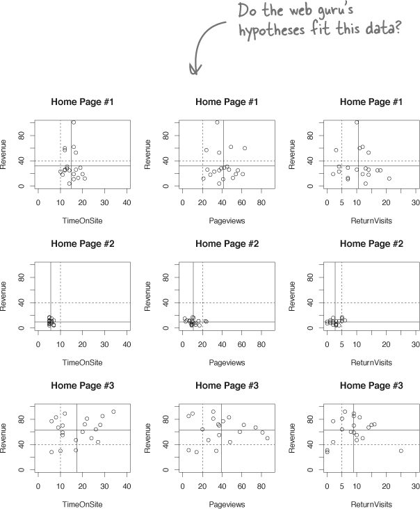
Hypothesis 2: The relaxing, cool color palette of Home Page #3 accounts for why it performed best.
___________________________
___________________________
___________________________
___________________________
___________________________
___________________________
Sharpen your pencil Solution
How well did you find the web guru’s hypotheses to fit the data?
Hypothesis 1: The snappy performance of snappy web pages accounts for why Home Page #3 performed best.
This can’t be true, since #3 isn’t the fastest, according to the experiment designers. It might be that as general rule people prefer faster pages, but page load speed can’t explain #3’s success in the context of this experiment.
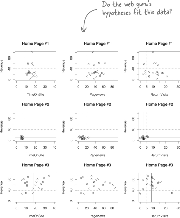
Hypothesis 2: The relaxing, cool color palette of Home Page #3 accounts for why it performed best.
This hypothesis fits the data. Home Page #3 is the highest-performing page, and it has the coolest color palette. The data don’t prove that the color palette is the reason that #3 performed so well, but it fits the hypothesis.
They’ve had an opportunity to take a look at your scatterplots and sent you some of their own thinking about what’s going on. These people are data junkies, and their hypotheses definitely fit.
To: | Head First |
From: | New Army experiment designers |
Re: | We don’t know why Home Page #3 is stronger |
We’re delighted to hear that #3 is the best, but we really don’t know why. Who knows what people are thinking? But that is actually OK: as long as we’re showing improvement on the business fundamentals, we don’t need to understand people in a deep way. Still, it’s interesting to learn as much as we can. The stylesheets are really different from each other in many ways. So when it comes to isolating individual features that might account for the performance differential, it’s hard. In the future, we’d like to take Home Page #3 and test a bunch of subtle permutations. That way, we might learn things like how button shape or font choice affect user behavior. But we conjecture that there are two factors. First, Home Page #3 is really readable. We use fonts and a layout that are easy on the eyes. Second, the page hierarchy is flatter. You can find pretty much everything in three clicks, when for Home Page #1 it takes you more like seven clicks to find what you want. Both could be affecting our revenue, but we need more testing to say for sure. | |
You created an excellent visualization that enabled New Army to quickly and simultaneously assess all the variables they tested in their experiment.
And you evaluated that visualization in light of a bunch of different hypotheses, giving them some excellent ideas about what to test for in the future.

Because of the new website, traffic is greater than ever. Your visualization of the experimental results showed what they needed to know to spruce up their website.
Even better, New Army has embarked on a continuous program of experimentation to fine-tune their new design, using your visualization to see what works. Nice job!
Get Head First Data Analysis now with the O’Reilly learning platform.
O’Reilly members experience books, live events, courses curated by job role, and more from O’Reilly and nearly 200 top publishers.

