Chapter 7. Fragments: Make it Modular

You’ve seen how to create apps that work in the same way irrespective of the device they’re running on.
But what if you want your app to look and behave differently depending on whether it’s running on a phone or a tablet? In this chapter, we’ll show you how to make your app choose the most appropriate layout for the device screen size. We’ll also introduce you to fragments, a way of creating modular code components that can be reused by different activities.
Your app needs to look great on all devices
One of the great things about Android development is that you can put the exact same app on devices with completely different screen sizes and processors, and have them run in exactly the same way. But that doesn’t mean that they always have to look exactly the same.
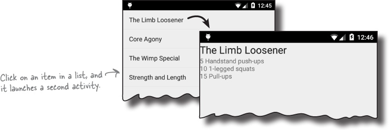
On a phone:
Take a look at this image of an app on a phone. It displays a list of workouts, and when you click on one, you are shown the details of that workout.
On a tablet:
On a larger device, like a tablet, you have a lot more screen space available. It would be good if all the information appeared on the same screen. On the tablet, the list of workouts only goes part-way across the screen, and when you click on an item, the details appear on the right.
To make the phone and tablet user interfaces ...
Get Head First Android Development now with the O’Reilly learning platform.
O’Reilly members experience books, live events, courses curated by job role, and more from O’Reilly and nearly 200 top publishers.

