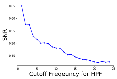
The following code block shows how to plot the change in the signal to noise ratio (SNR) with the cutoff frequency (F) for the HPF:
pylab.plot(lbs, snrs_hp, 'b.-')pylab.xlabel('Cutoff Frequency for HPF', size=20)pylab.ylabel('SNR', size=20)pylab.show()
The following screenshot shows how the SNR of the output image decreases with the increase in the cutoff frequency of the HPF: