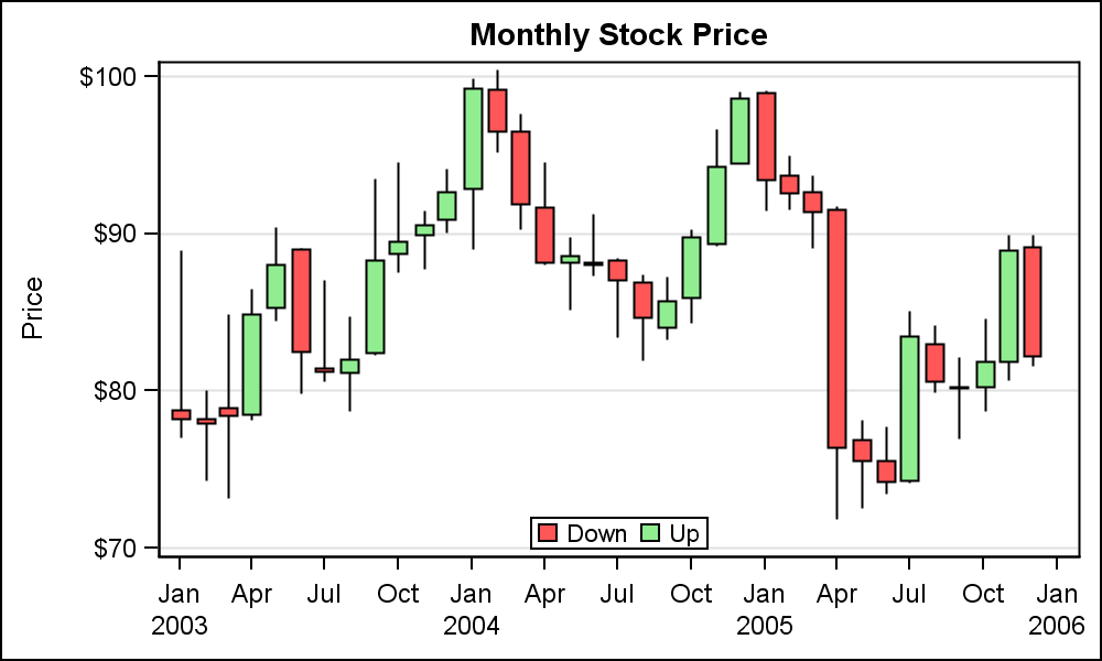
Candlestick charts are visually quite similar to the box-and-whiskers charts, except they are used to represent the difference between the opening and closing value, while showing the direction of the value (whether increasing or decreasing) through different colors. If the value of a particular piece of data stays the same, the rectangular shape will not be shown at all:
For more information regarding the different types of charts supported by Qt, please head over to the following link: https://doc.qt.io/qt-5/qtcharts-overview.html.
Qt supports most of the diagram types you need for your project. It is also extremely easy ...

