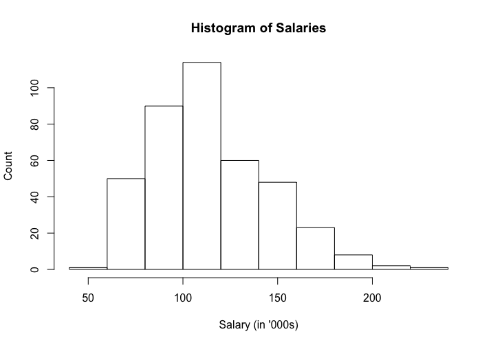
Histograms are used to visualize count data. The chart consists of bars with a y axis representing the count and the x axis representing the data. The following code demonstrates the use of the hist function in R:
# Data Visualisation

library(car)
library(RColorBrewer)

data("Salaries")

# Histogram of Salaries of Professors from the Salaries dataset
hist(Salaries$salary/1000, main="Histogram of Salaries", xlab="Salary (in '000s)", ylab="Count")
The output of the preceding code is as follows:
We will be running the same code with a minor change of col=brewer.pal(8,"Reds"). This will provide you with the same output as the previous ...

