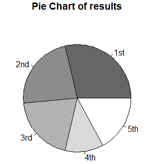
For the next R program, we show a pie chart based on the percentage of each input value:
results <- c(10,8,7,4,6)
names<-c("1st","2nd","3rd","4th","5th")
pct<-round(results/sum(results)*100)
pct2<-rev(sort(pct))
name<-"Pie Chart of results"
colors<-seq(0.4, 1.0, length = length(results))
pie(results, labels = names, col = gray(colors),main=name)
The related graph is shown here:
The next Python program shows the histogram for a standard normal distribution:
import numpy as np import matplotlib.pyplot as plt data = np.random.RandomState(10) n=5000 n2=1000 x=data.normal(size=n) y=data.normal(loc=5, ...

