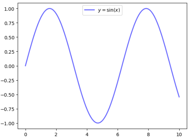
In the following Julia function, we add the legend y=sin(x) to the output graph:
using PyPlot
x = linspace(0, 10, 100)
y = sin.(x)
name=L"$y = sin(x)$"
fig, ax = subplots()
ax[:plot](x, y, "b-", linewidth=2, label=name,alpha=0.6)
ax[:legend](loc="upper center")
The associated graph is shown here:
In the R program, we add the following formula to the graph (the formula for the normal distribution):

The R code is given here:
set.seed(12345) mu=4 std=2 nRandom=2000 x <- rnorm(mean =mu, sd =std, n =nRandom) ...

