Coloring the axes
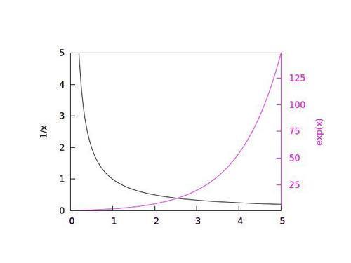
We showed back in Chapter 1, Plotting Curves, Boxes, Points, and more, how to use two different y-axes when plotting two functions or datasets that have dissimilar ranges. We can make it easier to see which curve goes with which axis by using color.
In the following figure, two curves are colored (shaded in print) to match corresponding colors on the vertical axes with which they are associated. The axis labels are colored to match, as well. This makes it easy to match the curves with their y-axes without having to use arrows or legends.
How to do it…
The following script created the previous figure:
set multi set tmargin at screen ...
Get gnuplot Cookbook now with the O’Reilly learning platform.
O’Reilly members experience books, live events, courses curated by job role, and more from O’Reilly and nearly 200 top publishers.

