Defining the tic values
This recipe will show you how to take a little more control over where the tics appear on your axes. The following figure illustrates one use of manually specified tic marks:
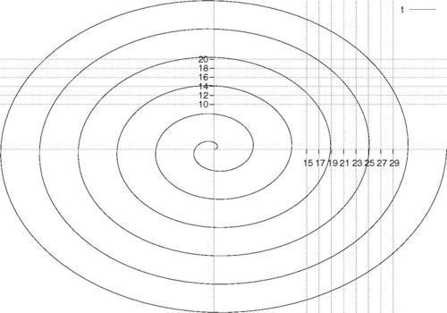
The previous figure is similar to the one towards the end of Chapter 1, Plotting Curves, Boxes, Points, and more, where we introduced polar coordinates. The difference here is that we have placed our tic marks only in a certain area—that you can imagine is a region of interest—and added grid lines so the reader can more easily extract quantitative information from the graph in the region.
How to do it…
Following is the script that produced the previous ...
Get gnuplot Cookbook now with the O’Reilly learning platform.
O’Reilly members experience books, live events, courses curated by job role, and more from O’Reilly and nearly 200 top publishers.

