Pie is represented with the ![]() icon.
icon.
A Pie works in one specific situation: when you want to compare to the proportion between two values. With more than two values, a Bar is always more efficient. Here's an example of a visualization, representing the unranked sales by category with a Pie chart and a Bar chart:
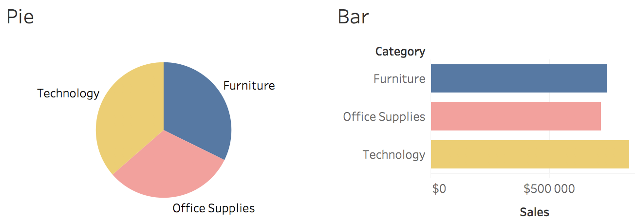
You can easily rank the categories with bars. It's much more difficult to do it with a Pie. The goal of data visualization is to help you make decisions as fast as possible. The best visualization is the one that answers your question ...

