The best way to understand these is with an example. In the following diagram, you can see three measures, according to Category and Sub-Category:
- A normal aggregation, the maximum of sales: MAX([Sales])
- An attribute aggregation of a Calculated Measure using an Exclude function: ATTR( { EXCLUDE [Sub-Category]: MAX([Sales]) } )
- An average aggregation of a Calculated Measure using an Include function: AVG( { INCLUDE [Segment]: MAX([Sales]) } )
Here's the result:
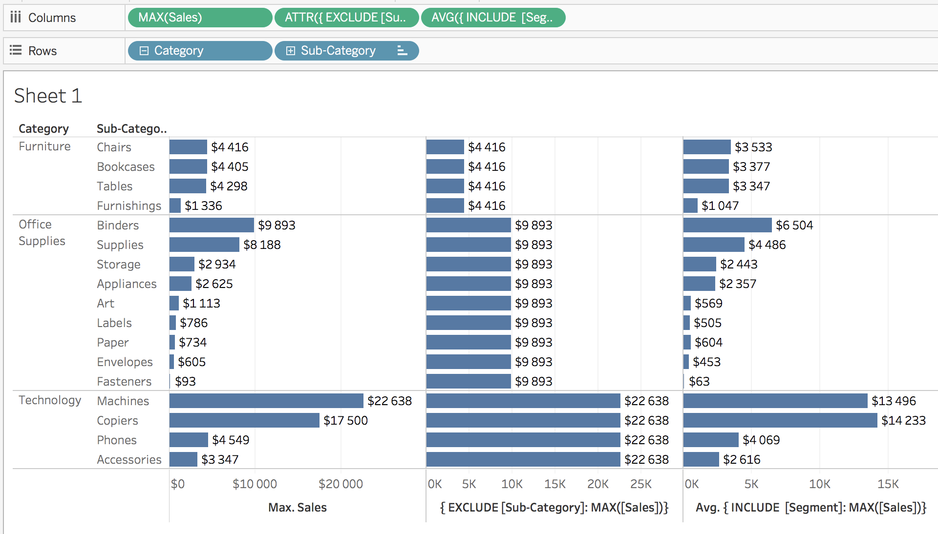
Let's spend some time understanding what you see:
- The first value is a simple aggregation. It returns the highest sales value by Category and Sub-Category, which ...

