We will use a Material-UI LinearProgress component to indicate how much of the video has been buffered, and how much has been played. Then we'll combine this component with a range input to give users the ability to move the time slider to a different part of the video and play from there:
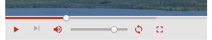
The LinearProgress component will take the played and loaded values to show each in a different color:
<LinearProgress color="primary" variant="buffer" value={played*100} valueBuffer={loaded*100} style={{width: '100%'}} classes={{ colorPrimary: classes.primaryColor, dashedColorPrimary: classes.primaryDashed, dashed: {animation: 'none'} ...
